


Art Companion: Chapter 32, Newberry Color Theory: It Works!
Soon to Be Released in a Matter of Days. The Art Studio Companion: A Master Class for Artists

In this study, we examine how this color theory enhances light, shadows, depth, and atmosphere while bringing out uniquely beautiful color harmonies.
232 Rembrandt, Titus, 1657. The Wallace Collection.
Classical artists, like da Vinci and Rembrandt, generally painted the color of things as they are. For example, in Rembrandt’s painting of his son, Titus, wearing a red hat is painted red; then black or brown is used to mold the forms and make shadows, kind of like a tinted black-and-white photo. In Classical landscapes, artists like would use blue tint for depth (blue mountains in the distance) and orange light in the foreground, but they didn’t take color theory much further than that.
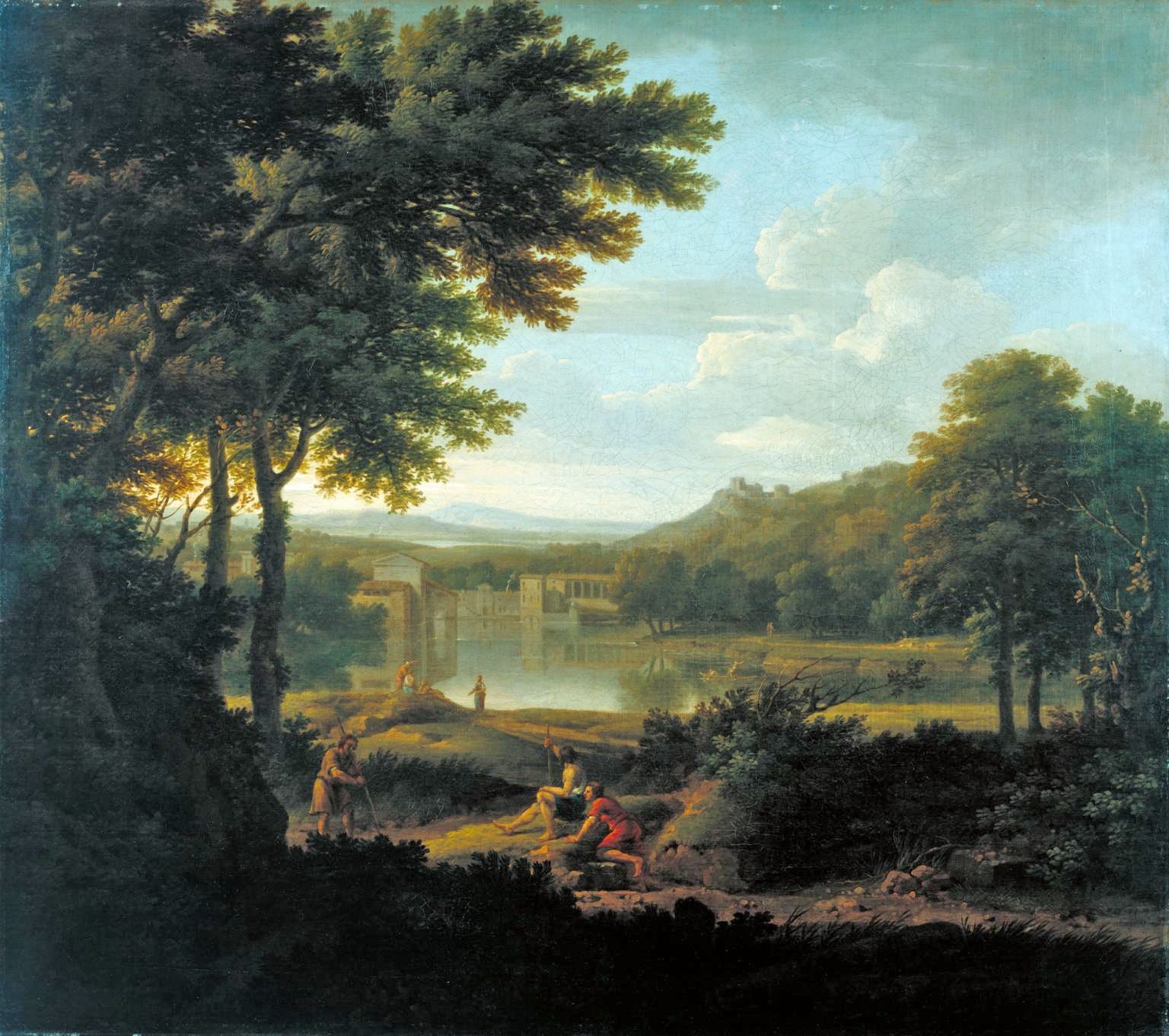
233 Lambert, Classical Landscape, 1745. Tate.
The French Impressionists, especially Monet and Van Gogh, took their studios outside into the open air to paint the effects of daylight. This approach made them sensitive to noticing the nuanced tints of atmosphere, lights, shadows, and depths. For instance, Monet captured how cast shadows of haystacks not only had a bluish tint, but those cast shadows also reflected the blue sky. Van Gogh, in his masterpiece The Harvest, showed us how golden ambient light bounces off a sunlit valley of golden fields, consequently mixing the golden haze with the blue sky, making it appear green.
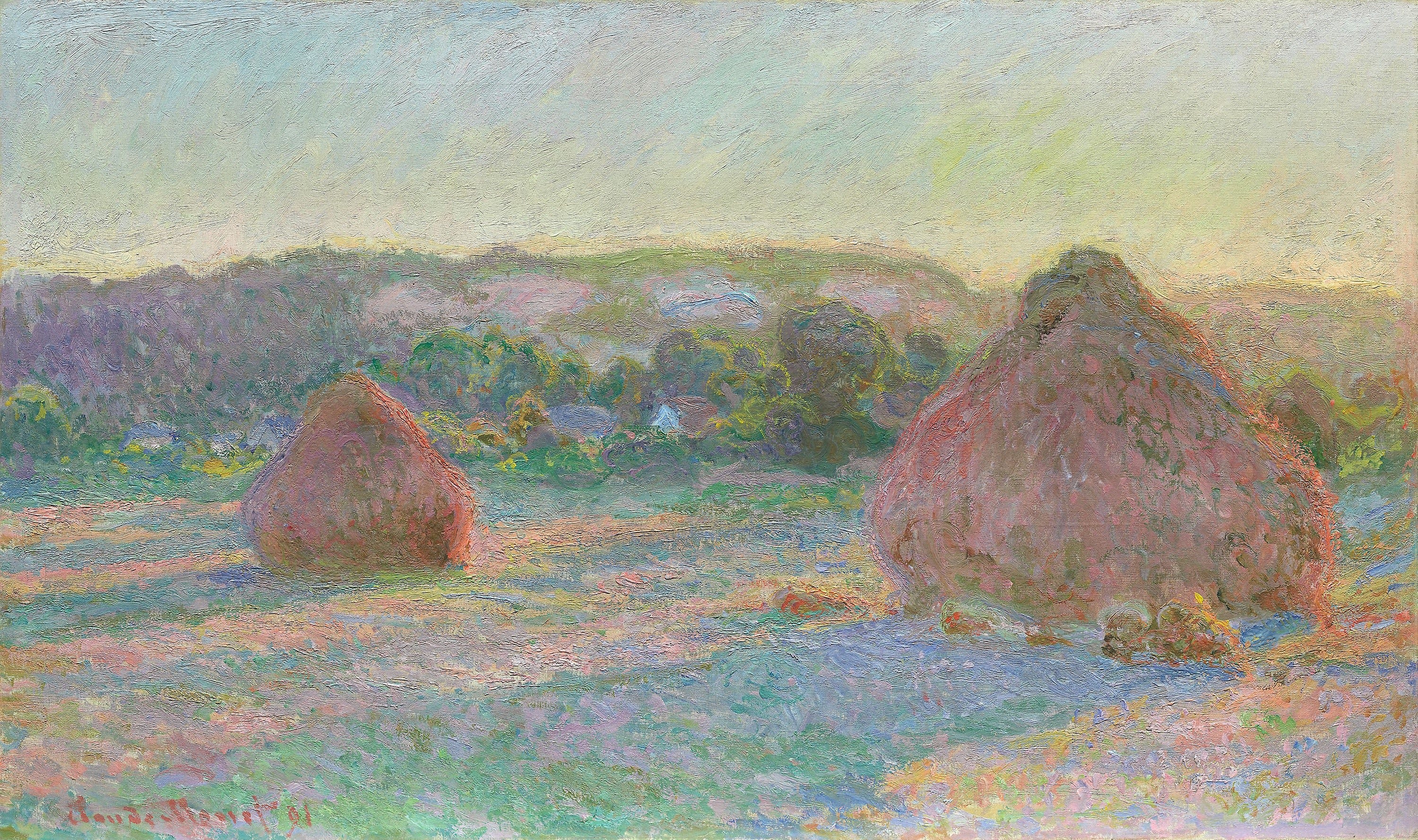
234 Monet, Stacks of Wheat (End of Summer), 1891. Art Institute of Chicago.
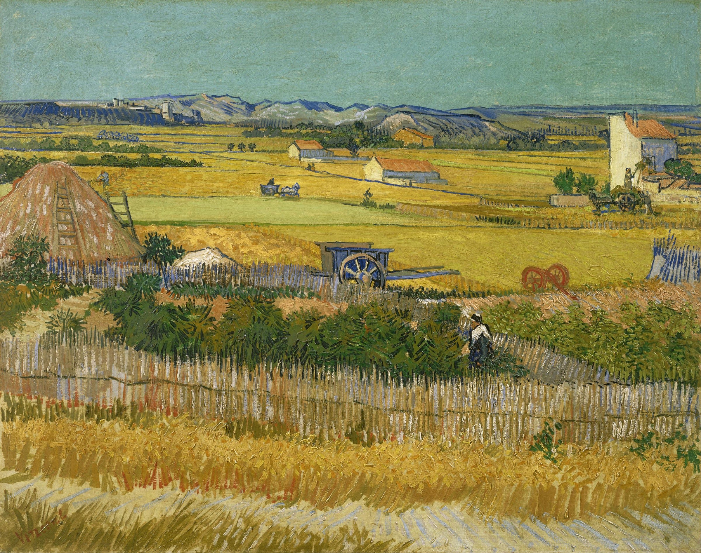
235 Van Gogh, The Harvest, 1888. Van Gogh Museum, Amsterdam.
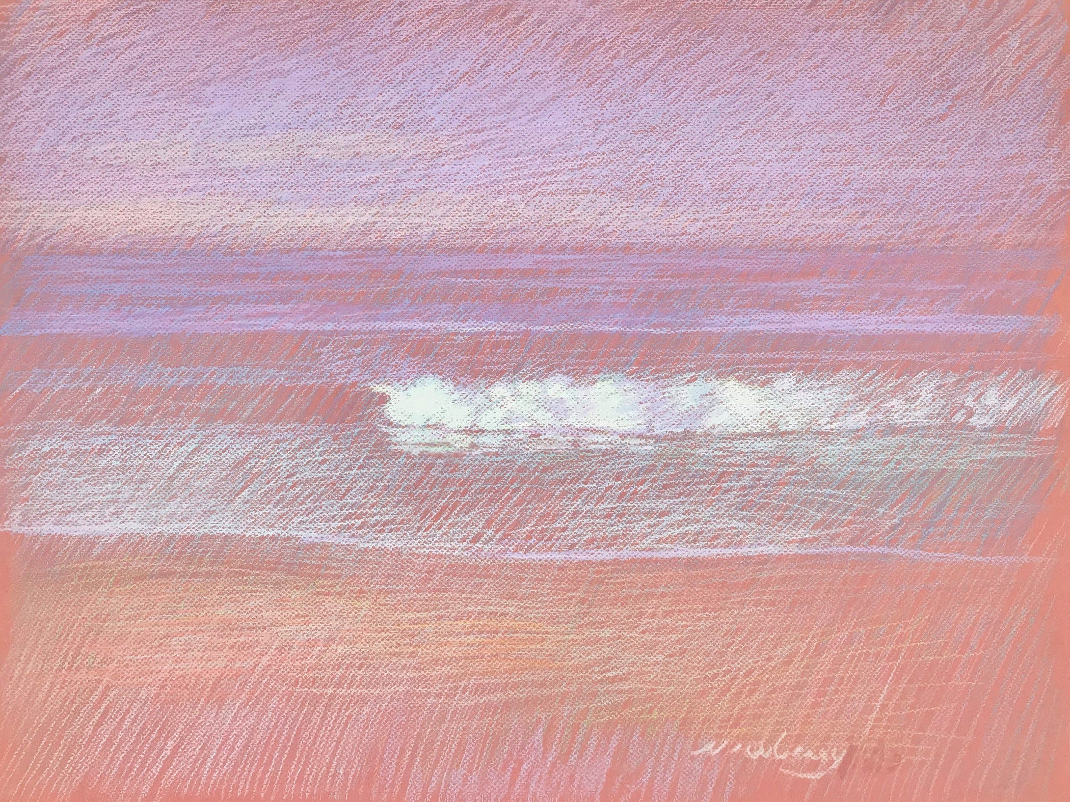
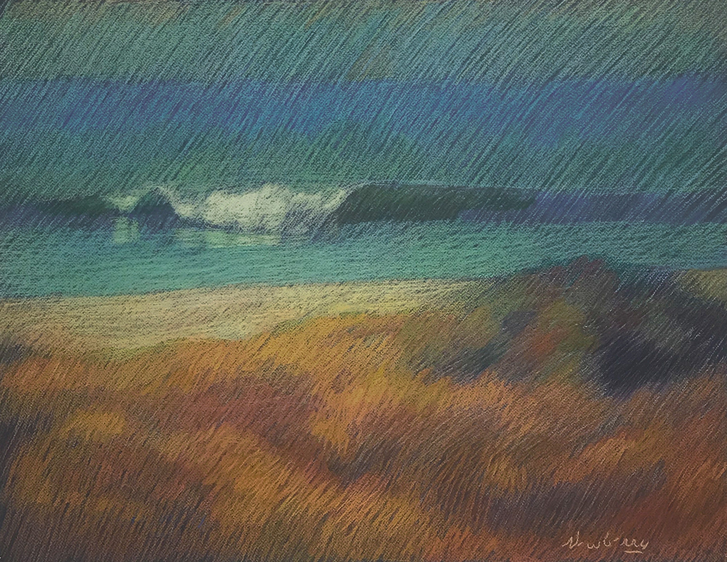
236 Newberry, San Onofre: Pink, 2020, pastel.
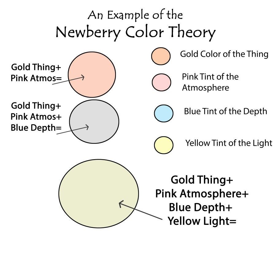
After 50 years of intensely studying and painting visual perceptions of reality, and studying artists like Monet, I deduced principles that work incredibly well in practice and published the results in Newberry Color Theory. The book comprises "The Wave Series," sixteen pastel drawings based on my color theory. Its uniqueness lies in the integration of how the colors of things interact with light, depth, and atmosphere. While each of these elements had been studied by scientists or explored by artists, they had not been approached as an overall system. The series explores unique color variations using the following four color elements:
When we look at reality, there are four essential color elements:
1. Color of Things
2. Complementary (Opposite) Tints of Depth vs. Foreground
3. Complementary Tints of Light vs. Shadows (Clear Sky N/A)
4. Tint of Atmosphere
Note on the colored paper: The color theory I've developed focuses on light depth, objects, atmosphere, and their interplay within a composition. While the orange-rust-colored paper serves as the substrate for my pastel drawing, it both does and doesn't directly influence the color theory I've applied.
On one hand, the paper's hue acts as a foundational influence, subtly affecting how colors appear upon it. It sets a tone and establishes a starting point for the interaction of light and pigments, shaping the overall atmosphere and mood of the artwork.
Regardless of the paper's color, the essence of my color theory lies in the deliberate manipulation of light and color within the composition itself., the color theory's principles remain consistent.
The Color Theory Behind San Onofre: Pink
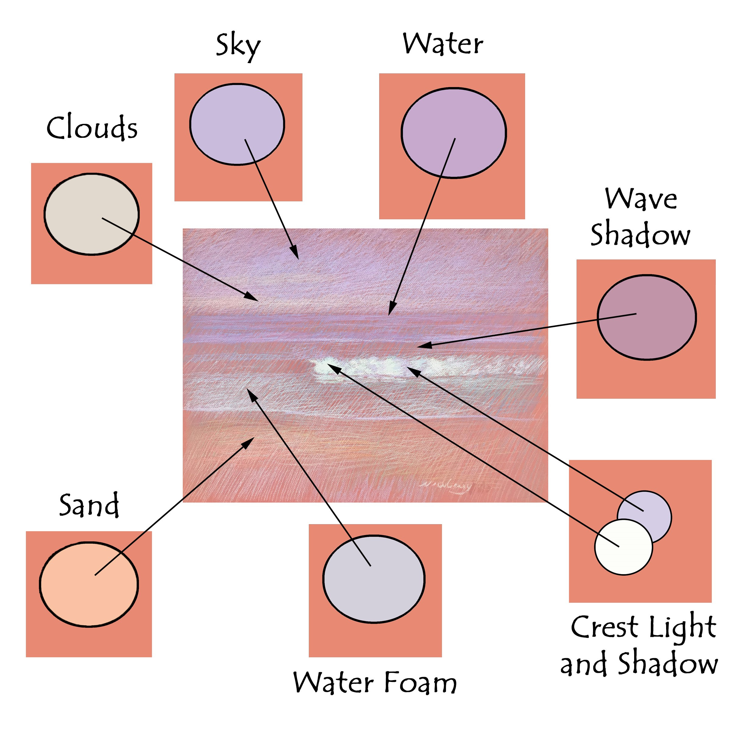
237 Map of key colors in San Onofre: Pink.
The preceding chart is a color map of San Onofre: Pink. It shows examples of the colors of things in the final pastel drawing. Next, I will show you how each of these colors was derived by the color theory.
CLOUDS
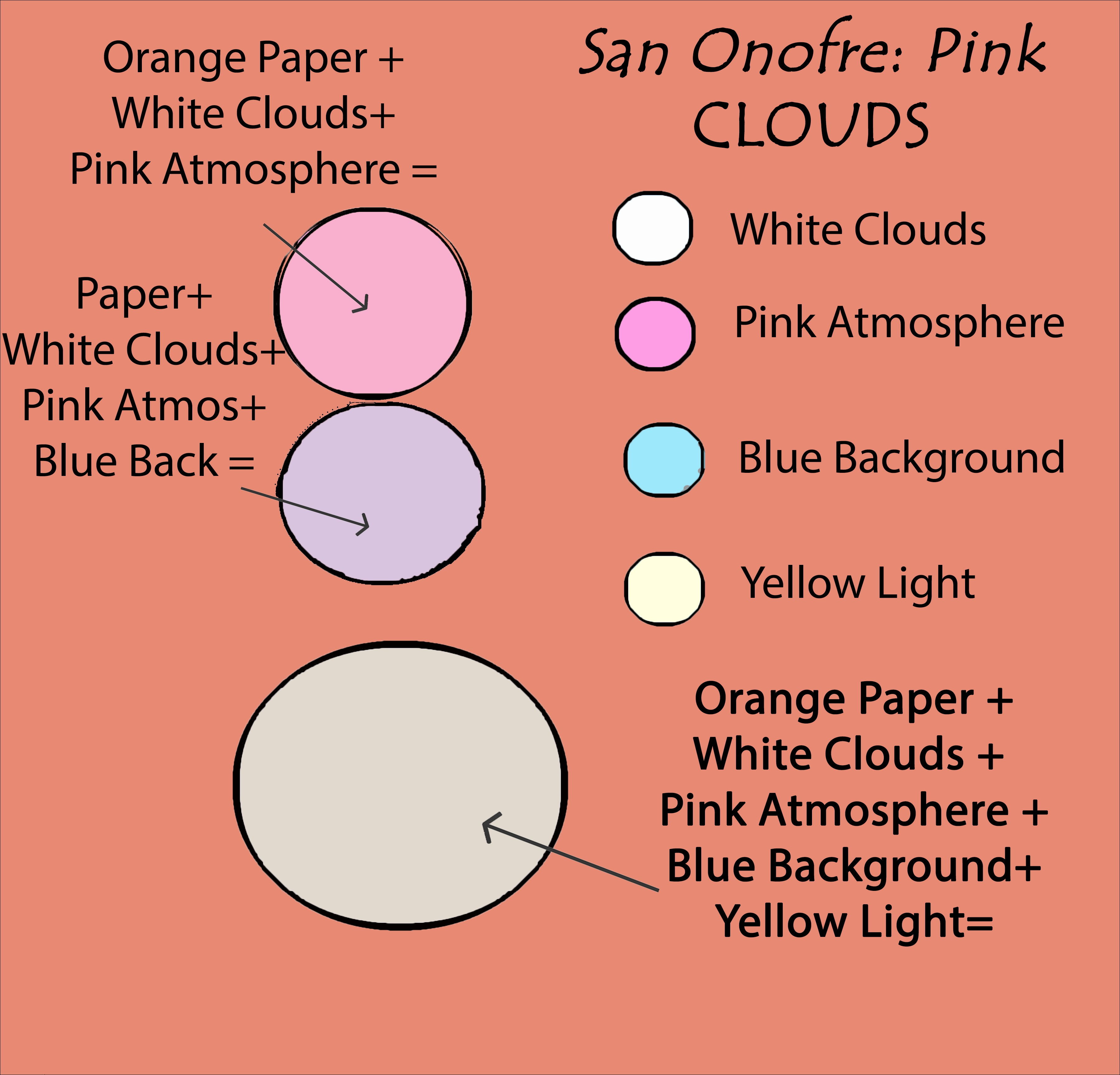
238 Color chart for the clouds.
The final color for the white marine cloud layer on the horizon is beige. The white cloud is deep in space and consequently took on a blue tint, pink atmosphere, and some yellow from the light source—when combined they make beige. The beige color helps the white cloud marine layer fit perfectly in space, with just enough light, and atmosphere to feel irresistibly at home.
SKY
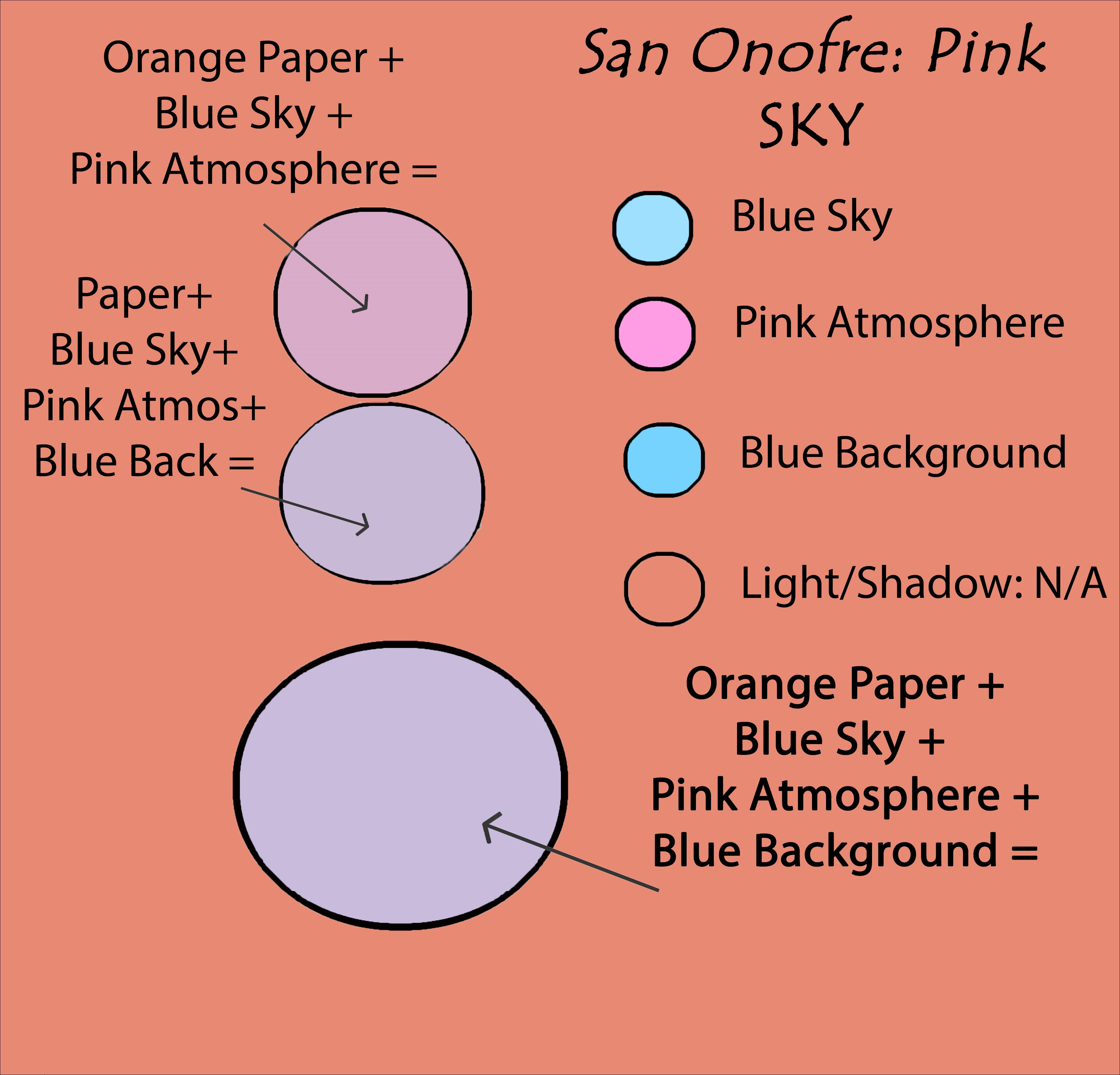
239 Color chart for the sky.
The clear sky is an exception to the four elements of the color theory because it doesn’t have 3d substance—it doesn’t react to light and shadow like a ball or a structure. So the sky in San Onofre: Pink is combination of its blueness, pink atmosphere, and blue spatial depth (background) creating a slightly purple color.
WATER
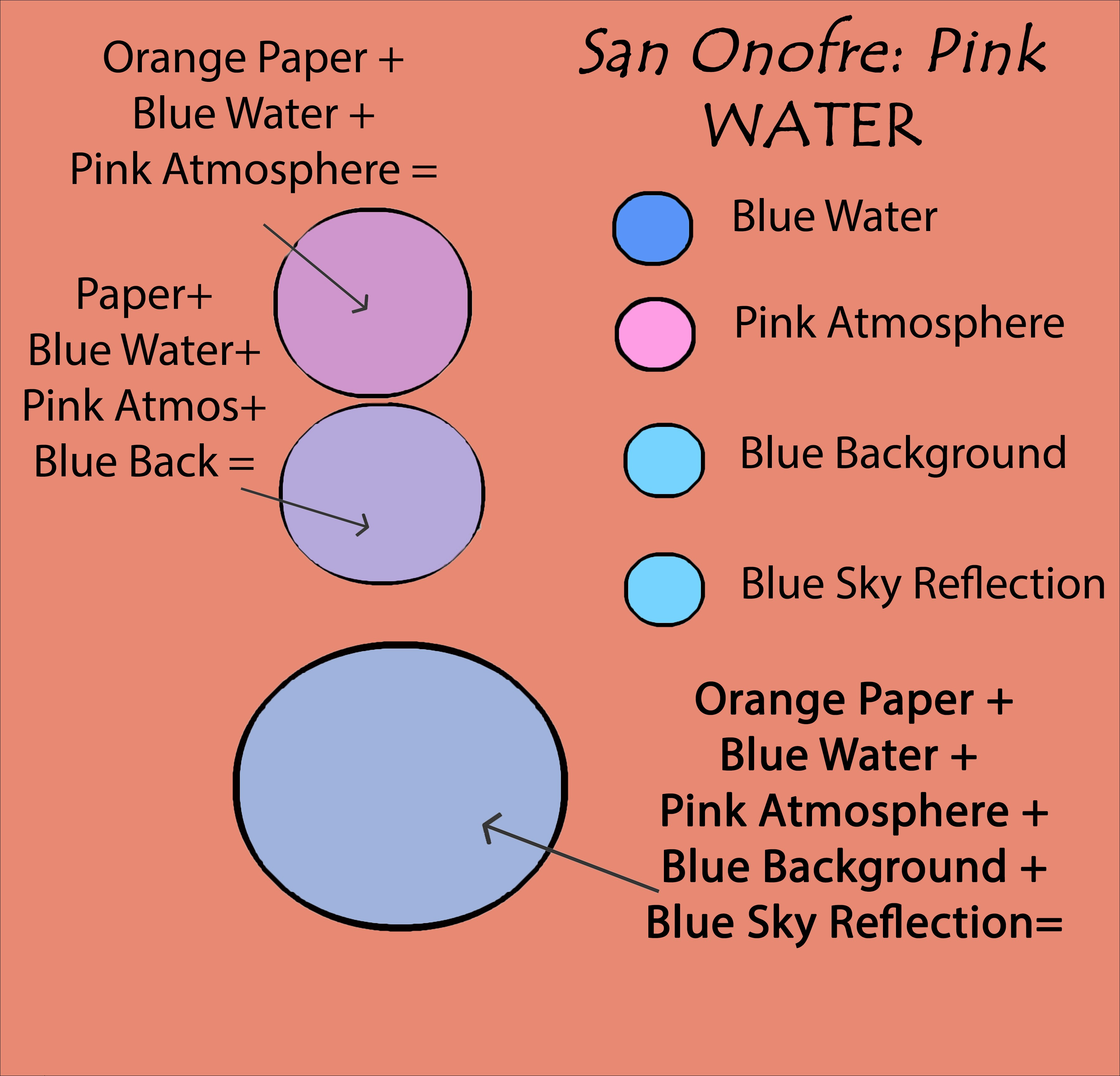
240 Color chart for the water.
The color of the water, like the sky, is slightly different than other objects as it is reflective. Consequently, in the color theory, instead of picking up yellowish light from the sun, it is mostly picking up and reflecting the blue sky.
WAVE SHADOW
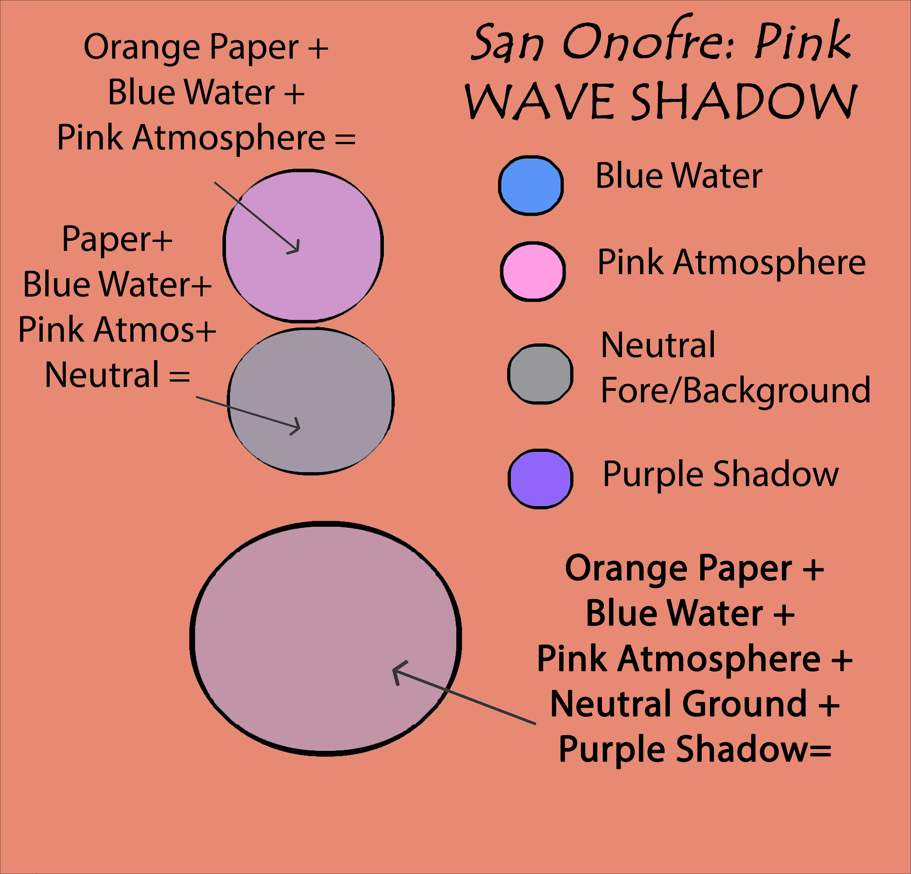
241 Color chart for the wave’s shadow.
The prominent shadow of one of the waves is about halfway between the foreground and background, hence it is neither affected by the blue distance nor the orange foreground; consequently, its spatial color tint is gray. Mixed with the other elements, it finishes on a reddish-brown note.
WATER FOAM
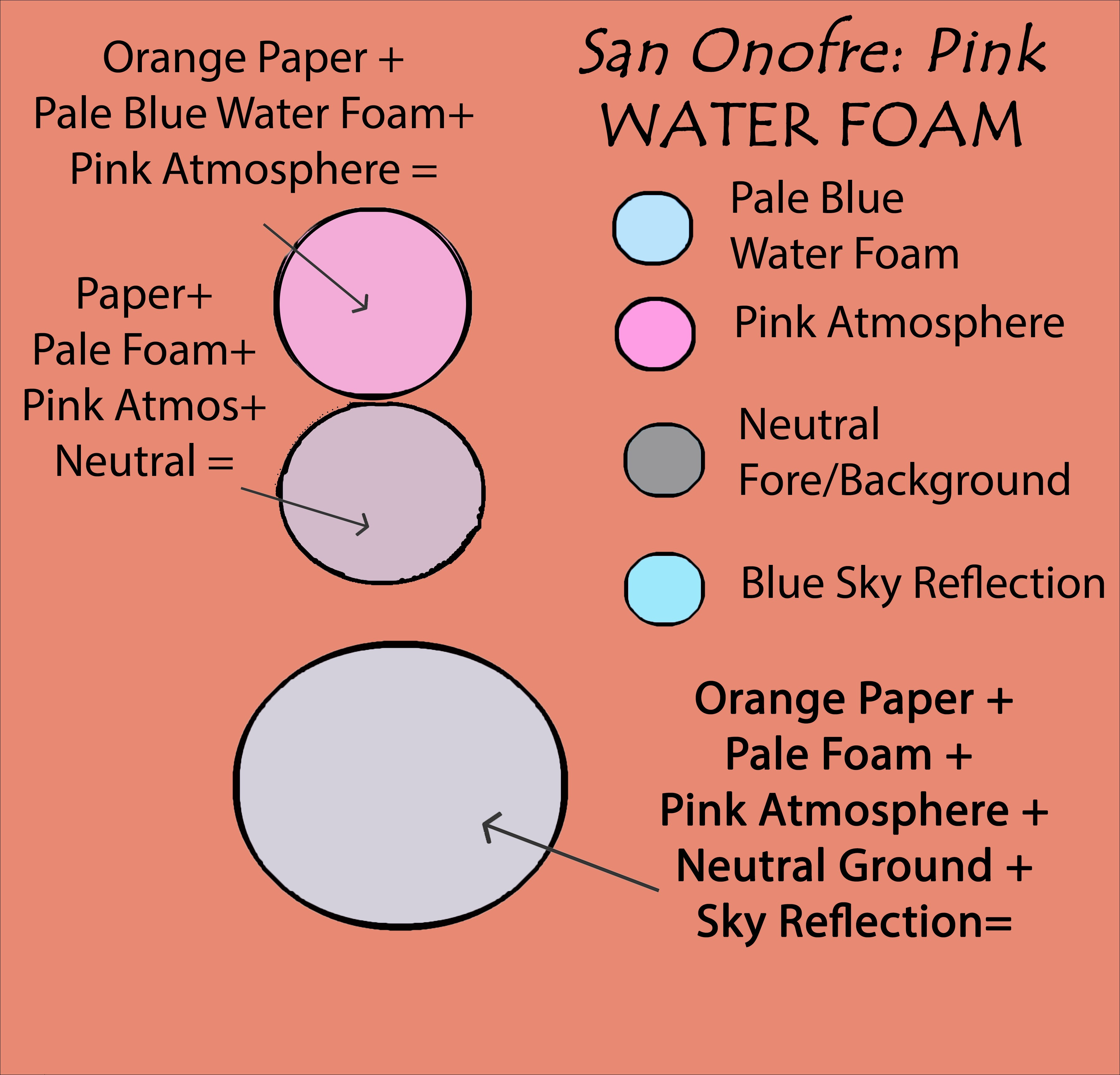
242 Color chart for the water’s foam.
The agitated water foam at the edge of the sand is a pale blue color and when we mix it with the other elements becomes a cool purple-gray.
Pro Tip: What I love about pastel drawings is that you can achieve gray from layers of shimmering complementary colors. Like this gray foam area shows the orange paper winking through the turquoise and pale blue pastel marks.
SAND
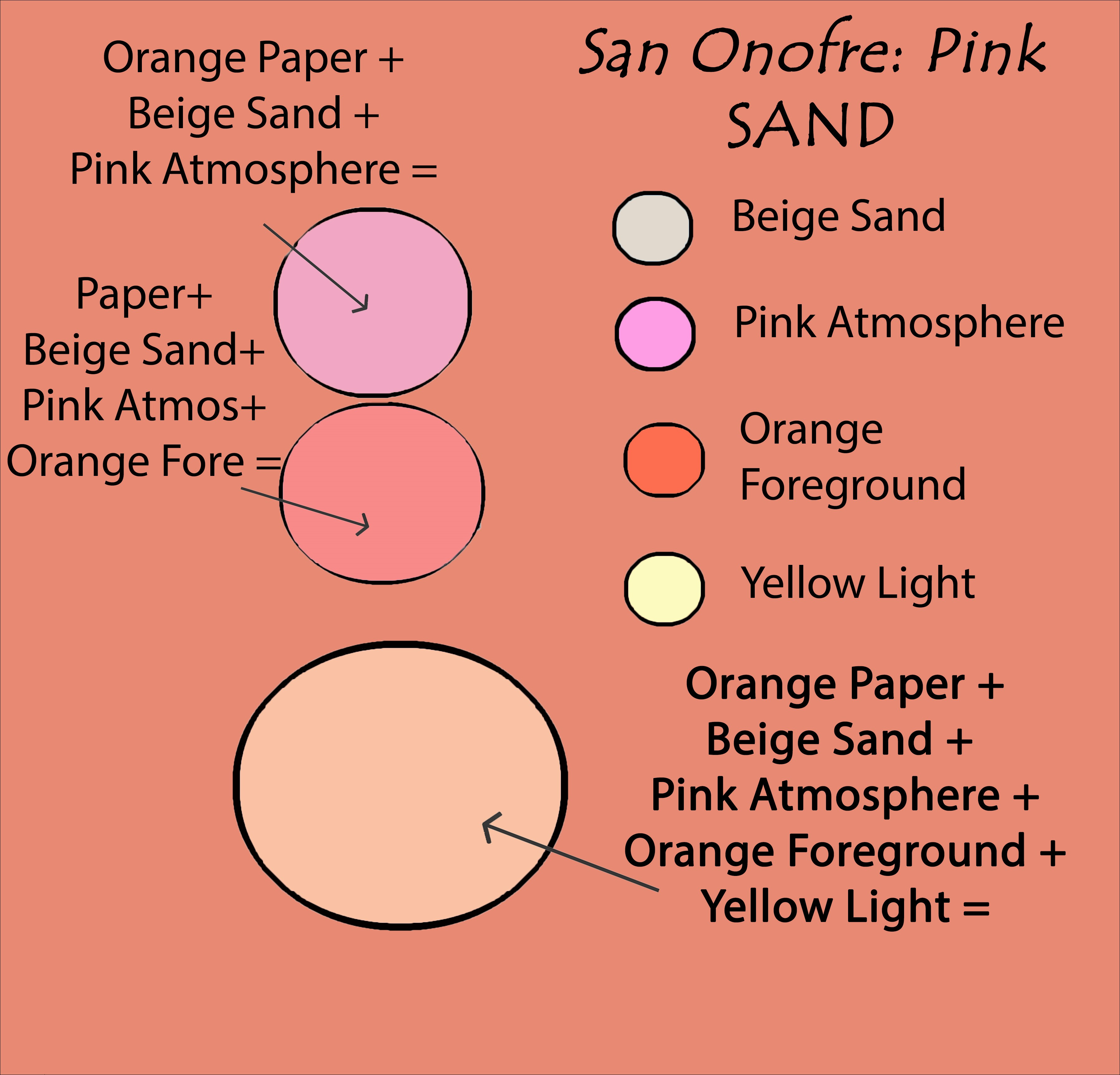
243 Color chart for the sand.
The color of the sand ultimately becomes a warm camel color. Normally, an artist would simply add light to the beige sand, giving it a cool look. But because of the blue distance, when warmth is added to the foreground, not only is the result pleasing, but it also increases the distance between the foreground and background, making the artwork more inviting.
CREST LIGHT AND SHADOW
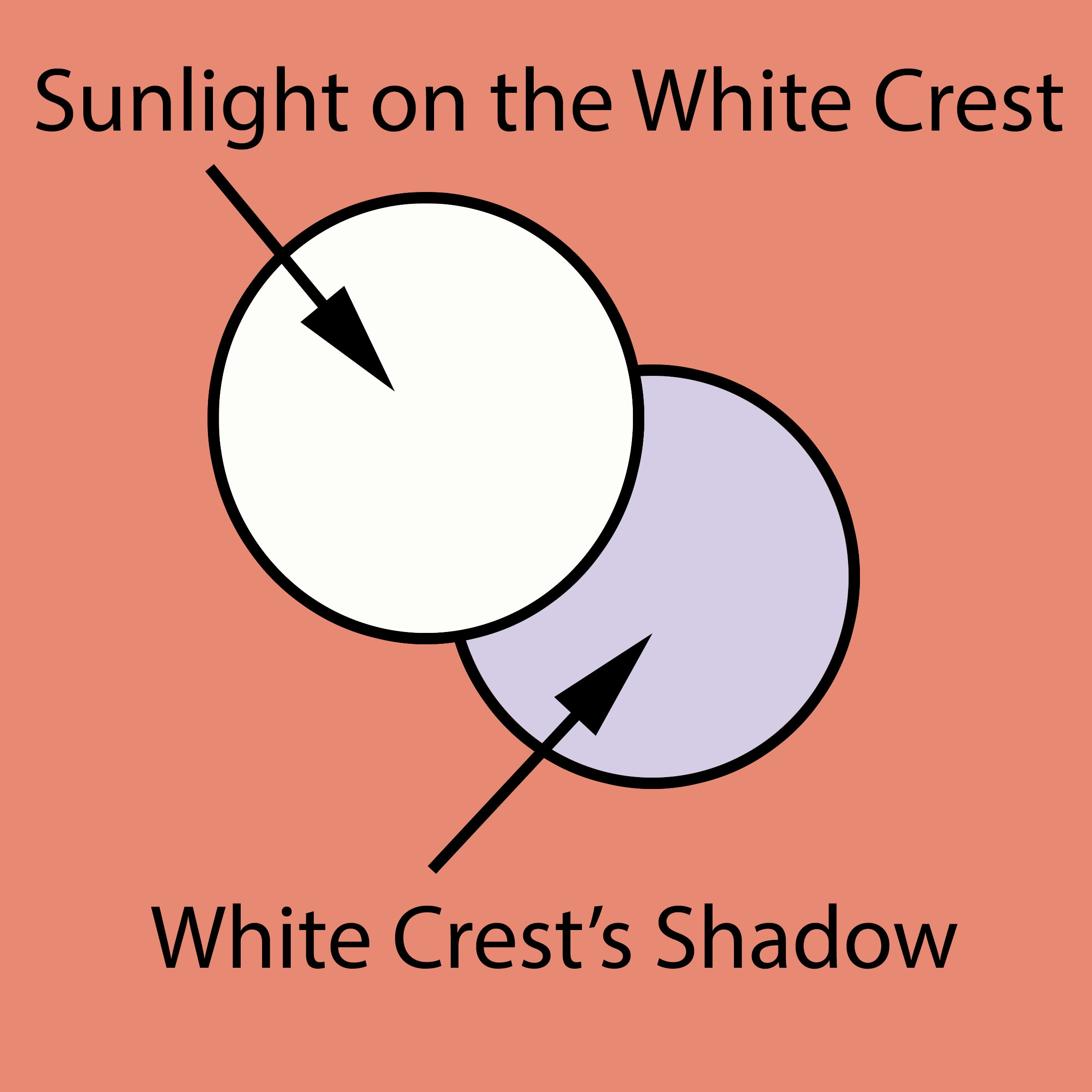
244 Color chart for highlight and shadow of the wave crest.
One significant exception I make for the color theory is the brightest light. By bypassing the tint of atmosphere and neutral gray distance, highlight pops off the paper. Bright highlights like a white glint on water, or the white highlight on a shinny forehead, are several degrees lighter than the next lightest areas. So while the rest of the drawing was bathed in atmospheric tints and depth, the lightest lights could stand out.
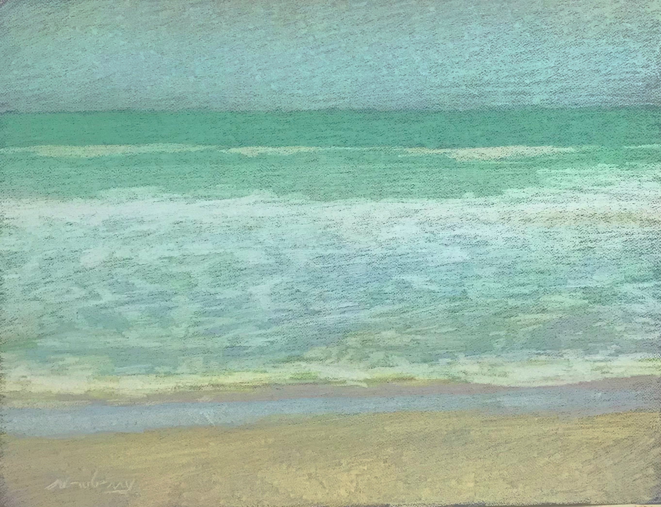
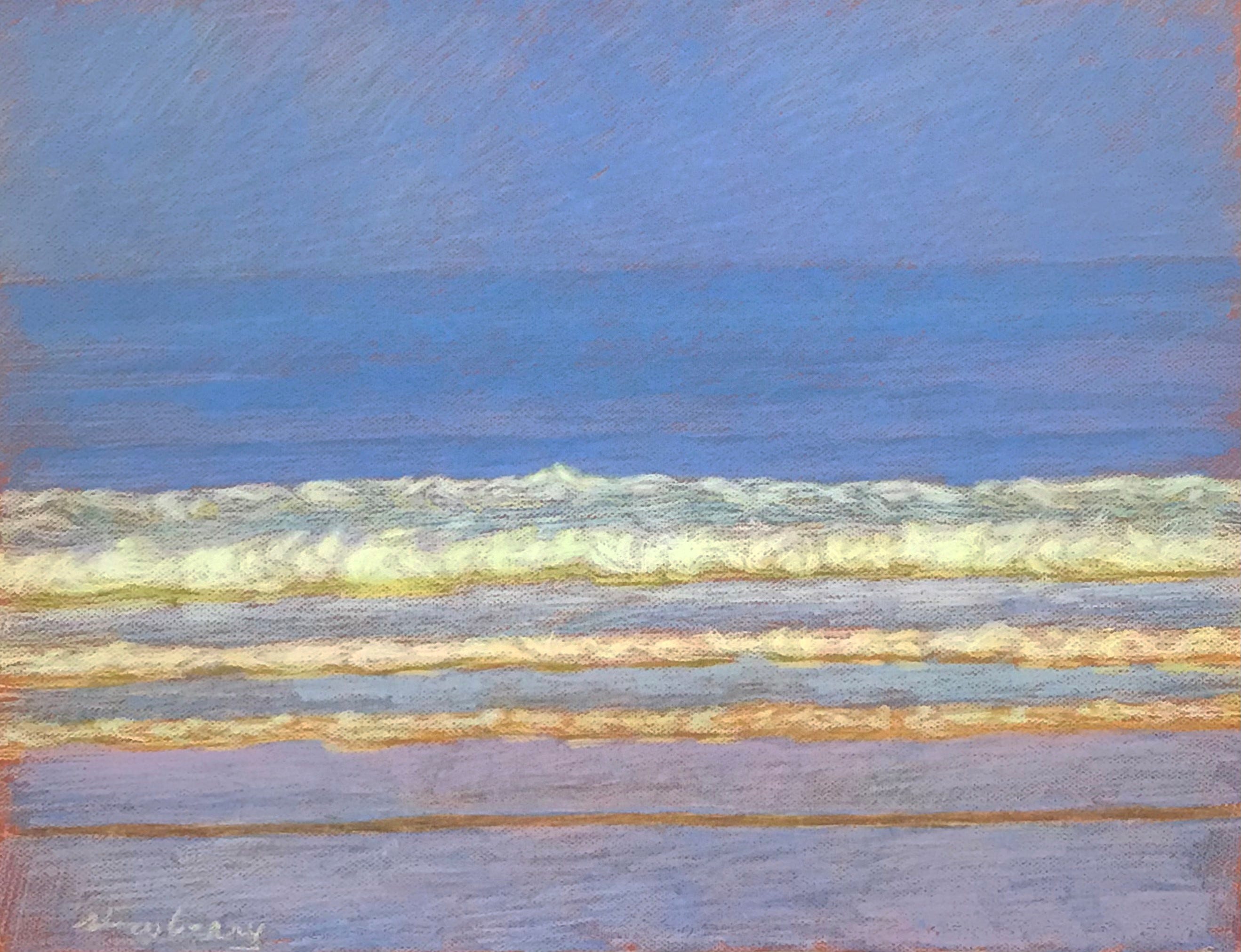
Three Pastels from the Wave Series
245 Newberry, San Onofre: Gold, 2020, pastel, 18x24”.
246 Newberry, Apollo Beach: Light Yellow, 2020, pastel, 18x24”.
247 Newberry, San Onofre: Blue-Violet, 2020, pastel, 18x24”.
I included three more pastels from the Wave Series and you can see they are totally different in color schemes yet have a similar style. What you are feeling is the commonality of the approach yet seeing their color flexibility.
An interesting aside is that even realism in art is not reality, it is still pigment on a 2d surface that simulates reality. The artist must find ways to transcribe reality to make you feel it. Often artists find one approach, like a classical way of painting, and rarely depart from the tried and true. I believe my color theory blows that out of the water offering tremendous freedom of color choices while also intensifying the realistic experience of light, depth, and color.
The Color Theory for a White Canvas
248 An example of a color scheme on a white canvas.
We worked earlier with mixing in the color of the paper, but now let's look at it with a white canvas base. Above is a color scheme example of a gold thing, like a grassy golden meadow in the distance. When its color is integrated with other factors, like I did above, it turns into a beige color.
Artist Melvin Toledo Tests It Out
The wonderful artist, Melvin Toledo, experimented with my color theory. Melvin Toledo was born in a small town in Northern Nicaragua. His interest in art began in high school while drawing characters from the popular manga series Dragon Ball Z. Encouraged by family members, he left his hometown in 2000 to attend the School of Fine Arts in Tegucigalpa, Honduras. The following year, he began working as a painter using a mixture of oil and lithographic ink for Decoraciones Hondureñas, a family business that sold his paintings across the country. In 2007, he moved to the United States where he started painting exclusively in oils. After two years in North Carolina, he relocated to Atlanta, Georgia, where he currently lives with his wife and children.
The results are a stunning blend of color and Melvin’s realistic style. He jotted down the color themes for each of his four paintings:
Green - Green atmosphere, yellow light and purple shadows.
Pink - Pink atmosphere, light green highlights, and rust shadows.
Turquoise - Pink lights, green shadows, and turquoise atmosphere.
Yellow - Yellow atmosphere, yellow highlights, and purple shadows.

249 Toledo, Green, 2022, oil on panel, 12x12". Permission from the artist.
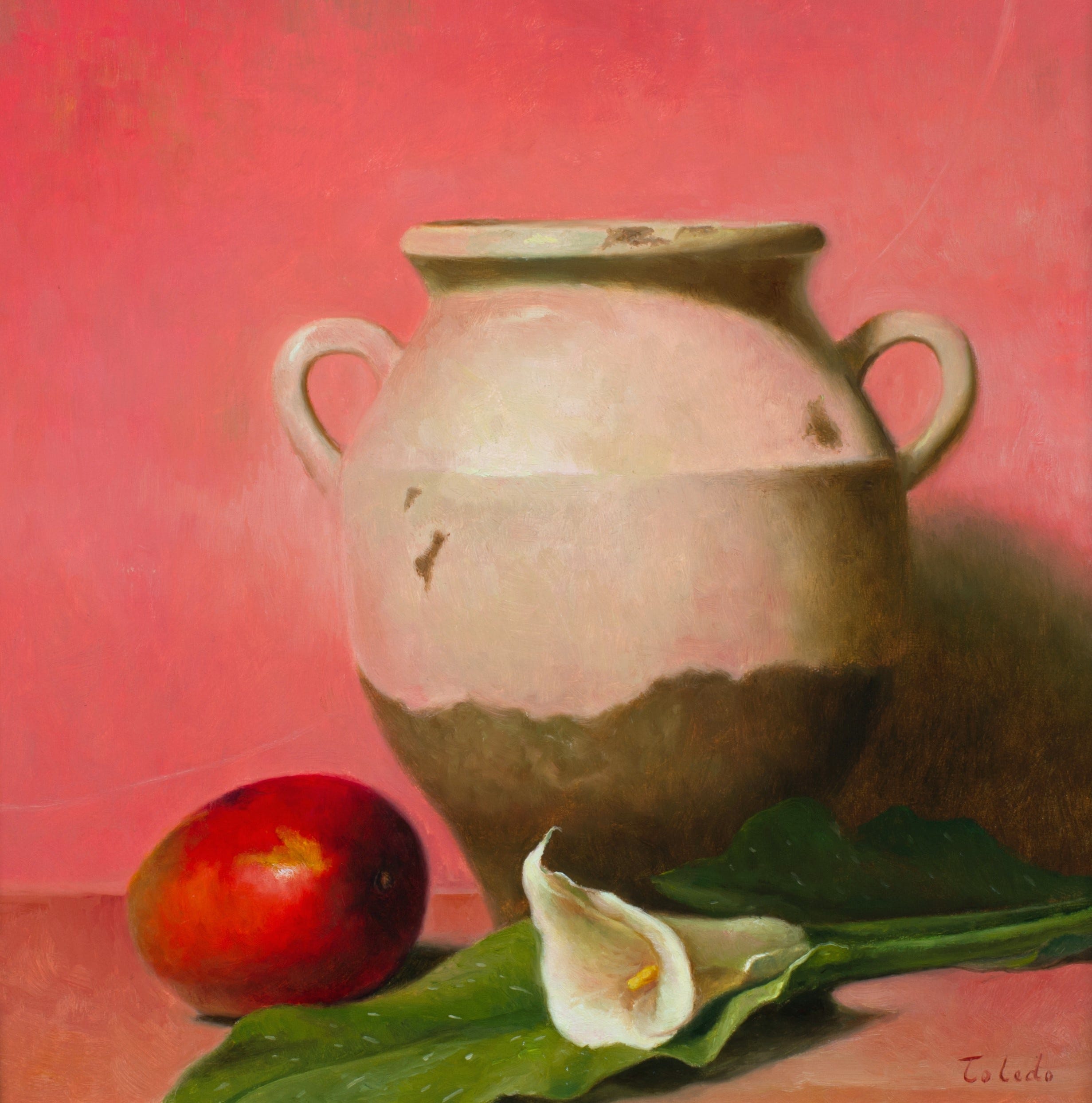
250 Toledo, Pink, 2022, oil on panel, 12x12". Permission from the artist.
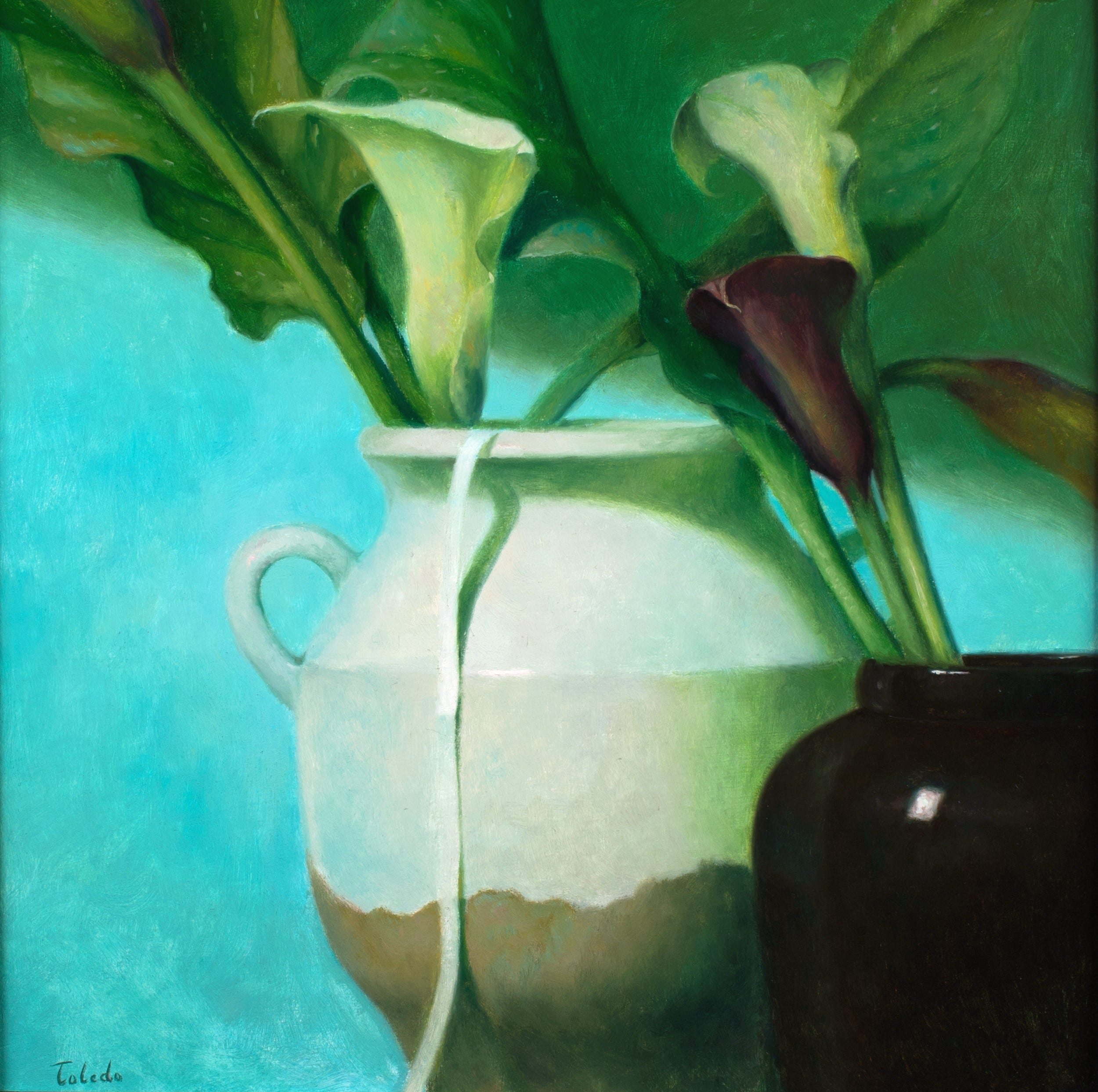
251 Toledo, Turquoise, 2022, oil on panel, 12x12". Permission from the artist.

252 Toledo, Yellow, 2022, oil on panel, 12x12". Permission from the artist.
Practice
As always, it is crucial to reinforce your understanding through practice. Let’s analyze the landscape reference photo and come up with a color theory plan.
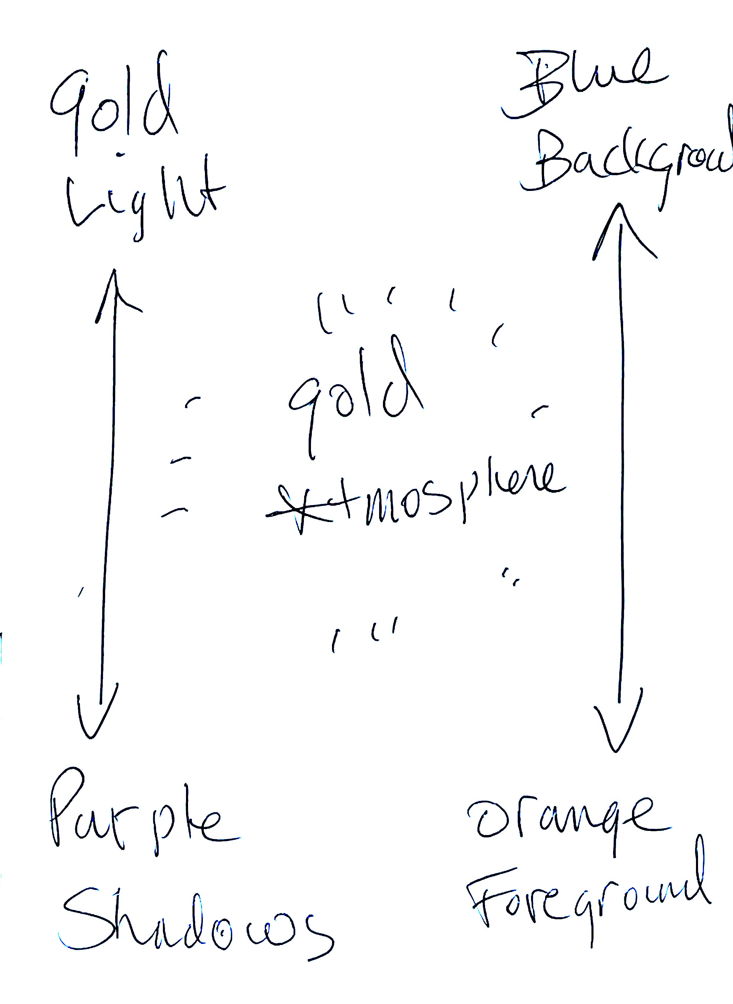
The golden horizontal field is the prominent color accent. To really make it hum, I would choose to have gold as the light tint. So, we would have a gold field with a golden light, what I call double gold.
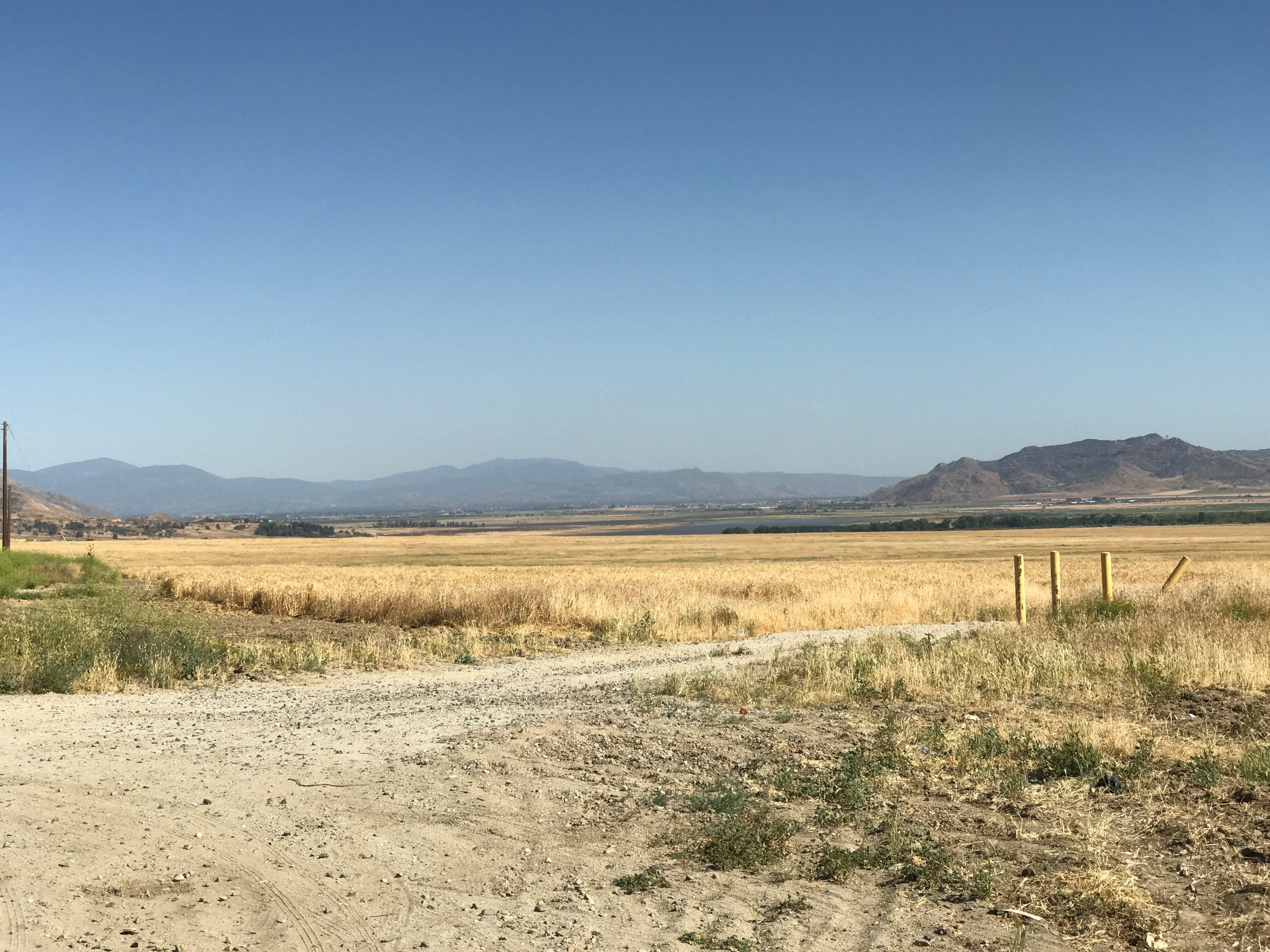
253 Newberry. A valley below Idyllwild, California.
There are not a lot of pronounced shadows—some cast shadows of the little plants, the shadows of posts, and some in the mountain. The opposite of gold is earthy purple. You won't be using much of that, but keep it in mind.
The furthest mountain range and sky are variations on pale blue and ultramarine. It seems logical to pick a blue tint for the distance. So that would make the mountain and the sky double blue—the color of the blue thing, and color the distance blue. The opposite of blue is warm orange, which would give the foreground dirt road and the front part of the golden fields orange tints.
254 A color chart notecard.
Next, and what I think is fun, and a lesson I learned from van Gogh, is picking the color of the atmosphere. I would pick gold for the atmosphere, as if the gold fields were sending up golden rays. That would make the field triple gold because of its color, the gold light, and gold atmosphere. Now for the exciting part: because the gold atmosphere is in front of the sky, we would mix gold with the double blues, giving the sky and background mountains a blue-greenish tint.
Pro Tip: When I mention double or triple a color, like gold, it involves layering gold on gold on gold in pastel drawing. In painting, it would involve progressively making the gold color more saturated.
The result is instead of copying the landscape literally as we see it in the photo, we are enhancing it by stretching the spatial depth, fortifying the light, and giving it a colored atmosphere. Below is my color chart notecard for how I would approach the color theory for this landscape. And I do make these for each artwork, it helps remind me at glance what the big picture is.
Try using this landscape photo reference in either painting or pastel. I suggest you first try out my suggested color scheme, then create a second artwork with your chosen color scheme. Keep in mind that when you create your own color chart, ensure that the color of the light and shadow must be complementary (opposites), as well as for the foreground and background.
Incorporating these color theory principles into your artwork will elevate its visual impact, allowing you to create with much greater color possibilities.
About the Author
Michael Newberry is a creative figurative artist who has exhibited in New York, Los Angeles, Seattle, Athens, and Rome. With a solo career spanning artistic, teaching, and art writing fields, he has garnered appreciation from artists and collectors, some as far away as Japan and Australia. His figures tell stories that resonate with those seeking a realm where thought, emotion, and senses intertwine. The journey through Newberry's art can be transformative. Of his growing collection of over 1,100 works, 800 have found loving homes.
Praise for the Author
Michael Newberry is a life-long artist, who has often advocated for the figurative arts through philosophical articles and reviews. He speaks plainly and from the heart but with a razor sharp knowledge of art history and theory. 'Evolution Through Art' is a clear-headed contemplation of art history and its relationship to our evolution and humanity. And it offers a moral platform for figurative artists to advocate for themselves while bringing beauty and humanity back into the arts.
- Brett Holverstott
Aside from the grasp, clarity and expertise in Michael's work, his ability to communicate with words, sets him apart. He is a natural teacher as well as an artist. This book, like all his others, is a gem.
- Martine Vaugel, Sculptor
The Art Studio Companion is brought to life on the strength of an inimitable human spirit that is an excellently-blended alloy of artistic creator, teacher, curator, critic, historian, and analyst... a timeless work of art, crafted to keep the truth and honesty of art alive.
- Abiodun Olaku, Artist
Get Notice of the Paperback and Kindle Releases
By Following me on my Amazon Author Page.
Oh, this is very cool; I want to try this. I The pastels are incredible, thank you so much for the tutorial!
I am buying the color theory book Michael, I will need to have it by my side to learn and practice. Plus I hear from the reviews that it’s full of your 16 beautiful pastels 🤗