
Art Companion: Chapter 30, Pastel Technique: Drive Towards the Light
Art Companion: Chapter 30, Pastel Technique: Drive Towards the Light
The Art Studio Companion: A Master Class for Artists

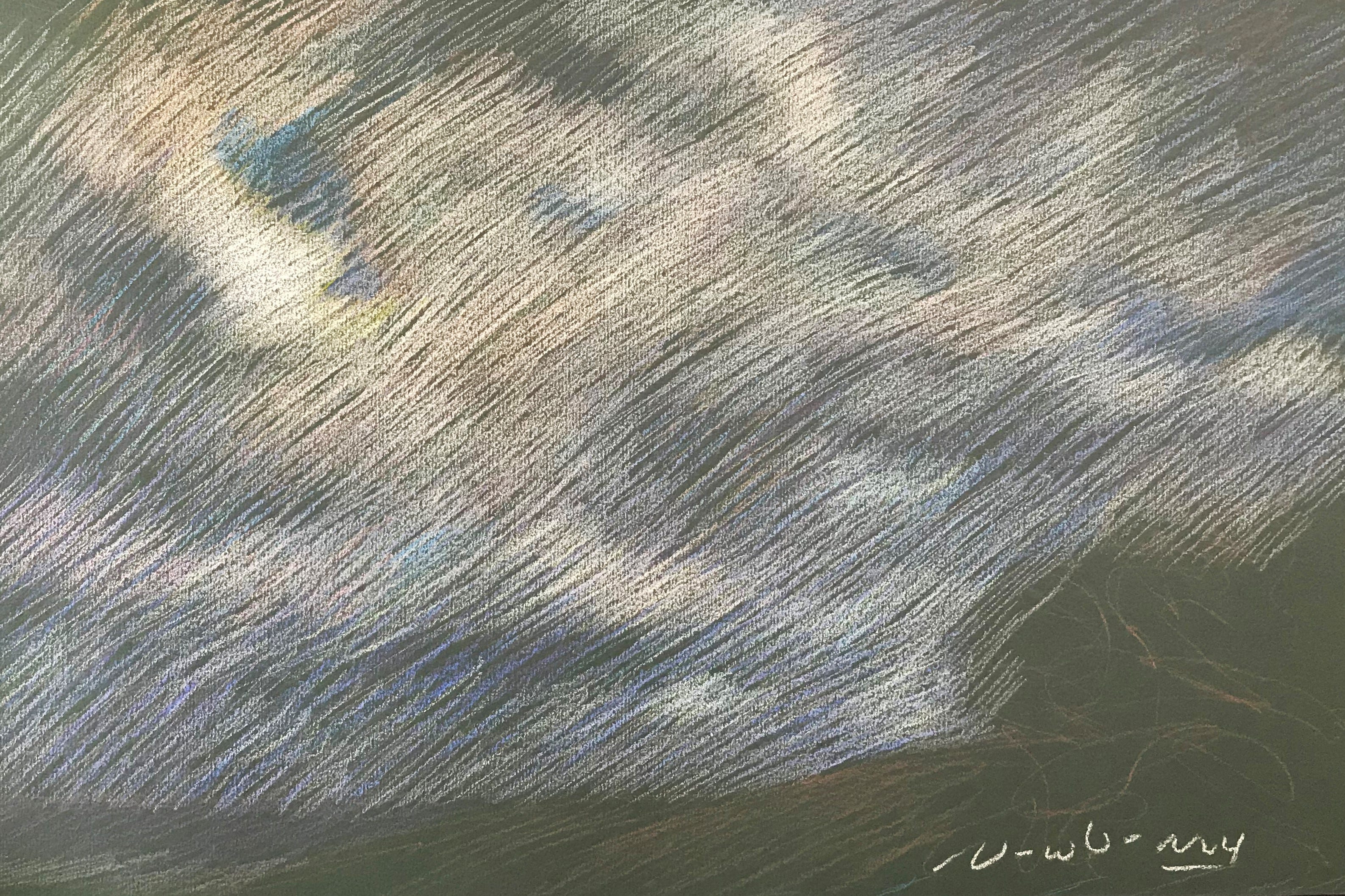
219 Newberry, Sunrise Highway Near Borrego Spring, 2018, pastel.
In this study, we examine my pastel technique that drives towards the light.
I have a few golden rules for pastel landscapes:
1. Dark Paper: For soft pastels (the chalk kind), use dark-colored paper. Black paper, for instance, enables every pastel but black in your set to have lighter vibrancy than the paper. The concept is to layer one tone at a time until you reach your brightest lights. The lighter the paper, the less light range you have to work with. You don't want to start with creamy beige paper and find that you only have white, light yellow, and a few other of the lightest hues of pastel to work with.
2. Drive Towards the Light: The lightest part of the scene and your drawing is your final destination; therefore, save your light pastels for last. It is a one-way trip from dark towards the light. The idea is to build consecutive layers of tones, from mid-darks to mid-tones, to mid-lights, and then finally to your brightest lights. There is no going back to darken things. Regarding color choices, decide whether the next layer of an area should be warmer or cooler. Some areas will undoubtedly have many layers of alternating warm and cool colors, creating a wonderful energy of shimmering colors.
3. Squint Like Hell!: Squinting is the greatest tool to convey light in painting, bar none. Squinting is a paradox; it dims your vision, yet it is the most natural technical tool to convey and see light. You don't need a class, tutorial, or a teacher ... Squinting will guide you better than any resource for developing light in art. Squint while looking at both the scene and your artwork. Squinting will not only tell you which areas to lighten, but it will also tell you whether the area is a warmer or cooler color. The aim is to match your artwork's light and color vibrations to the scene's vibrations.
4. Use a Timer: Give yourself about 10 minutes to compose the main features. Then take a deep breath and draw/paint as fast as you can, putting yourself literally on a timer. Set it for 35 minutes. There is no time to think, worry, talk, or contemplate. Just squint and layer tone upon tone, from dark towards light, by small degrees.
Pro Tip 1: When it comes to plein air landscape painting, let the light be your most important consideration in picking a view to paint. A landscape, no matter how beautiful, will be dull if there is no light.
Pro Tip 2: Keep your expectations modest; think of producing one excellent work out of every ten attempts.
Study the following images documenting my process from start to finish. Afterwards, I will discuss the process in detail.
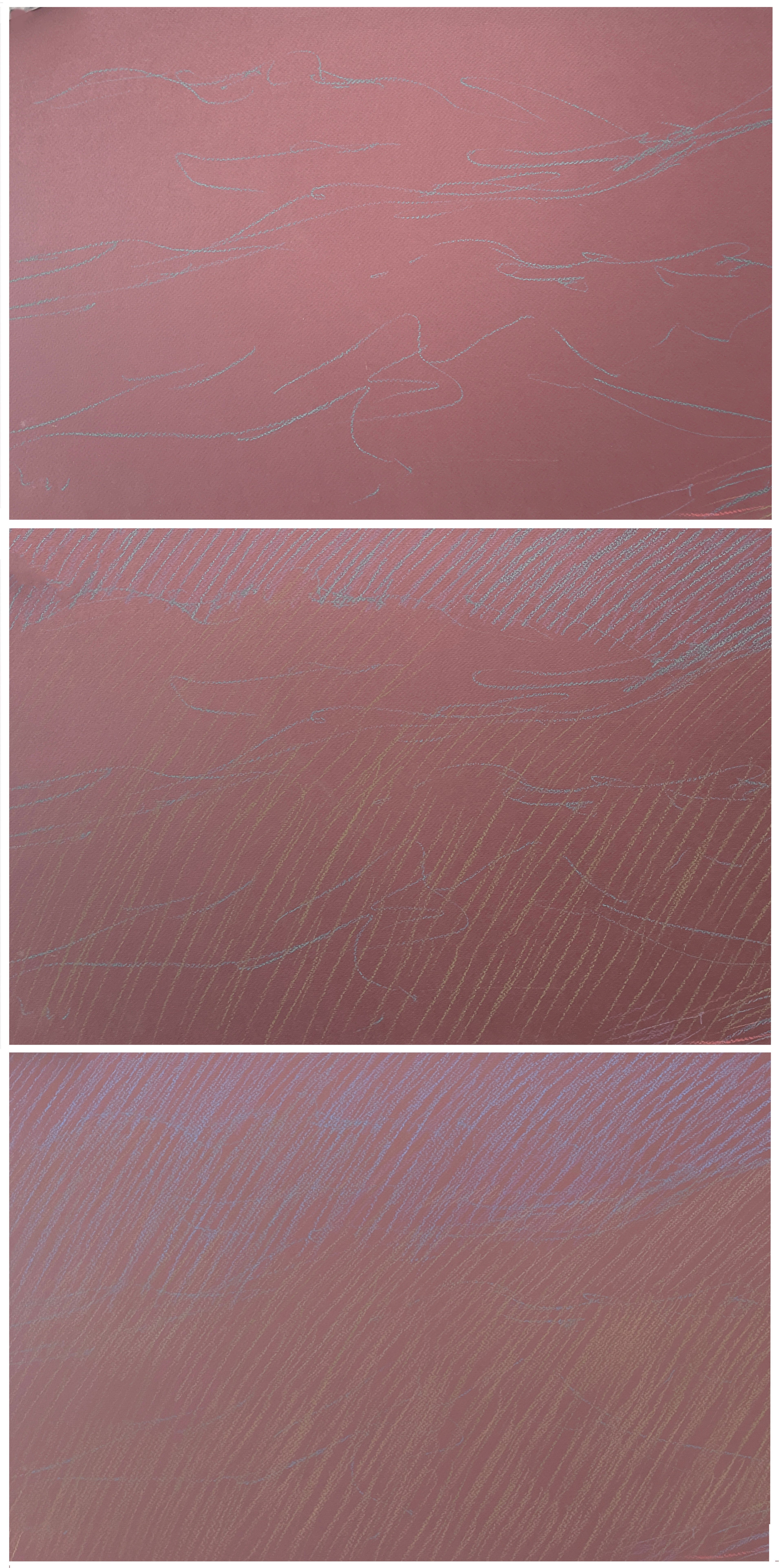
220 Demo of starting a pastel landscape.
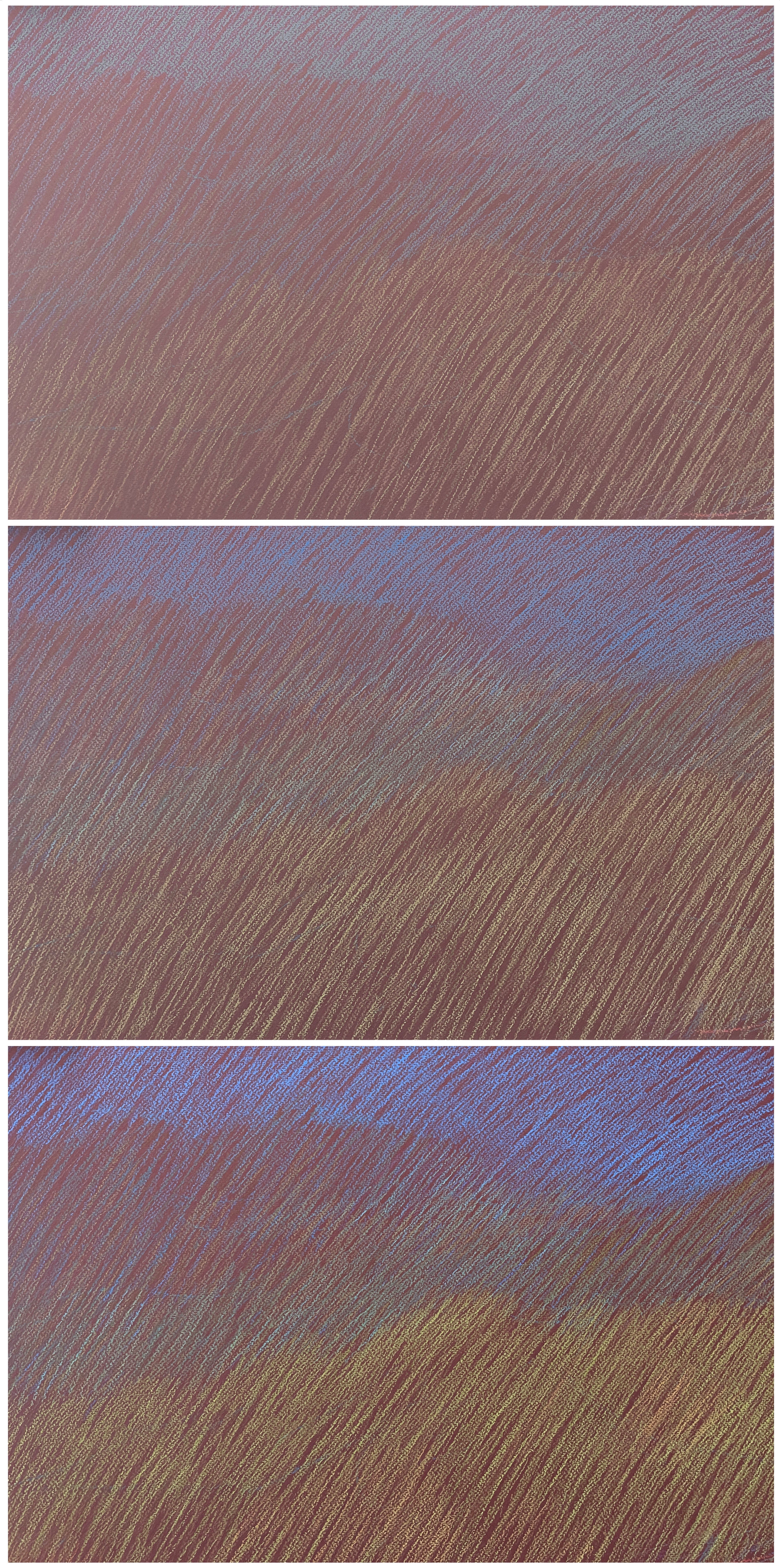
221 Demo of adding midtones and color continuing with parallel lines.
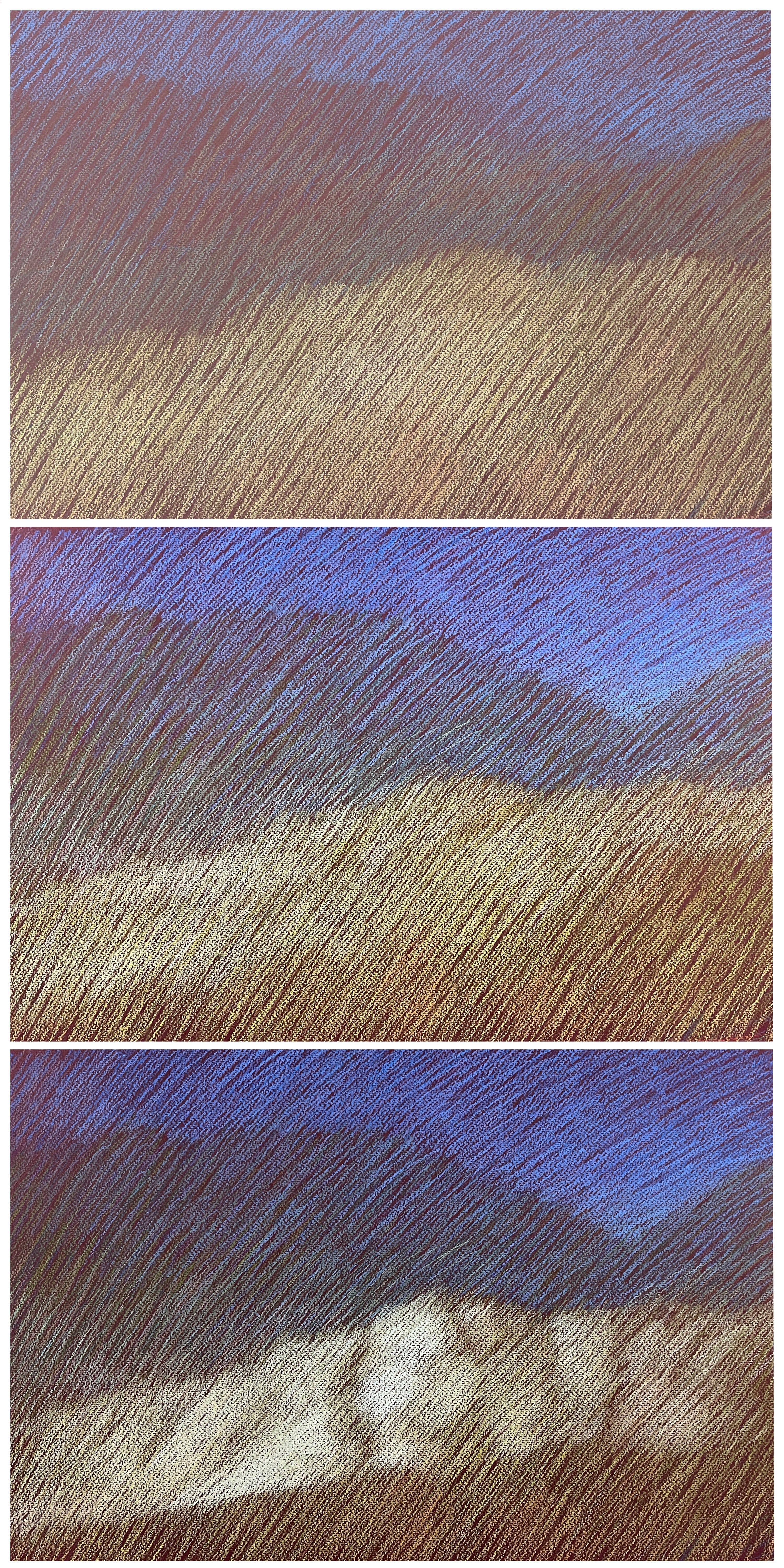
222 Demo of final stages of driving towards the light.
For this pastel, demo 220, I used dark sienna-colored paper. I took a few minutes to sketch in the general composition with complementary dark blue pastel, but one tone lighter than the paper. That is the whole secret to this technique: each new color should only be one tone lighter than the previous. It builds your drawing like waves of subtle energy.
My first layer marks represent the colors of things as they are. For instance, a layer of blue for the sky, brown for gold sandstone, and gray for the mountains.
Pro Tip 3: Layer with parallel lines (like da Vinci!) about ¼” apart. I am right-handed, and the natural flow of drawing parallel lines is the diagonally for me. So find your most natural way of sketching parallel lines. The parallel lines are a way of applying tones, it is like painting washes. It works great for pastel and ink drawings. The parallel lines also allow your original composition sketch to be read while you apply layers over it.
After the drawing has been blocked in with one layer of respective colors, then I start the second layer estimating whether it should be a warmer or cooler layer. At this stage, I might leave very dark areas alone and not touch them with more layers. We are driving from dark to light, and along the way we leave behind the darks and midtones.
Next is to build layer upon layer, warm or cooler. In demo 221, you can see the landscape slowly emerging from this process.
I then begin to nudge towards the light, as seen in demo 222. You will find that the lighter the area, let's say 15 layers of tones, you will need a light enough pastel to easily be one tone lighter.
Pro Tip 4: Every time you make a mark it should easily feel like one step lighter.
Lastly, accent the absolutely lightest area, and call it a day! Congratulations you are done!
Before putting away your drawing, set the drawing, still clipped to the portfolio drawing board, upright against something. Then, spray it with the best pastel fixative, Sennilier, from an 18” distance in equal side-to-side motions. Cover it with a sheet of glassine and tuck it away in your handy portfolio. Then, you're ready for the next pastel.
Here are some of my pastel drawings. As I mentioned earlier, the final touches consist of the lightest and brightest areas. These areas were created by building up many layers of consecutive tones, rather than directly drawing the light. I used the same process for the different colored papers, and it is fascinating to see the different kinds of moods and energies the colored paper sets in motion: from moody grays to sizzling hots!
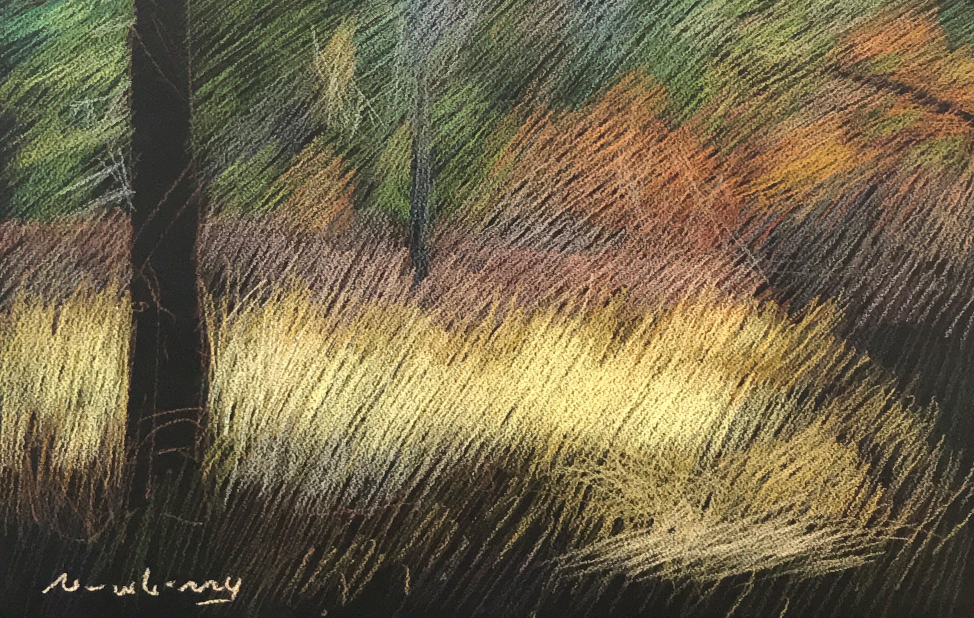
223 Newberry, Idyllwild Meadow, 2017, pastel.
224 Newberry, Texas Clouds, 2017, pastel

225 Newberry, Idyllwild Red, 2020, pastel.
Practice #1
As always, it is crucial to reinforce your understanding through practice. Familiarize yourself with the technique by simply practicing the parallel line technique on dark paper—I like Canson or Strathmore dark papers with a little tooth. Starting dark, but one tone lighter than the paper, play with layering alternating warm and cool colors. It will be abstract. Leave some darks alone after one or two layers, and proceed to your lightest areas while leaving some of the middle-toned areas alone. The technique works easily with very pleasing results. The technique will serve you very well.
Practice #2
As always, it is crucial to reinforce your understanding through practice. Try some sunlit landscape, like your backyard. No more than 45 minutes drawing! You will have to work fast, no time to contemplate. Just squint a lot and move from dark gradually towards the light. Don’t edit. Later contemplate the piece especially noting the raw energy of the drawing. The goal is only to capture the feeling of the moment and something of the color.
Coming soon!
Sipping a second cup of coffee while seated beneath one of your wave series pastels. Ahhhh.
Can’t wait to try this!