

Memoir: Chapter 12, Coffee Pot Bayou and The Pink House
Memoir: Chapter 12, Coffee Pot Bayou and The Pink House
(Written Today) An Art Memoir: Depth, Light, and Love

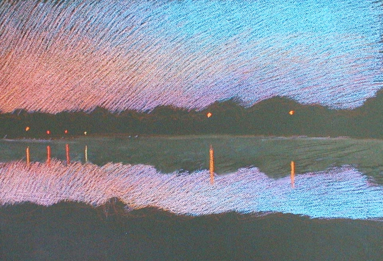
155 Coffee Pot Bayou Sunset, 2003, pastel. View from my studio.
In 2003, my sister Janet (Janny), the tennis player, lived in Saint Petersburg, FL, with her husband, Ralph. Across the street was a small pink house on Coffee Pot Bayou. The owner had recently died at 103. My sister had bought it, and it was sitting empty. If I could rent it, that would be an inspired move from my wonderful Turkish house in Greece.
So, we agreed, and I was to start the new year in St. Pete. The little house had wonderful karma. It was so peaceful and felt like part of the view, so open. Neighbors were far enough away that I could play music at optimum levels. My mom lived in St. Petersburg, and I had lived there once when I was sixteen years old. I had tennis player friends from then who were still around, so in a way, it was like coming home to friends, family, and something familiar.
I've been doing so many traveling shows. It was pretty easy for me to pack up all my art and take it with me on the flight to Florida from Greece.
While painting in Florida, I continued to work on my two major paintings, Venus and Artemis, although the energy of Florida brought a different focus—an intense study of light phenomena. I delved deeply into exploring the optics of glass, water reflections, and refractions. Alongside this, I explored visual concept play, abstract realism, and how the introduction of an animal element can profoundly alter the dynamic of a landscape.
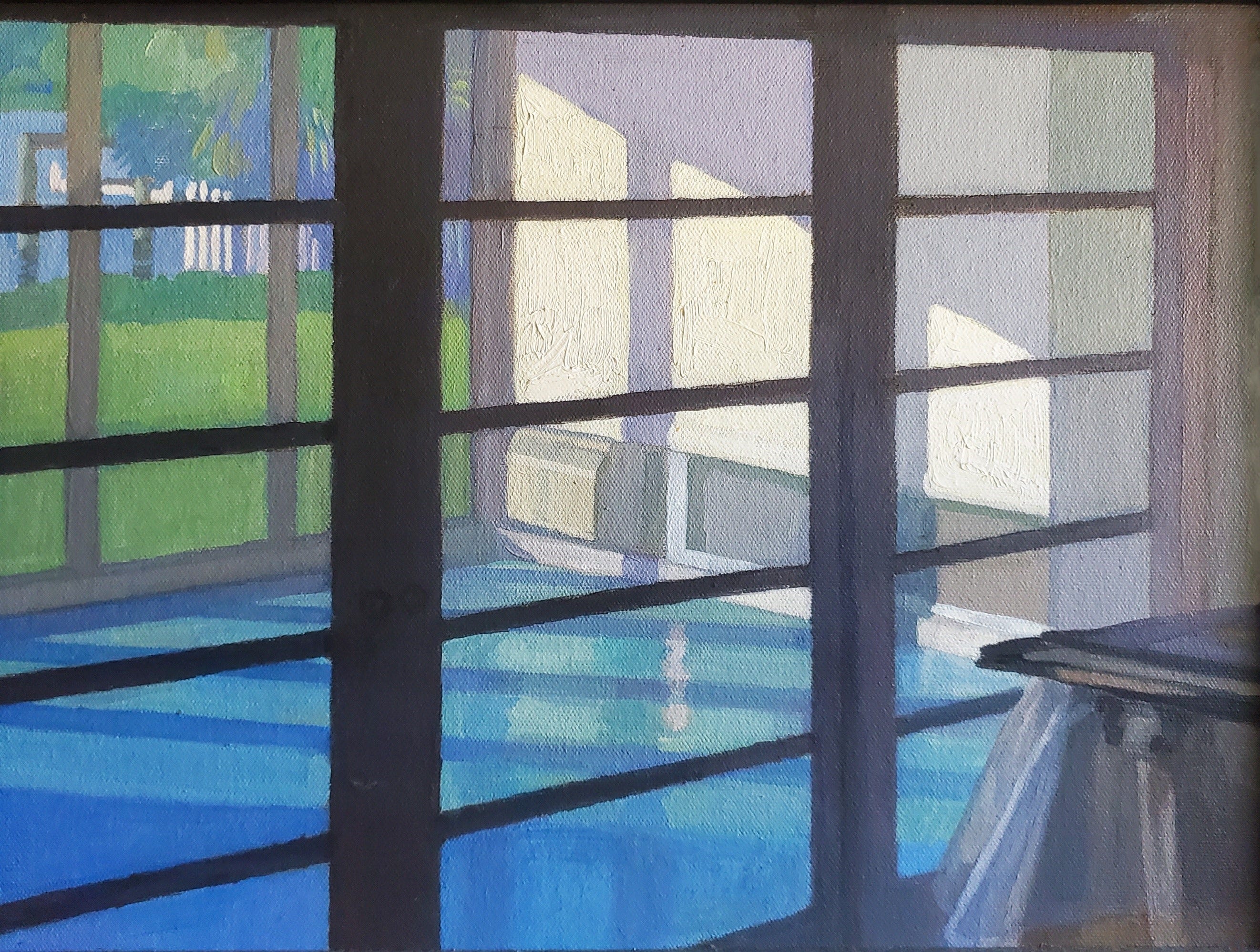
156 Blinds, 2005, oil on canvas panel, 9x12”.
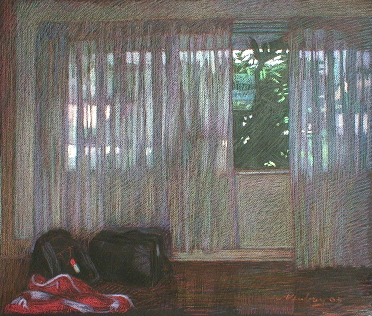
Blinds, The Sunroom
The only place that got direct sunlight was the sunroom. Around 11:00 o'clock, it got wonderful cast shadows, and combined with the design of the large sliding doors, created beautiful geometric patterns of light and shadow. Normally, when painting by natural light outdoors, I would give myself an hour. But in painting this interior, if I used the hour, the light and shadows would be in completely different places than at the start. For two or three weeks, beginning at 11:00 AM, I would paint for no more than 15 minutes. It was refreshing to see everything as I had remembered it at precising at 11.
This small window of time, capturing the light as I really saw it, made for a very naturally brilliant painting that was also extraordinarily complex.
Views, Interiors, and Other Sketches
I painted and drew several interiors and views looking out from my house. Some of my perspectives were extraordinarily complex, usually featuring some light or beautifully colored accent that fascinated my eye. I enjoyed the challenge of seeing if I could paint these complicated visual optics.
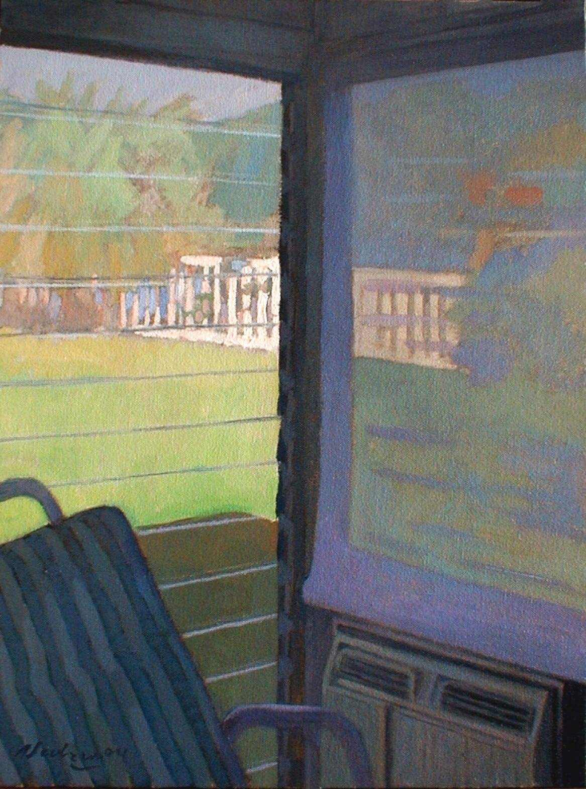
157 Sunroom Corner, 2004, oil on canvas, 18x12”.
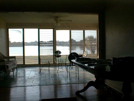
158 View from my St. Petersburg studio, the Pink House.
159 Sunroom Corner, 2003, pastel.
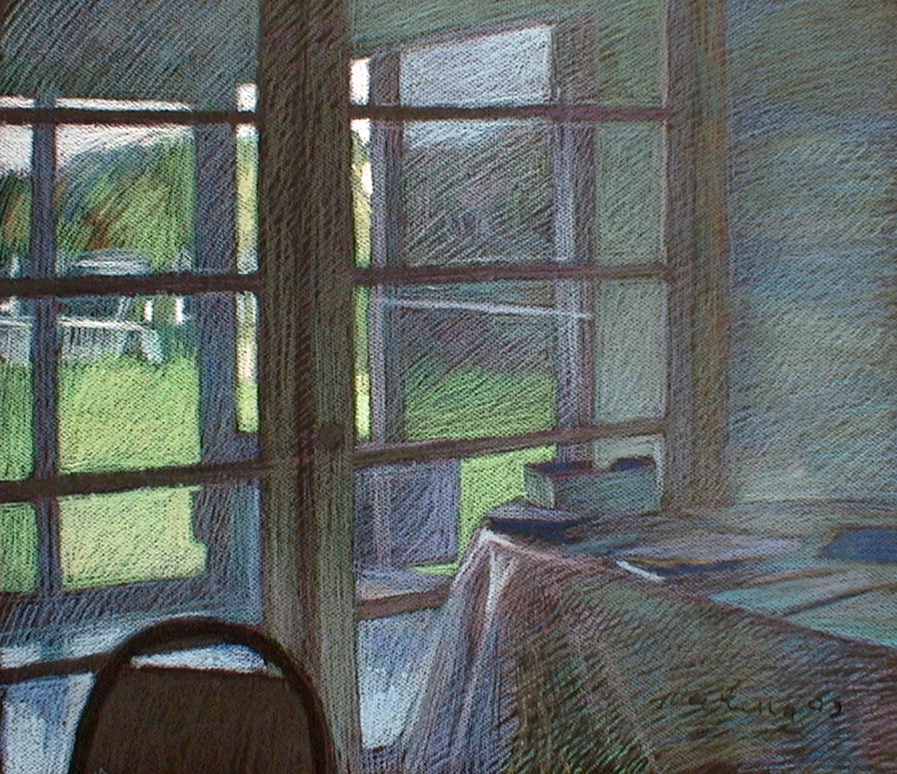
160 Front Windows, 2004, pastel.
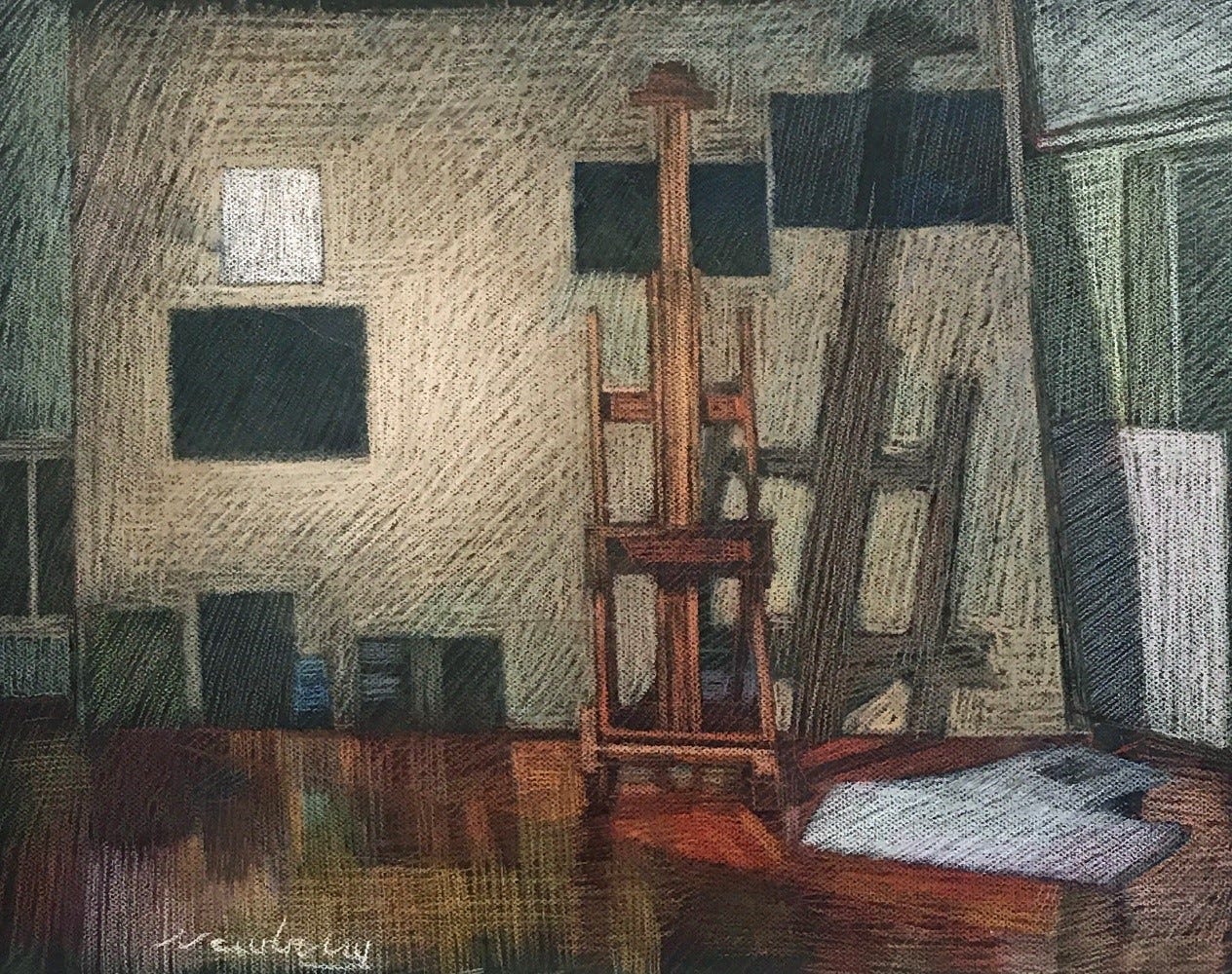
162 Studio Painting Wall and Easel, 2004, pastel.
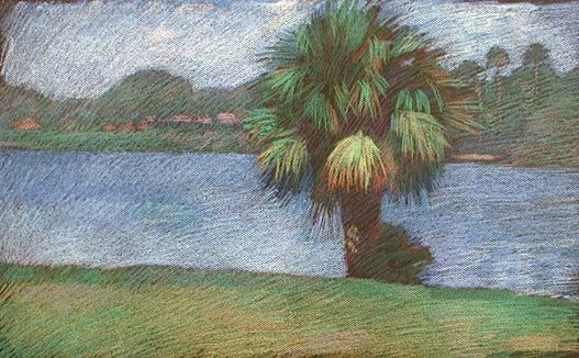
163 Palm in My Backyard, 2003, pastel.
164 Darron Posing, 2003, pastel.
165 Self-Portrait with Venus, 2004, pastel
166 Kim, 2004, pastel.
Study for Venus
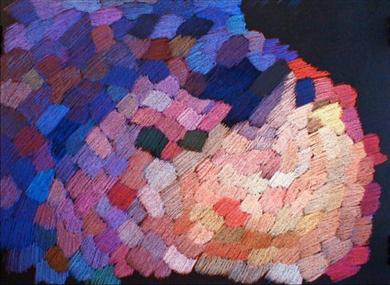
167 Color Study for Venus, 2004, pastel.
While painting Venus, I had some trouble with the colors and their interactions. I knew that she was lit with the warm glow of magic hour, so that's the feeling I wanted, but my instinct for it didn't lead in the right direction. I turned to pastels to play with the colors that I had in my mind's eye for Venus. I didn't want to get involved with the realism of her figure, the water, the mountains, and the sky behind her—I just wanted to explore a range of color harmonies I could use. The result was this pastel study, which actually resembles a tapestry of wool thread. It's amusing that it is essentially an abstract work, but, for me, it is a study of color swatches.
Iraqi War
The Iraq War was going on and it was in the news 24/7, with weapons of mass destruction cited as the motive for engaging in the war. My response to it was to read the full set of "1001 Nights." I wanted to get a sense of Near Eastern culture, and the best way to do that, at least for me as an artist, was to read their mythologies. One of the things that most struck me in Shahrazad's stories was that often the liar, the cheat, and the murderer would be successful at the end of a particular story, with the moral that good or bad doesn't matter, but cleverness does. Conversely, if someone wasn't clever, it didn't matter if they were good or bad; they would still suffer.
The interesting thing about being an artist is that speculations, hunches, feelings, premonitions, and instincts about whether something is good or bad are part of the tools of artistic creation. And I say part because there's also all the technical stuff like mathematics and visual perception. So, there are a lot of tools that one works with. There was something that seemed so wrong with the Iraq War, and all the propaganda around it just didn't feel right. One day, I was in the supermarket, and one of the displays had stuff for kids. In one transparent package was a collection of about 20 plastic, multicolored cowboys and Indians. I thought there might be something there I could use.
One little painting project I did involved placing the cowboys and Indians in a semi-transparent gift bag, with the visual wordplay of "bagging them." The message conveyed was that the corpses from both sides of the war are bagged.
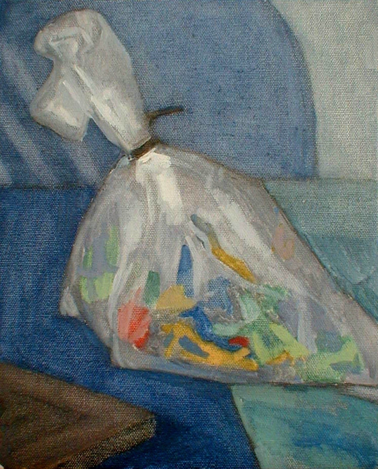
168 Bagged Soldiers, 2004, oil on panel, 12x9”.
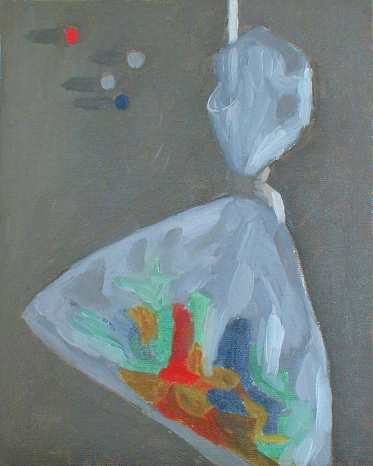
169 Bagged Soldiers 2, 2004, oil on panel, 12x9”.

170 Cowboys and Indians, 2004, graphite.
The Cowboys and Indians also appeared in a still life line drawing I did. They were arranged on a glass table, and instead of fighting against each other, they all faced in the same direction except for one cowboy at the top of the composition, symbolizing he was the leader. He had guns in both hands. poised to fire on friend or foe alike unless they united in battle. Due to perspective, he is the furthest back, he is literally and symbolically the smallest among them. The drawing has an interesting quality because it appears abstracted, yet it was simply a line drawing of exactly what I saw on the glass tabletop.
One might conclude from the drawing that George Bush, as the leader of free world, was conducting friends and foes alike, in a small-minded way, to constantly engage in an endless war, with no real enemy, and the real agenda hidden from view.
Lightbox
In a strangely similar vein to the abstract realism of Cowboys and Indians was my shadowed self-portrait. It's similar in that it's abstract in a modern way, yet I was painting exactly what I was seeing in reality. I painted it in the sunroom, capturing my shadowed reflection in the large sliding wood-framed glass doors. Notably, there was a window of light inside my head—a rectangular cube of light that mirrored my front door's communication window on the other side of the living room.
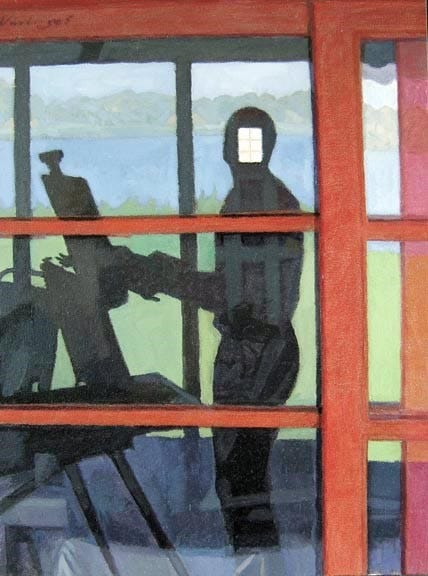
171 Lightbox, 2005, oil on panel, 12x9”.
A fascinating optical effect occurs with the shadow cast on the glass windows, allowing us to see through the glass. For instance, at the bottom of the painting, you can see the curve of the cloth-covered table on the other side of the windows. Conversely, the reflections of the lit bayou don't have transparency. Within my shadowed, transparent body, you can see a few horizontal and vertical strips—these are the paneling of the front door at the far end of the house. I love the symbolism—that as the artist, I'm inconspicuous in shadow, looking at the light around me. But the brightest light of all is in the content of my consciousness.
Anna Moody Calls, Thodoris is Dead
Anna, my friend and model for Venus, called me from Greece to inform me that Thodoris Archontopoulos had died. It wasn't unexpected. He had a very rare case of leukemia. Growing up in smoggy Athens and smoking would have been contributing factors. He was in his 40s, and his career as an archaeologist and art historian was picking up momentum. He was on a trajectory to be a lead archaeological museum curator or director. I remember one exhibition he curated of ancient amphora pottery. He had arranged them in a profoundly modern way, creating patterns and rhythms, like a school of fish. It resulted in a magnificent visual display.
Though I had been working religiously on Venus and Artemis I wasn’t doing much other figurative work, but I wanted to mourn the loss of Thodoris through art. With a model posing about 9 hours total, I did this charcoal mourning piece. It resulted in how the loss felt to me.
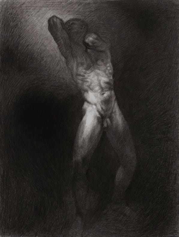
172 Loss, 2004, charcoal.
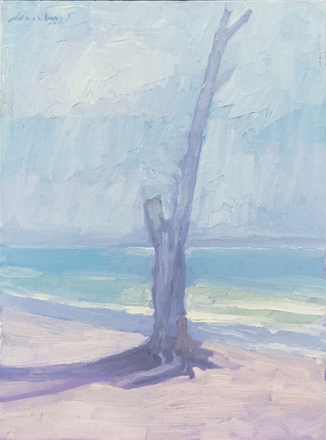
173 Solitude, 2005, oil on panel, 12x9”.
One of my favorite plein air paintings is Solitude: The Only One Standing. It's the dead trunk of a mangrove tree by the water. I always thought it was my favorite because of the technical execution—very fluid, beautiful subtle and high-key colors, a lot of luminosity, spatial depth, and interesting shadowed colors. The globs of paint were applied so effortlessly.
Now, sharing it with you, I'm wondering if I had been feeling lonely and the loss of Thodoris more than I understood. In Lightbox, I projected myself as a transparent, shadowed being with light around me. Even though Solitude is a landscape, all art is a kind of artist’s self-portrait. Now I look at it in a paradoxical way, with the energy and beauty of creamy light colors energetically applied, juxtaposed with the subject that would normally be dark and gloomy. It's an interesting puzzle. In hindsight, it seems more likely that it is a mourning piece, sadly contemplating the loss of life, yet seeing beautiful life that still exists.
This is a wonderful example of when an artist is creating a work and may not be fully cognizant of all the elements that go into the work. At the time, I thought I was just painting what I saw as an interesting landscape, not being aware that I was still in mourning.
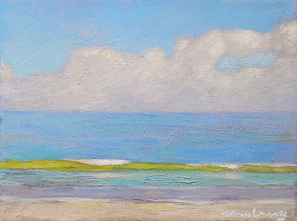
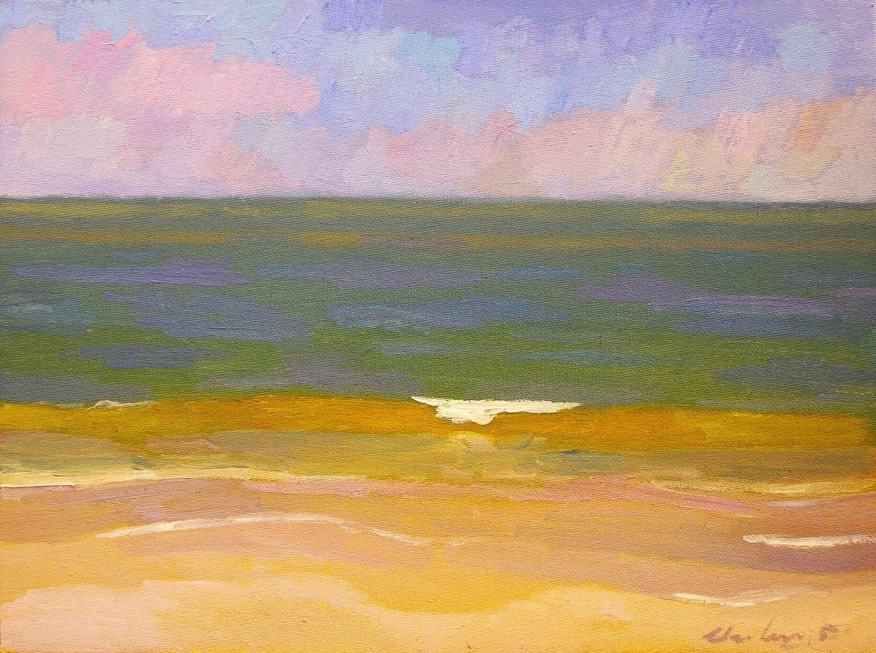
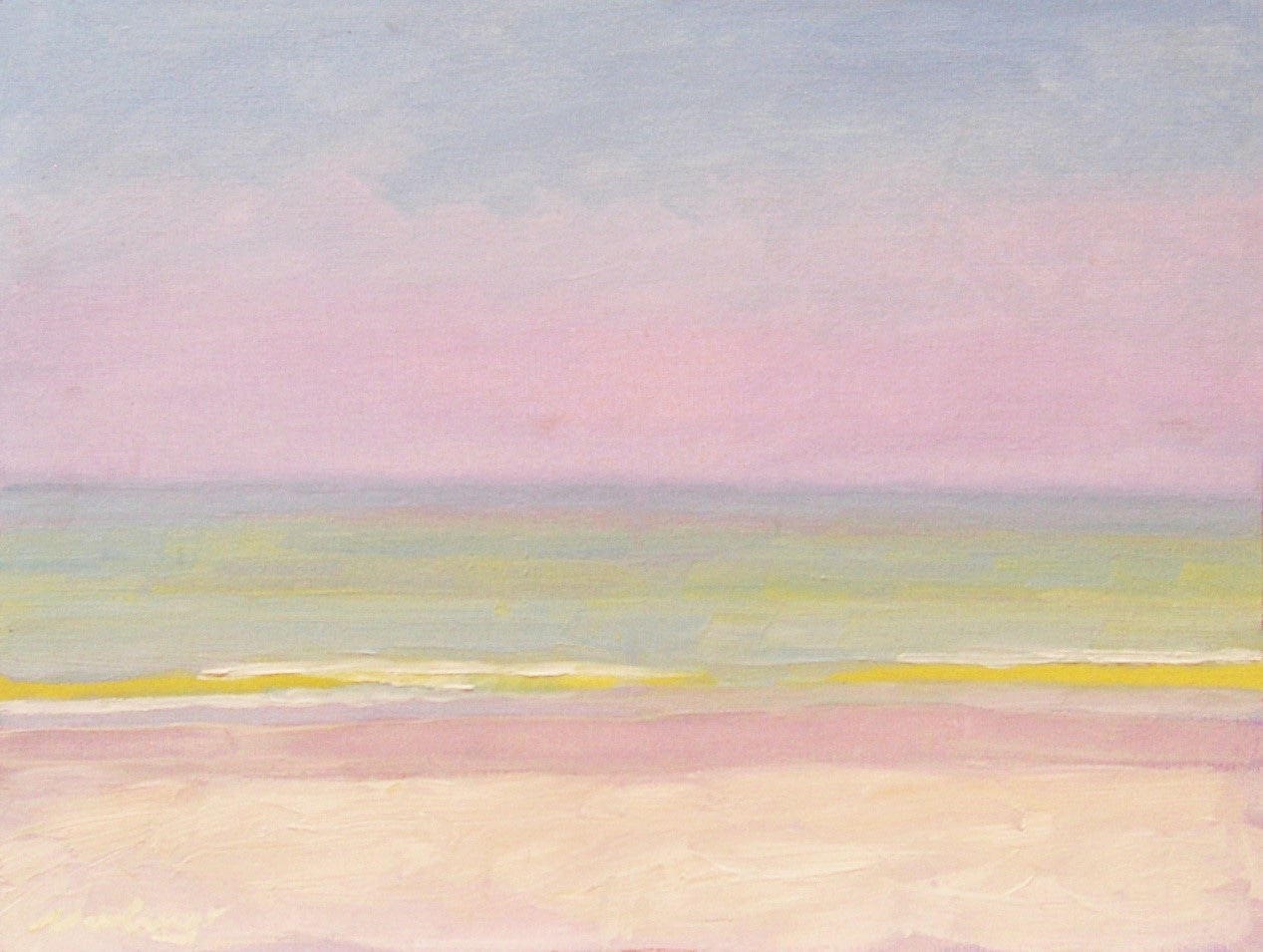
Three Wave Paintings
I was fascinated by the saturated and lit color inside the curve of Florida waves. (To Californians, a Florida wave is really a ripple.) The phenomenon is that when sunlight illuminates the golden sand beneath shallow water, the sand reflects golden light towards the curve of the wave. This curve acts like a lens, magnifying the saturation of the lit golden color of the sandy bottom.
174 Lime-Yellow Wave, 2005, oil on panel, 9x12”.
175 Orange Wave, 2005, oil on panel, 9x12”.
176 Yellow Wave, 2005, oil on panel, 9x12”.
Flight and Fetch
I updated two of my Florida plein air paintings, one by including a seagull and the other by including a dog. That significantly added to the energy of the composition by shifting the vocal point to the dog or bird, creating an intense feeling of eye movement. Plus, I was surprised at how interesting including an animal added to the story of the painting—such as the freedom of flight and a loyal dog expecting a ball to be thrown.
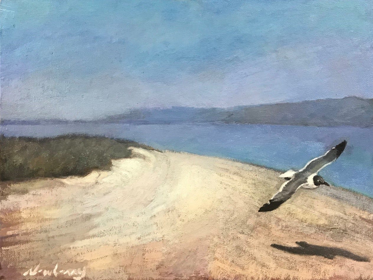
177 Flight, oil on panel, 9x12”.
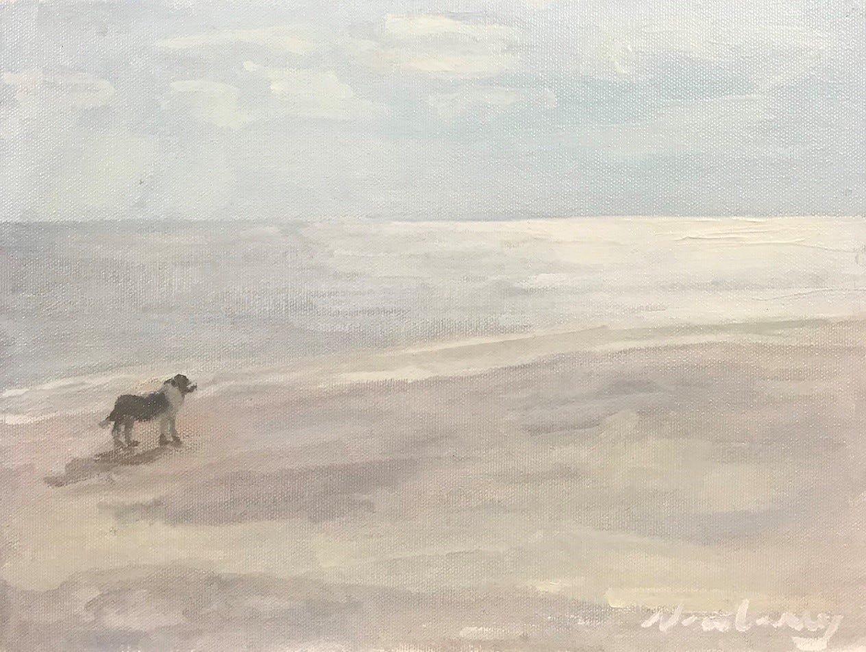
178 Fetch, oil on panel, 9x12”.
Watercolor Woes
With all of Florida's humidity and being surrounded by water, working with watercolor seemed to be a given. I had never done it before, so I invested in some watercolors and paper, along with a guidebook on techniques. I experimented with these five watercolors. I completed a self-portrait and a view of Coffee Pot Bayou from my house; I was very happy with them. My greatest strength as a painter is in editing, but unfortunately, watercolor doesn't take kindly to editing. The other three took weeks to develop, but then they got mold! I was so frustrated with the loss of time and effort that I swore I would never touch watercolor again.
One of the watercolors is a marvelously pathetic romantic work depicting a submerged rose. I love the image and had so much fun painting it, but it must have been karma for it to get mold? The roses are plunked headfirst into a vase of water, leaving a cut stem where the roses should be. The glorious red petals are distorted and amplified through the glass and water. As for what led to the project, I'm not saying.
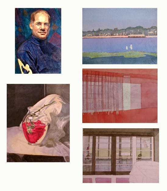
179 Watercolors, Self, Coffee Pot Bayou, Rose Curtains, Sunroom, Rose.
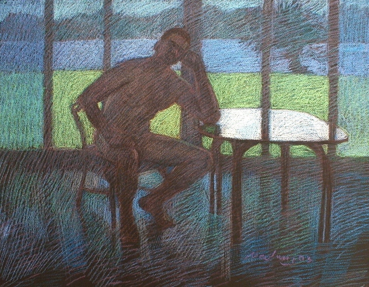
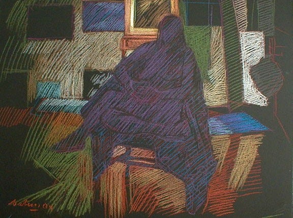
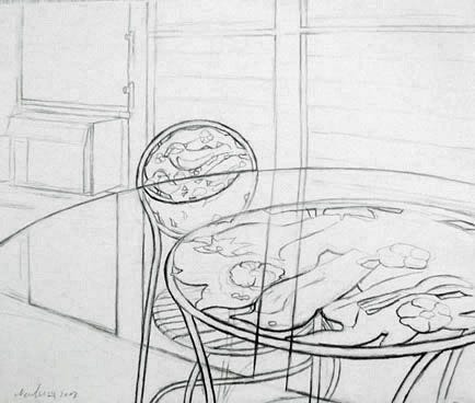
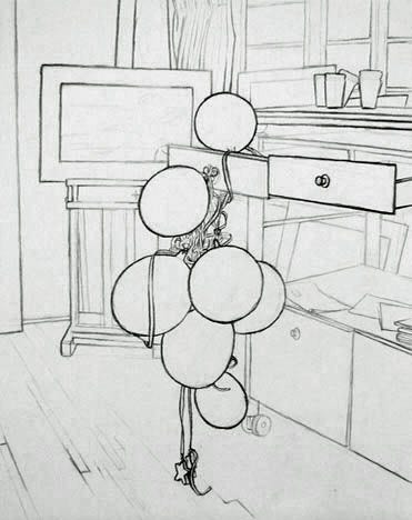
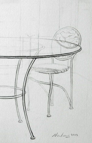
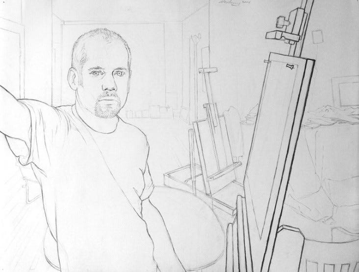
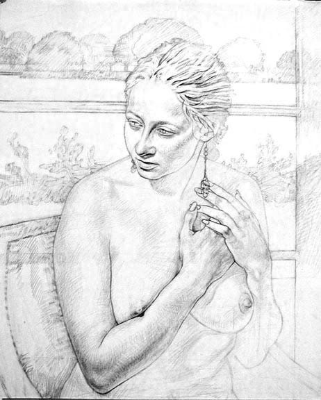
Line Drawings
One of my favorite line drawings is Balloons. Someone brought balloons for the opening of my open studio exhibition. I drew them the next day as a line drawing. Though I don't make finished line drawings very often, I do often compose my paintings with a line drawing before I start to paint. In the two drawings with the table and the chair, I was playing with the compositional balance of the circular and semi-circular patterns of the glass table top, the chair’s back, and the legs of the table and chair.
The variation in line quality is due to two things: placing the edges through space—darker as the edge is closer and lighter in the distance—and recognizing that edges of objects are not equal in sharpness and contrast with the background. Some edges are diffused and merge with the background, while other edges are sharpened in high relief. For example, if there is a bright light on the table and an adjacent near-black background, the edge will be really sharp, hence a pronounced and dark line.
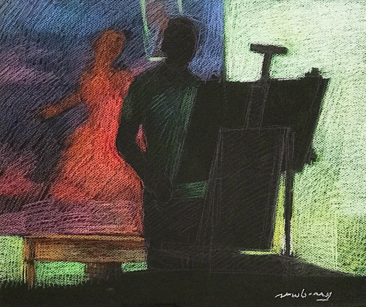
One of my favorite self-portraits is this line drawing in front of the easel. I did it by looking at a mirror. Beyond my head is my painting wall, where I work on my major paintings. I always have a mirror at the opposite end so that I can see the painting I'm working on in reverse. It helps me see mistakes from another perspective.
The portrait of Kimberly: she posed for some of my sketches, and she was the female model for Lovers Jumping. This portrait isn't strictly a line drawing because I used a lot of subtle shadowing. A fun compositional element is the arc of the trees behind her, which is similar to the arc of her head, creating a nice pattern. This was also a study for a painting that never came about. Though looking at it afresh, it would make a very nice space painting. Kind of like the Mona Lisa, but instead of a Florentine landscape in the background, there would be a space nebula. I like that idea.
180 Line drawings, interiors, self-portrait, and Kim.
181 Joseph, 2004, acrylic.
Portrait of Joseph
I enjoyed painting this acrylic portrait of Joseph, using a lot of watery glazes, and then adding thick light paint for the highlights. Joseph had an amusing gesture of an arch to his eyebrow and to his upper lip. He posed life for this portrait. While setting up the composition, I wondered what I could put in the background that would mimic an arch-like quality. I had a leather jacket that would do just that. I hung it up on an easel behind his head, and indeed, it had folds that did mimic the arch in his eyebrow and the arch in his lip. By doing this, I created a fascinating rhythm of arches running through this realistic portrait
Three French Easels
I'm not alone in loving my art materials and my studio space. I also have a special love for my French easel. I used it hundreds of times in making plein air paintings, folding it up into a briefcase and then unfolding it to be a portable studio outside. It comfortably holds a palette, oil paints, brushes, and pots of painting mediums. Its three adjustable legs are a godsend, as you can even use it to paint among the rocks and on uneven ground.
In the first painting, you can see a shiny material on the side of the easel, and that was tinfoil blocking the lamp light so it didn't shine on the distant still life setup for another painting. In the shadows in the background, you can see another clamp lamp that's turned off and a vase. This painting is a nice play on visuals: painting a painting’s setup of another painting’s setup.
The other two paintings of the French easel are a fun variation between night and day.
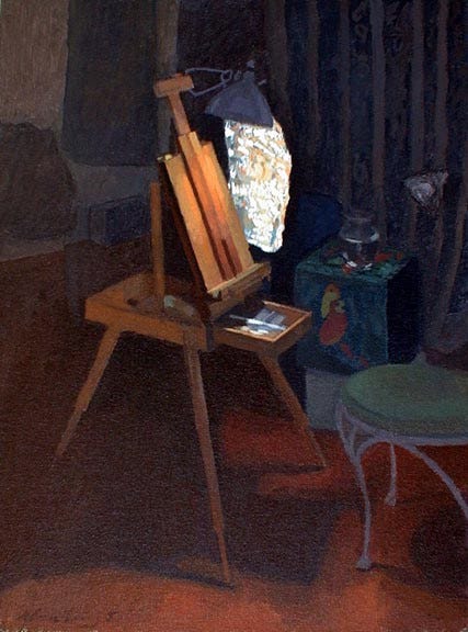
182 Easel with Tinfoil, 2005, oil on panel, 12x9”.
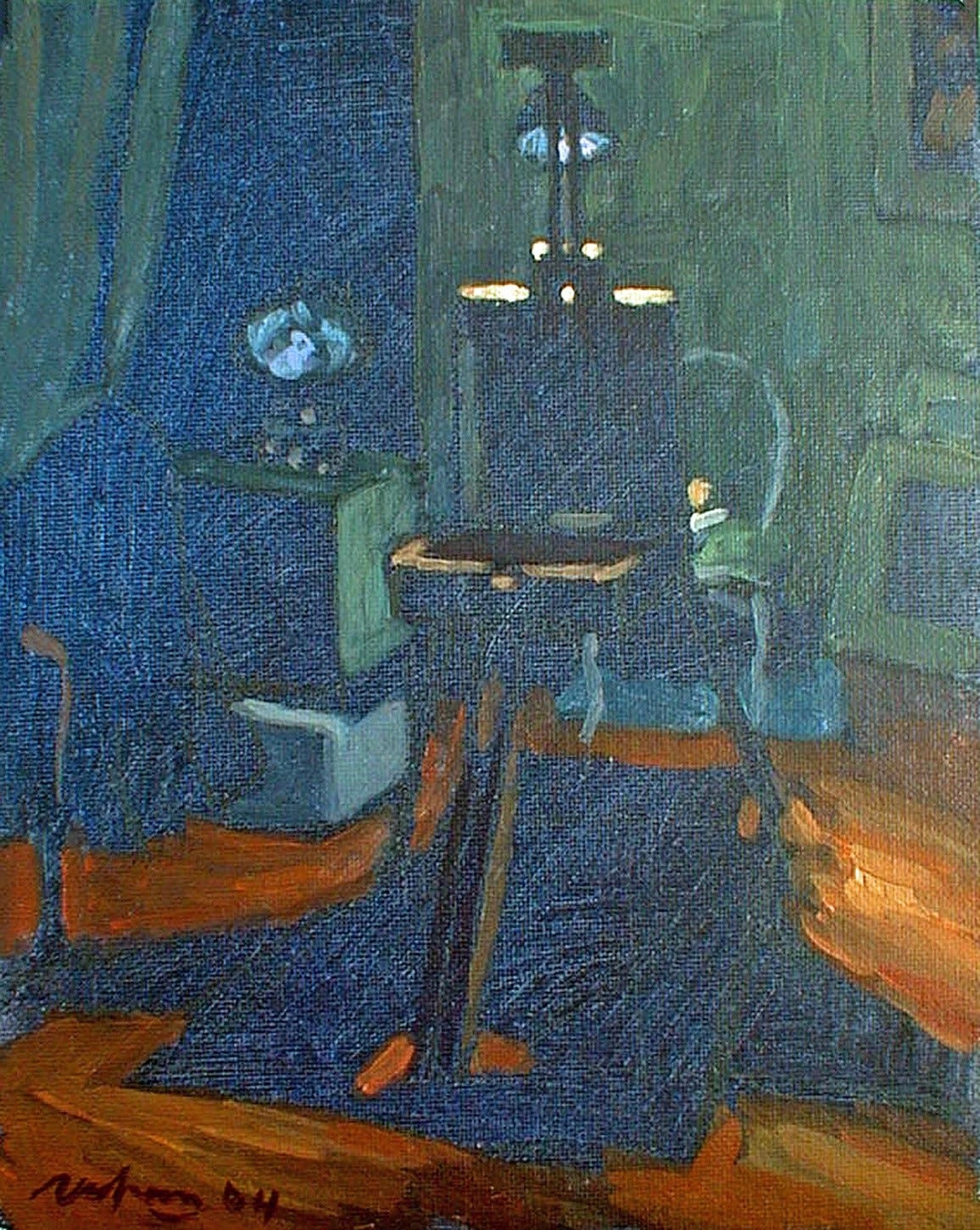
183 Easel at Night, 2004, oil on panel, 12x9”.
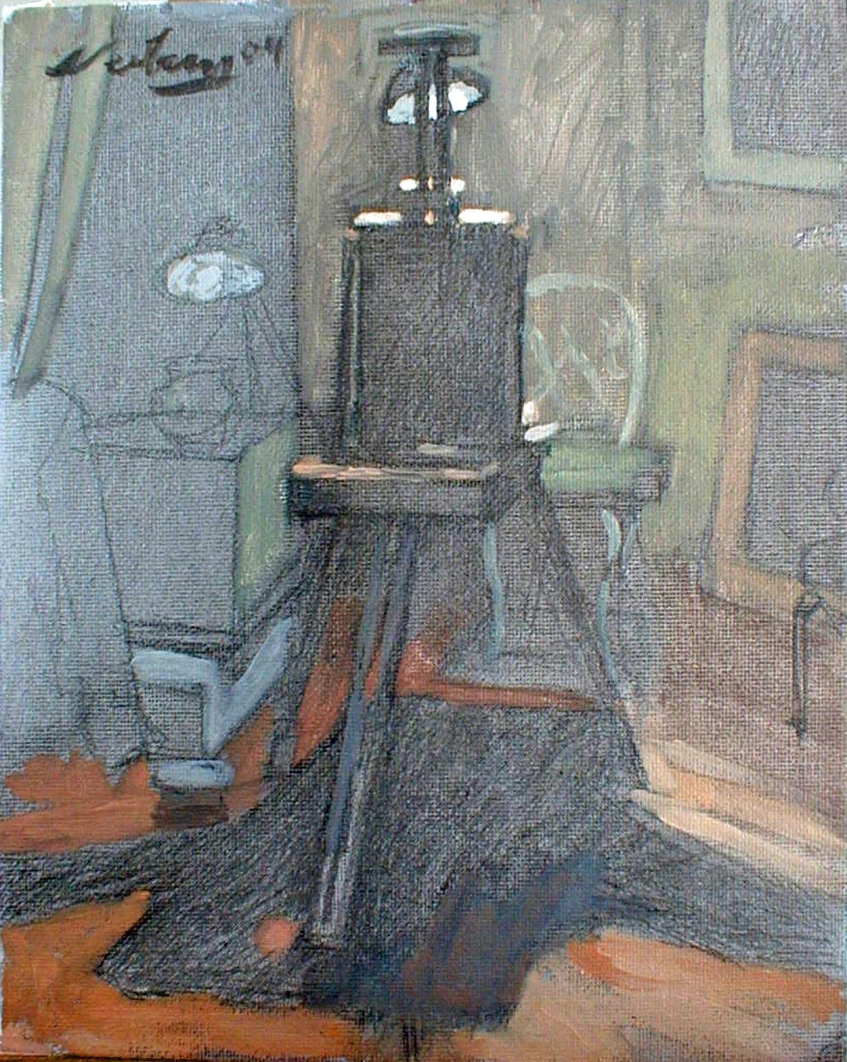
184 Easel by Daylight, 2004, oil on panel, 12x9”.
Preparation for Art Conference in New York
During my artistic exploration in Florida, I was also preparing for an art conference I would soon lead in New York. The date was set for October 3rd, 2003. Brett Holverstott and I booked the Pierre Hotel in Manhattan for the conference and arranged accommodations for the speakers. We also secured round-trip airfare for one speaker from Holland and another from France. I finalized the topics for their talks and worked diligently on raising funds for the conference, which I successfully achieved.
I sent out notices to individuals in the objectivist intellectual and art worlds and created a website for the foundation. Additionally, we arranged for a printed brochure and hired a videographer to document the lectures. Everything was ready to go. One mistake that was brought to my attention was in naming my foundation: The Foundation for the Advancement of Art. Nikki Smith, my English friend with a wicked sense of humor from Greece, pointed out that the acronym for the foundation was FAART! Realizing she was right, I couldn't help but laugh intensely at my mistake. I definitely couldn't have that, so I opted for the much safer FAA as its acronym.
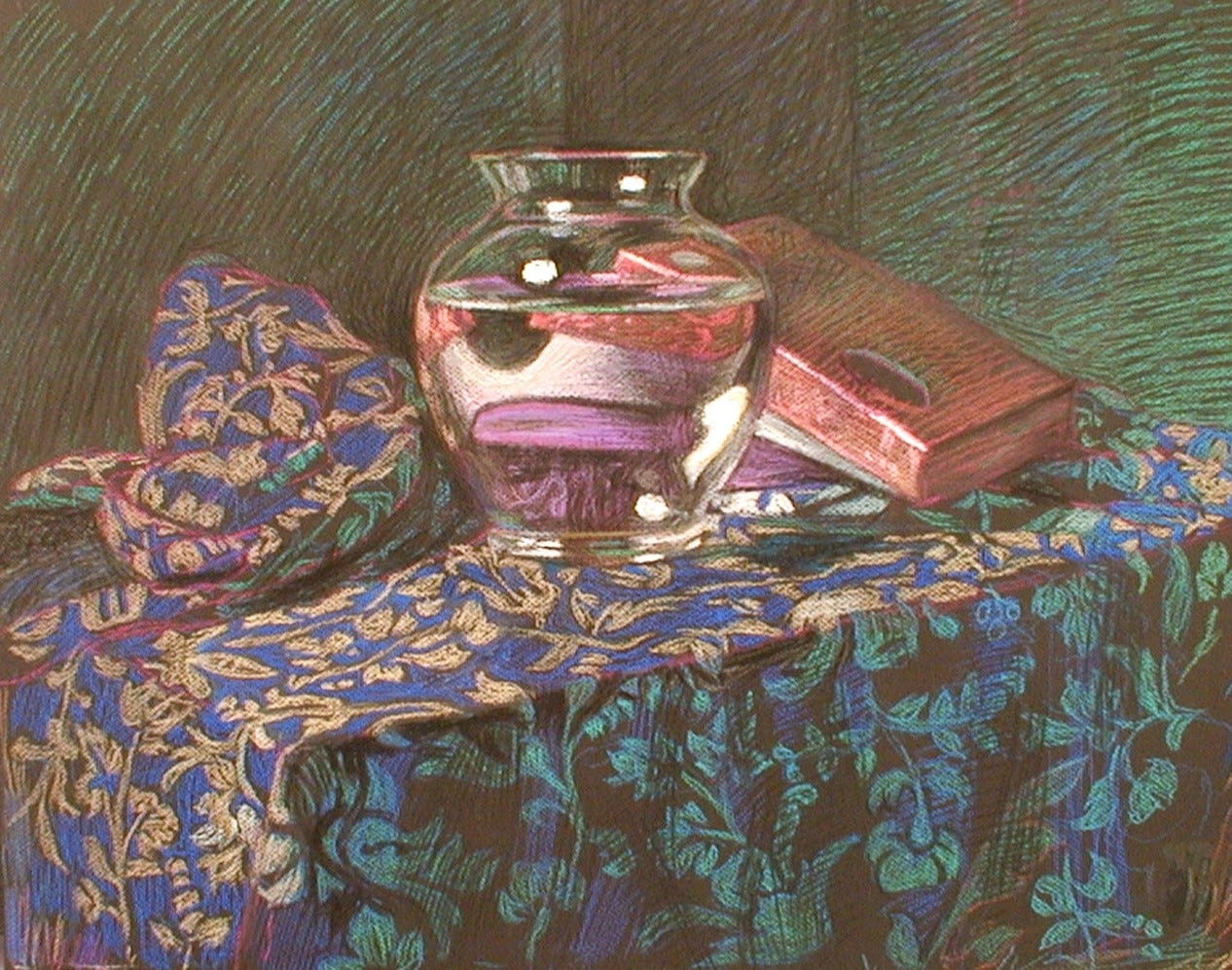
Glass Vase Series
I really liked this wonky, cheap glass vase. It had a nice weight, felt good in my hands, wasn't perfectly symmetrical, and I loved how it magnified the background. Looking at the Glass Vase Series now, it seems I was using the vase as a crystal ball, spending 100 or more hours looking deeply into it, seeing details and shapes that I hadn't previously noticed, and finding wonder in them.
185 Glass Vase, 2003, pastel.
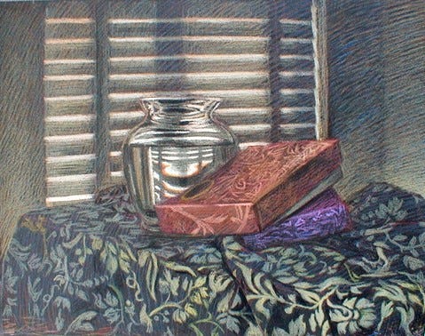
186 Glass Vase with Chocolate Boxes, 2003, pastel.
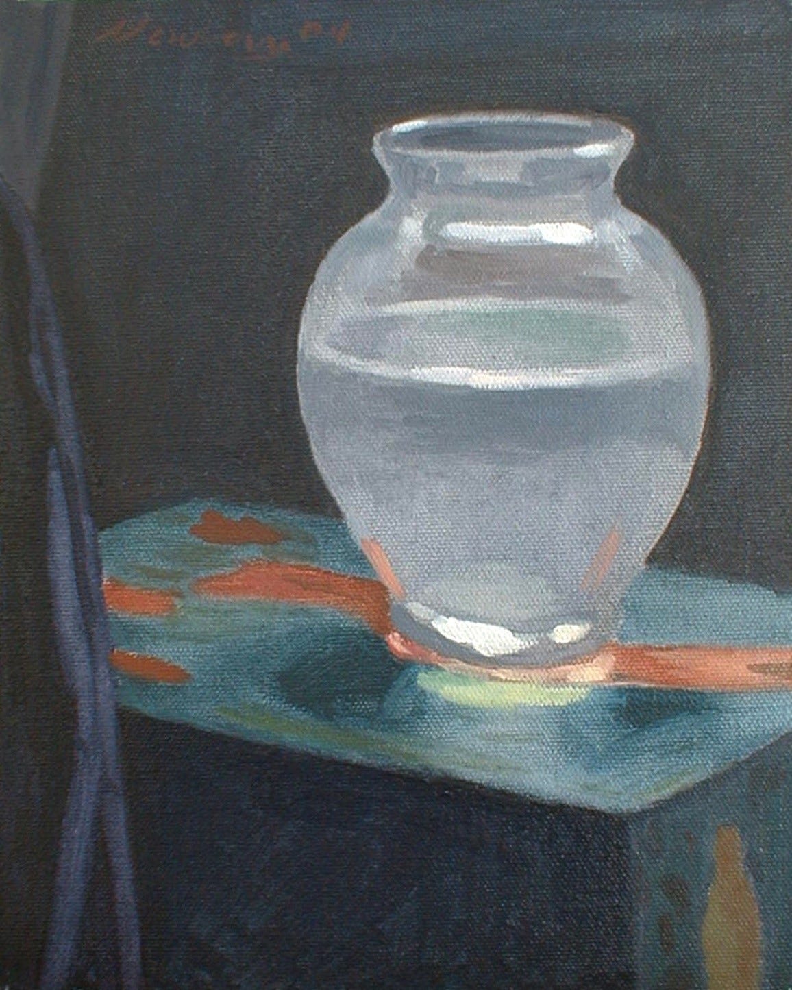
187 Glass Vase with Reflected Light, 2004, oil on panel, 9x12”.
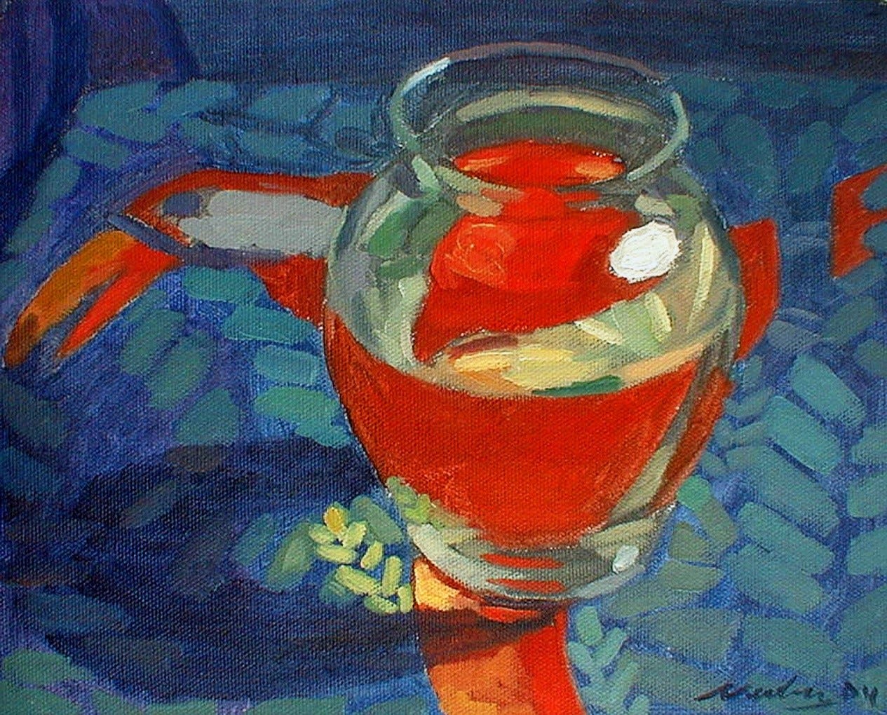
188 Glass Vase with Red, 2004, oil on panel, 9x12”.
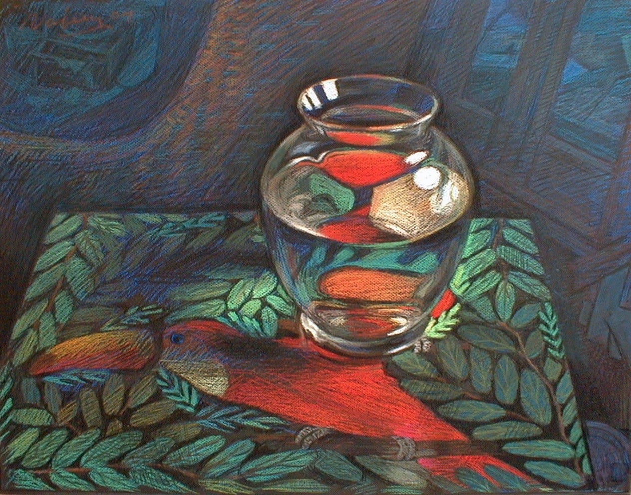
189 Glass Vase with Toucan, 2004, pastel.
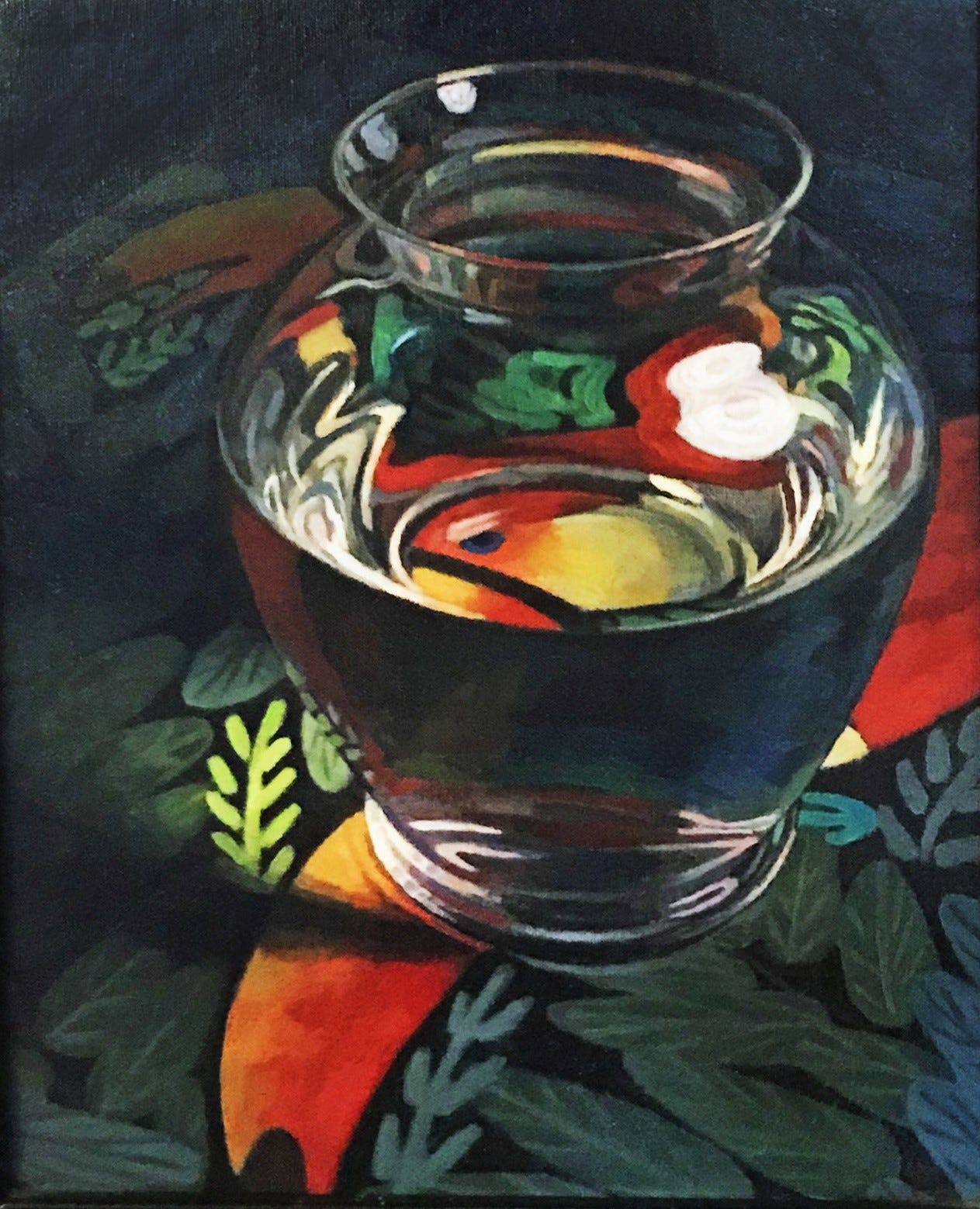
190 Toucan and Glass Vase, 2004, oil on panel, 16x12”.
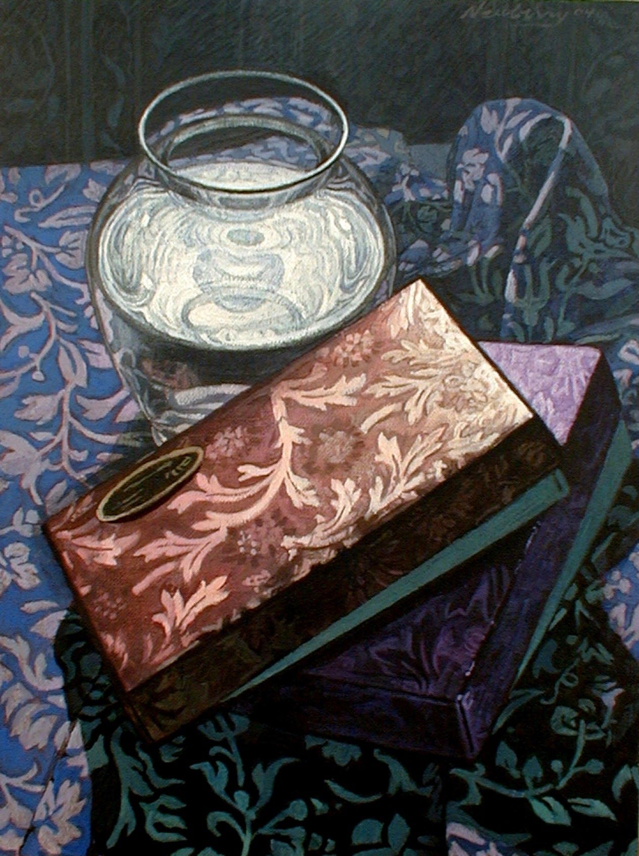
191 Glass Vase and Chocolate Boxes, 2004, acrylic on panel, 16x12”.
One special piece from the glass-based series is Glass Vase with Chocolate Boxes. If you look at the inside of the glass rim, you see two curious things. Just below the inside of the rim, you see through the glass to the edge of the table with the dark space behind it. But in the inner rim curve, it's reflecting the pattern of the tablecloth. So, in one way, it looks like the tablecloth had a bridge of cloth. But it has to do with the opposing curves—the inner rim curving towards us and the inner neck curving away from us—that dramatically changes what they reflect.
The second thing is the dramatically lit water surface in the vase. You might be able to see or visualize that it is reflecting the tin clamp lamp and its light bulb. A delightfully wonderful symbolism is that the reflection of the lightbulb is in the shape of a heart.
It was such an honor to live in a house that had such healing and great karma, exemplified by the previous owner living there until she died at 103. And for my sister facilitating for me living there. I hadn't expected that I would be delving so much into visual perception properties, but intensely studying and painting the details of complex optics would greatly add to my knowledge of light.
192 Photo of me in front of Coffee Pot Bayou, pic taken by Stephen Hicks. 2003.
Thank you for restacking @Dave pearen !
The study of all the different dimensions, attributes, details and reflections of light and color adds to my own artistic endeavors. So amazing as I look at the rainbows they make in our front room as they hang in the windows and off of fixtures and sit on table tops. I too am detail oriented after a creative item or new idea hits me. I may spend many days coming back to one of the pieces and just filing a little here or adding a piece there. Just like cooking for me. I feel it is the tiniest details that make the dish exquisite not the main ingredients. Thank for reassuring me I am not "obsessive compulsive"! I am just being true to my artistic expression in a perfect way!