

Section on Van Gogh from My Book: Evolution Through Art
Section on Van Gogh from My Book: Evolution Through Art
Advancements in Color Theory

VAN GOGH
Two centuries later Van Gogh did a similar thing in his portrait of his mother, but he pushed the envelope by adding highly saturated colors. He wrote his brother, Theo, that he was “seeking the broken and neutral tones to harmonize brutal extremes. Trying to render intense color and not a grey harmony.”
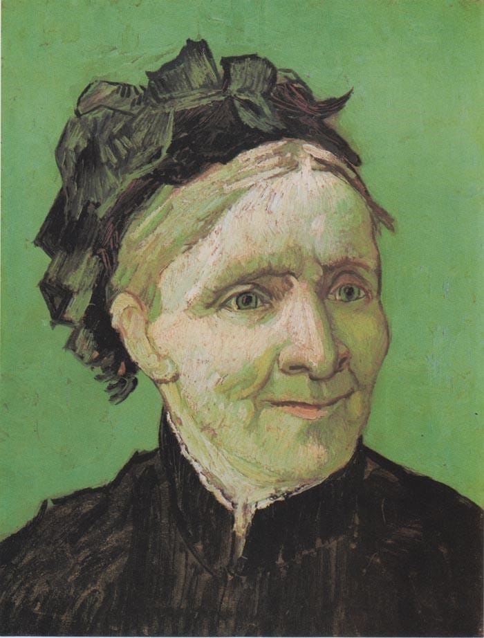
Figure 45 Van Gogh, Portrait of the Artist's Mother, 1888, oil on canvas, 16 x 13 inches. Norton Simon Museum, Pasadena
Van Gogh painted the lit background wall a saturated green, then used those same greens as the base for the shadows of her skin and hair. This creates an unexpected softness, a harmony, and paradoxically a healthy glow (at least as healthy as the sun-deficient Dutch can look), which is almost inconceivable because of the lime green colors. Her green shadows with delicate hints of warmer hues against the slightly cooler green wall give a hint of rosiness to her skin. Her eyes are also painted the background green, so not only is her skin transparent, but we also see through her eyes. Literally we see right through her. We can conclude that due to the bright color and her transparency Van Gogh's mother is a vibrant open soul.
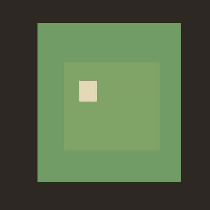
Figure 46 My illustration of the color extraction of the Van Gogh
If we abstract the colors of the Van Gogh portrait, the black of the clothes and hat, the background green, the green shadows of her face with its peach highlight, we can see how soft the two greens are. This means that even with highly saturated but closely related greens, their overlay is anything but harsh, and gives a pleasing hum-like harmony.
Van Gogh, by incorporating and harmonizing more extreme saturations of color is expanding the sensory experience of art. He is giving us a stylized simulation of reality and giving the painting an added visual punch. Like an evolutionary animal that gains a set of eyes, this color development added new conceptual awareness to our perception. The benefit to us is that it heightens our visual sensitivity, giving us a more refined use of our eyes.
Van Gogh mastered the conceptual play of how technical elements can convey psychological insights, that humans are not compartmentalized, but have layers of reason, emotion, and vibrancy that overlap.
Taking It Outside
On waking up in a dim room, shades drawn closed, you get up and open the French windows, and then you are greeted by an explosion of glistening light and color. It takes a few moments for your eyes to adjust to the powerful stimulus of brilliant greens, rust oranges, reds, blues and mauves, and yellows that careen off the French landscape. The contrast between the gray room and sunlit landscape sums up the color differences between the classical painters and the French Impressionists.
The classicists relied on traditional studio techniques, with rules for the “proper” colors to use at specific times in the painting. Often white was added to colors to lighten them and black was added to darken them––resulting in a dramatic play of light and dark, but with dull hues. The Impressionists changed that by stepping out from the classical studio and exploring the brilliant colors of the outside world.
They were not only breaking free of the traditional techniques, they were foregoing that system's patron-driven commissions. Rejecting classicism enabled them to pursue their choice of subject and means without being waylaid by higher authorities. Van Gogh bemoans this problem: “There is an old academic school, often odious and tyrannical, the `abomination of desolation', in short, men who dress, as it were, in a suit of steel armour, a cuirass, of prejudice and convention. When they are in charge, it is they who hand out the jobs and try, with much red tape, to keep them for their proteges and to exclude the man with an open mind.”[1]
With new found liberties the French Impressionists headed outside to explore the infinite variety of color, light, and atmosphere of the outdoors, using nature as their studio laboratories.
The Color Factor in Fine Art
I am always in hope of making a discovery there, to express the love of two lovers by a marriage of two complementary colors, their mingling and their opposition, the mysterious vibrations of kindred tones.[2]
Vincent Van Gogh
There are many studies on color psychology and how colors trigger emotional responses. Interior designers, graphic artists, and other art professionals in commercial fields have tons of experience in knowing how colors work on the human psyche from their research and results. But it is different for master artists. Color in itself doesn't matter as much as the more profound process to integrate color with light, shadow, form and depth. Van Gogh's landscape painting, The Harvest, is a superb example of this.
There is a classical concept in color theory that warm colors come forward and cool colors recede, and this is what Van Gogh has done. Then, he added a stunning third element. He treated the golden landscape as a bowl of glowing yellows, with their shimmer rising up from the fields. Notice that he turned the sky into a dusty turquoise green, a consequence of the blue sky being seen through a filter of the yellow atmosphere. This yellow light doubles the intensity of the golden fields, creating lime-, lemon-, and orange-yellows. Notice the subtle shift of color and space, from warm yellows in the foreground to cooler yellows in the background.
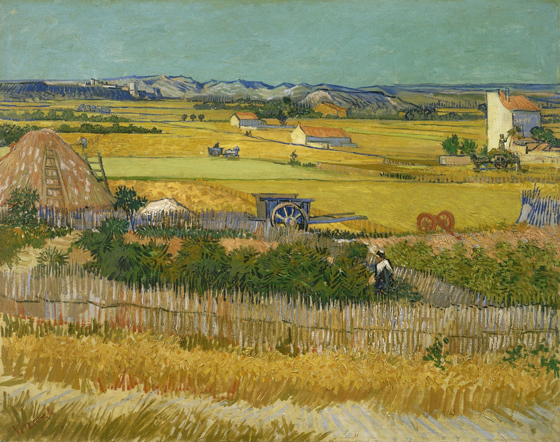
Figure 47 Van Gogh, The Harvest, 1888, oil on canvas, 29x36", Van Gogh Museum, Amsterdam
By seeing this dimension of the color of atmosphere we gain a greater perceptual understanding: the next time we look at a valley we might grasp how the color of light ricochets off the objects creating something like a light box, but on a grand scale. This effect abstracts the vibrancy of real life, giving life to the painting and to our outlook.
It must be noted Van Gogh's perspective in this work rivals any landscape of da Vinci. Similar objects diminish in size as they recede with flawless precision. Notice the woman in the foreground and compare her to the person moving hay from the cart on the right, then to the smaller person driving a cart, and then back to the tiny couple in the distance. The same applies to the horses, carts, houses, vegetation and fields. One result is that we don't even notice the complexity of these measurements, as it feels simply natural.
There is a wonderful healthiness to the subject, a clear day, beautiful golden fields, and farmers going about their business. And, of course, Van Gogh was sitting there painting the scene, like one of the team. A world filled with color, warmth, hard work, and an irreplaceable interaction with nature. Life doesn't get much better than that.
It is sad to note that Van Gogh wanted so badly to contribute something special and wonderful to humanity, which he did, yet he didn't realize its value. In a letter to his brother Theo he frankly writes: “... my only anxiety is: how can I be of use in the world, cannot I serve some purpose and be of any good, how can I learn more and study profoundly certain subjects?”[3]
But he also had moments of confidence in his efforts as an artist: “If you work with love and intelligence, you develop a kind of armor against people's opinions, just because of the sincerity of your love for nature and art. Nature is also severe and, to put it that way, hard, but never deceives and always helps you to move forward.”[4] We are blessed that not only did he move forward but he was instrumental in introducing and touching millions of people with his advancements in art.
[1] Vincent van Gogh. Letter to Theo van Gogh. Written July 1880 in Cuesmes. Translated by Mrs. Johanna van Gogh-Bonger, edited by Robert Harrison, number 133.
[2] Letter to Theo, September 1888; as quoted in Vincent van Gogh, edited by Alfred H. Barr; Museum of Modern Art, New York, 1935, (letter 531) p. 22
[3] Vincent van Gogh, edited by Alfred H. Barr; Museum of Modern Art, New York, 1935, (letter 133) p. 19
[4] Vincent van Gogh. Van Gogh’s Letters. Edited by Suh, H. Anna. New York: Black Dog & Levanthal Publishers, 2006. “letter 218” page 45.
