

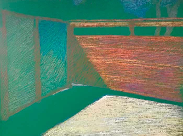
Obermeyer's Gate by Michael Newberry
Obermeyer's Gate by Michael Newberry

Paradox: Chevreul's Illusion Meets Blank Paper
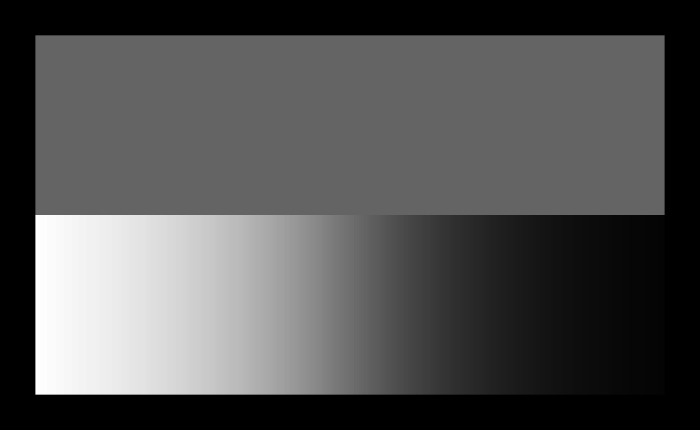
In 1861 Michel Eugene Chevreul published his book The Laws of Contrast of Color. As a teenager I clearly remember his illustration of a solid-toned gray strip laid next to a strip of the gradation from white to black. As you can see above the solid gray strip looks as if it changes tones from light to dark gray. In one way it is an illusion, because the gray strip is literally one tone, but in a physiological way it shows how context aware our visual perception is. An interesting paradox.
With my pastel, Obermeyer's Gate, the paper is an intense mid-tone green. About 1/3 of the drawing is blank paper and I used it as a "sounding board" to play off the light of the rich redwood gate and opaque cement driveway. In the background, you can sense bushy trees, with just a touch of blue sky to indicate their silhouettes. And the cast shadow seems to change, like the Chevreul Illusion, from being darker next to the highlights, and lighter against the darker wood shadows. That is just if you think of the tones, but it's crazy when the hues come into play.
Chevreul discovered another interesting phenomenon, simultaneous contrast, while being the director of dye works at Gobelins textile factory. If you put deep blue fabrics next to their black, the black fabric gave off a reddish tint. Undoubtedly if you put a scarlet next to the same black it would give off blueish tint. The effect takes place in your brain. You can test this by staring at a bright color, like red, for a minute or two then look away at something white you should see a visual echo of red's opposite, green (the optic is taking place in the communication of your brain with your eyes). The power and significance of this is that these "tricks" in a good artist's hands can paint a vibrant illusion that can feel like real light. An almost impossible task given that paper and pigment are reflective, they cannot literally produce light, but by mastering color theory the artist and manipulate the optical triggers of the eye, giving it a virtual reality to engage in, which sometimes feels more real than reality.
Van Gogh's art really took off when he began exploring this color theory with real life observations, he wrote, "this reciprocal heightening is what's called the law of simultaneous contrast…If the complementary colors are taken at equal value, that is to say, at the same degree of brightness and light, their juxtaposition will raise both the one and the other to an intensity so violent that human eyes will scarcely be able to bear to look at it."
Coming back to my pastel, the day was an intensely bright Southern Californian day. And the redwood gate was intense in reds and orange colors. Almost no way to communicate the intensity of those hot colors. But using the intense green paper (the compliment and opposite of red) I had a chance to set off both the color and the light.
The mental experience is like how Van Gogh describes it, "... an intensity so violent..." it feels like an explosion of electrons then bouncing off each other inside the confines of the skull. It is intense and very difficult to work with, as every color you add to the green paper takes on a totally different nature than worked with white or black paper.
We have a huge debt of gratitude to Van Gogh for showing us the successful results of mind bending color theory that evolved our understanding of light.
Michael Newberry, Idyllwild, 9/20/2020