

This tutorial is a transcription from a 2002 lecture I gave at the Courage of Your Perceptions Conference (Satellite to the EC’s Vision Scientists’ Conference) in Glasgow, Scotland.
The mastery of spatial depth in art has captivated audiences for thousands of years. From ancient cave paintings to contemporary masterpieces, artists have utilized various techniques to create the illusion of three-dimensional forms on a two-dimensional surface. My curiosity led me to delve into this phenomenon, and I discovered the crucial role that transparency and contrast play in creating spatial depth. Through my research, I formulated the idea that transparency creates the illusion of forms receding into the distance, while contrast brings them forward to create a dynamic and captivating visual experience.
Great artists are doing other spatial things as well: lighting, modeling form, and perspective drawing. But for this essay, I will focus on this transparency issue.
The first figure shows a gradation of light to dark stripes on a white background. As they get darker, the stripes ascend towards us like steps. The darkest stripe “pops out” in contrast to the white background. Conversely, the lightest of the stripes recedes into the distance of the white surface.
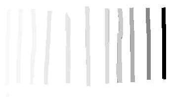
11 Stripes gradated from light to dark.
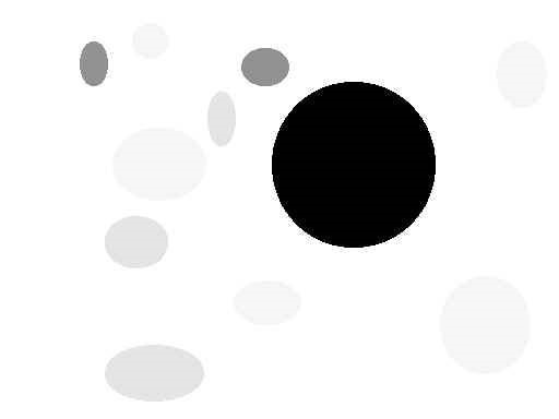
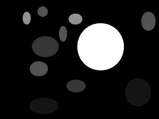
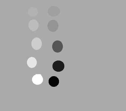
12 Different tonal and sized disks with a pronounced black one.
Similarly, the discs appear to move through space because of their relative lightness or darkness to the background and each other. The big black disc appears to jump forward.
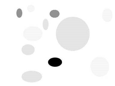
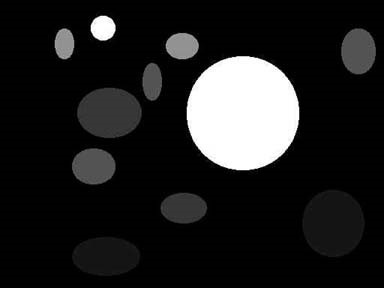
13 Different tonal and sized disks with a pronounced small black one.
Notice what happens when the large disc changes to light gray, it recedes significantly beyond the small black one.
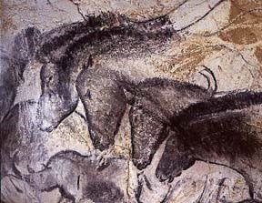
14 Chauvet Cave Horse Heads, 30,000 B.C. Wikipedia Commons.
Horse Heads from the Chauvet Cave dated 30,000 years ago. Notice the gray scale of the receding heads and the black modeling of the head closest to us. Also, notice how the light gray of the surface comes through the receding heads, literally making them transparent.
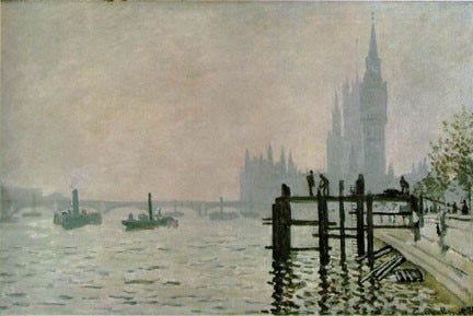
15 Monet, The Thames at Westminster, 1871. National Gallery, London. Wikipedia Commons.
This Monet is an excellent example of this idea. We first see the blackness of the pylons, and the other objects dance back into space by the degree of how transparent they become, or, in other words, how closely they match the gray of the background.
When the background changes to black, the principle of transparency still holds true. The discs will appear to recede further as the background becomes closer to a black tone, and the white will appear to pop forward.
16 Different tonal and sized disks on a black background with a pronounced white one.
17 Different tonal and sized disks on a black background with a pronounced large and a small white disk.
Here we have two white discs, a large and a small one, which show an example of perspective: the bigger one comes a bit more forward than the small one.
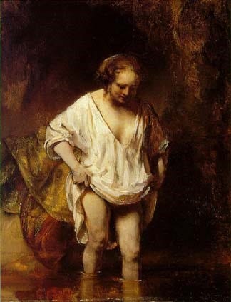
18 Rembrandt, Hendrickje Bathing in a River, 1654
National Gallery, London. Wikipedia Commons.
Due to the extreme lightness of her body and shift, Hendrickje comes forward, off the dark background. Notice the transparency of her left shoulder: it sends her left arm back and away from her chest. Rembrandt is working with a gray/brown/black scale, not with a full range of color. He sets objects back by making them merge to this dark tone. Compare the brilliant lightness of her shift to the middle tone glow of the material behind her on the bank. Her lightness is popping her forward.
19 Tonal disks fading into a gray background.
Here we have a gray background. The discs that come forward have become either more white or black respectively.
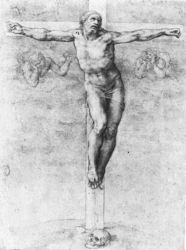
20 Michelangelo, Christ on the Cross, circa 1541, black and white chalk. British Museum. Wikipedia Commons.
In Michelangelo’s Christ, the closest part of his body to us is his right knee. The next closest is his right big toe and then his left chest. These areas have the greatest contrast between light and dark. Compare the high contrast of tone of his right foot to the more muted left foot behind. Or, compare the transparent area of his left knee to the intense light and dark of his right knee. Also, notice that his arms share a depth of space and have an equal range of tonal value, while the tone of his forward knee has a higher contrast. Finally, notice how delicately transparent the background figures are.
Color
Given a two-dimensional surface, transparency and contrast are a means to place identities/forms through spatial depth.
[This online tutorial is a transcription from a 2002 lecture I gave at the Courage of Your Perceptions Conference (Satellite to the EC’s Vision Scientists’ Conference) in Glasgow, Scotland.
In the first part of this chapter I discussed how this theory works with gray tonal scales and in paintings with limited color range. Let’s see what happens when we introduce intense colors.
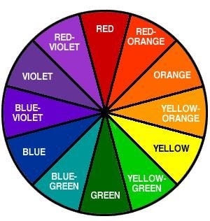
21 Classic Color Wheel
It’s important to note that contrast in color is not so much about light and dark but, rather, color opposites. For example, here is a classic color wheel in which opposite colors—also known as complimentary colors—are juxtaposed. Three major contrasts are:
Red vs. Green
Blue vs. Orange
Yellow vs. Violet
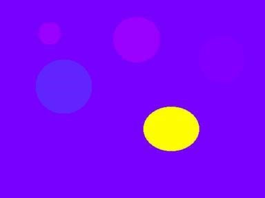
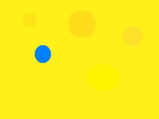
22 Pronounced yellow disk on a purple background.
In this diagram, blue-violet is the background color. Notice that the discs that come closest to it in color appear to recede, while the yellow one—its opposite—appears to pop forward.
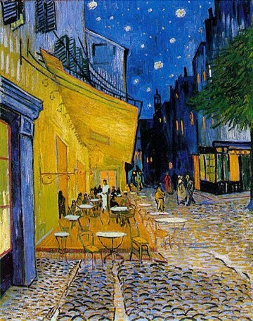
23 Van Gogh, Cafe Terrace on the Place du Forum, 1888
Rijksmuseum Kroller-Mueller, Otterlo. Wikipedia Commons.
This Van Gogh painting has an intense blue background, and the orange-yellow café comes forward. Notice the buildings beyond the café are variations on darks and blues. The window that is straight up above the café is literally transparent, but, if you look closely, you will see the blue sky winking throughout sections of the buildings, giving them a transparent quality as well.

24 Turquoise disk on an orange background.
Shifting to the opposite extreme from blue, we go to a scarlet background. The light turquoise disc comes forward.
In art school, I was taught that cool colors go back and warm colors come forward; this diagram contradicts that idea.
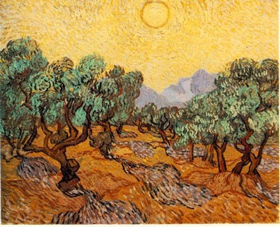
25 Van Gogh, Olive Trees with Yellow Sky and Sun, 1889
The Minneapolis Institute of Arts. Wikipedia Commons.
Intense yellow-orange sky and ground. The green, silvery leaves of the olive trees come forward to us. The ground recedes towards the sky as it gets intensely
orange.
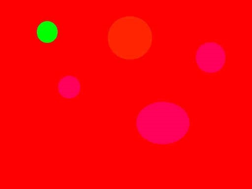
26 Green disk on red background. And if you look carefully you will see three red-magenta ones as well.
I think you are getting the idea of the diagrams. You can take any color as a background, mix in a few closely matching colors, and then, smack in an opposite color; it will pop forward.
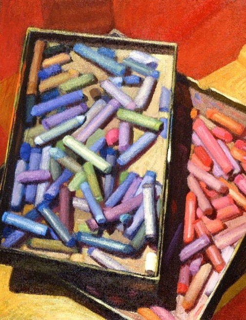
27 Newberry, Pastels, 1991, oil on wood, 11 x 14 inches.
This still life has a red background. Notice the wood base underneath the pastel boxes at the upper right side of the canvas–it is intensely colored with oranges, which help it recede from us towards the red floor. Also, notice the box of red, orange, and magenta pastels and how it is visually underneath the blue box with its “cool” colors popping forward..
28 Blue disk on a yellow background.
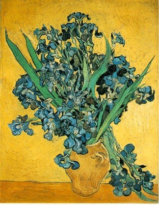
29 Van Gogh, Irises, 1890.
Rijksmuseum Vincent van Gogh, Amsterdam. Wikipedia Commons.
Three things to notice here:
1) The intense blue irises that overhang in front of the jar.
2) The color of the irises that drop behind the jar have more yellow mixed in with the blue. This is a less intense blue than the forward flowers, which helps increase the distance between them.
3) The central highlight on the vase is transparent and almost the same color as the background. This helps increase the distance between it and the intense blue flowers in front.
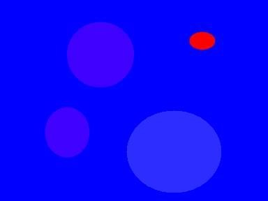
30 Red disk on a blue background.
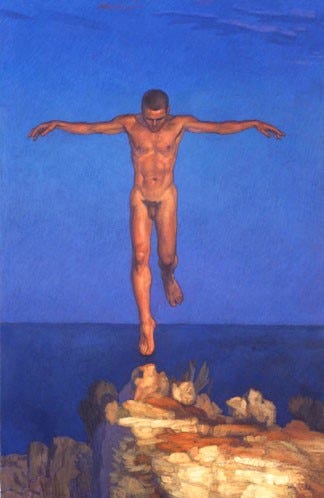
31 Newberry, Icarus Landing, 2000, acrylic on linen, 55 x 36 inches
There is a combination of both the high contrast of light and dark and the color contrast between the orange and the blue. Notice the spatial distance between his left foot and the right. The left foot has a lot of blue mixed in with it to help it recede, as shown in the example of the Van Gogh irises. Notice also the light and dark contrast of the tip of his head at his hairline, and compare that to the less intense contrast of the lights and darks of his shoulders.
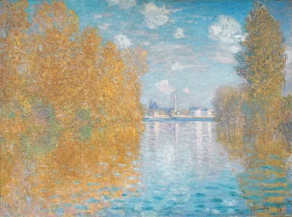
32 Claude Monet, Autumn Effect at Argenteui, 1873, The Courtauld, London. Wikipedia Commons.
Look at the arch of the blue sky and how it recedes towards a pale magenta at the horizon. Notice how the water mirrors the sky in this same manner.
On the left, see the intense orange of the trees and notice how they are closer to us than the trees on the right. And look how the trees further away from us have a paler magenta mixed in with them.
Another thing is the high contrast of color of the orange reflections of the trees and the blue sky on the water, shooting the water underneath our feet.
In conclusion, I hope that this chapter has shed light on the timeless art of creating spatial depth in two-dimensional works. Using transparency and contrast, artists have been able to bring their visions to life, captivating audiences for centuries. I invite you to continue exploring the works of master artists, and to see for yourself the stunning effects that can be achieved through the careful manipulation of these fundamental elements. Thank you for joining me on this journey into the fascinating world of spatial depth in art.
Look for it in the Spring of 2023 on Amazon.