
Chapter 3, Space: Creating Depth Through Transparency and Contrast, Part 2: Color
From the upcoming new edition of The Art Studio Companion

Given a two-dimensional surface, transparency and contrast are a means to place identities/forms through spatial depth.
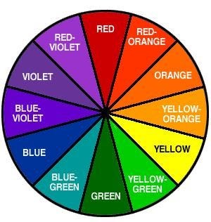
25 Classic Color Wheel. My photo.
In this study, we see what happens when we introduce intense colors while solving spatial problems.
It’s important to note that contrast in color is not so much about light and dark but, rather, color opposites. For example, here is a classic color wheel in which opposite colors—also known as complementary colors—are juxtaposed. Three major contrasts are: Red vs. Green; Blue vs. Orange; Yellow vs. Violet.
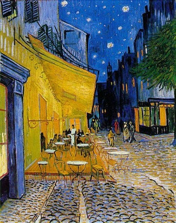
26 Van Gogh, Cafe Terrace on the Place du Forum, 1888. Kroller-Mueller. WC.
This Vincent Van Gogh painting has an intense blue background, and the orange-yellow café comes forward. Notice the buildings beyond the café are variations on darks and blues. The window that is straight up above the café is literally transparent, but, if you look closely, you will see the blue sky winking throughout sections of the buildings, giving them a transparent quality as well.[1]
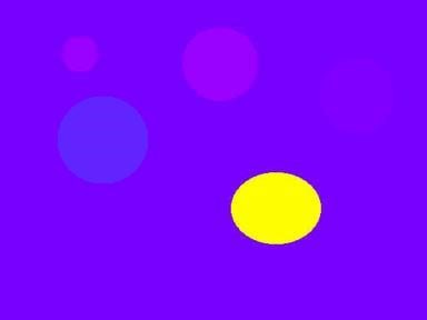
27 Newberry. Yellow disk on a purple background.
In this diagram, blue-violet is the background color. Notice that the discs that come closest to it in color appear to recede, while the yellow one—its opposite—appears to pop forward.

28 Newberry. Turquoise disk on an orange background.
Shifting to the opposite extreme from blue, we arrive at a scarlet background. The light turquoise disc comes forward. In art school, I was taught that cool colors recede and warm colors advance; however, this diagram contradicts that idea. Van Gogh's Olive Trees illustrates how the warm yellow sky and orange fields can be in the background while the mint green of the olive leaves pops forward.
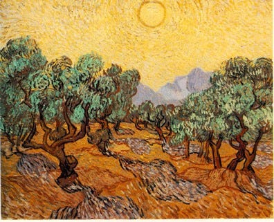
29 Van Gogh, Olive Trees, 1889. The Minneapolis Institute of Arts. WC.
30 Newberry, Pastels, 1991, oil on wood, 11 x 14 inches.
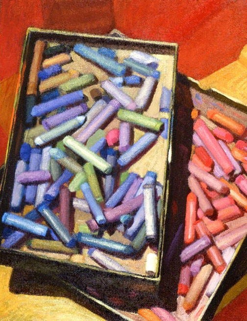
My still life Pastels has a red background. Notice the wood base underneath the pastel boxes at the upper right side of the canvas–it is intensely colored with oranges, which help it recede from us towards the red floor. Also, notice the box of red, orange, and magenta pastels and how it is visually underneath the blue box with its “cool” colors popping forward. The demo below illustrates this, how a green pops on a red background.
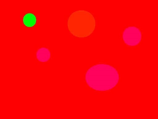
31 Newberry. Green disk on a red background.
I think you are getting the idea of the diagrams. You can take any color as a background, mix in a few closely matching colors, and then, smack in an opposite color; it will pop forward.
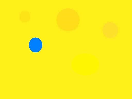
32 Newberry. Blue disk on a yellow background.
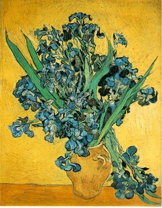
33 Van Gogh, Irises, 1890. Rijksmuseum. WC.
Three things to notice about Van Gogh’s Irises:
1. The intense blue irises that overhang in front of the jar.
2. The color of the irises that drop behind the jar have more yellow mixed in with the blue. This is a less intense blue than the forward flowers, which helps increase the distance between them.
3. The central highlight on the vase is transparent and almost the same color as the background. This helps increase the distance between it and the intense blue flowers in front.
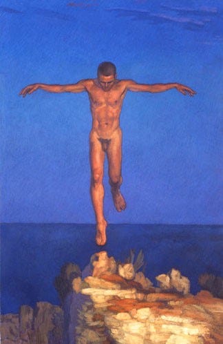
34 Newberry, Icarus Landing, 2000, acrylic on linen, 55 x 36”.
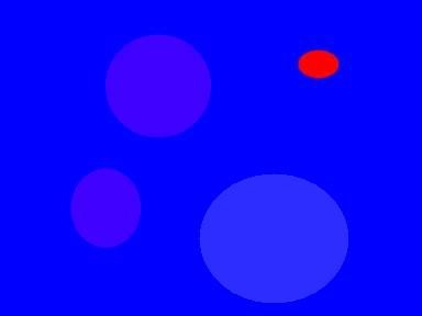
35 Newberry. Red disk on a blue background.
In Icarus Landing there is a combination of both the high contrast of light and dark and the color contrast between the orange and the blue. Notice the spatial distance between his left foot and the right. The left foot has a lot of blue mixed in with it to help it recede, as shown in the example of Van Gogh’s Irises. Notice also the light and dark contrast of the tip of his head at his hairline, and compare that to the less intense contrast of the lights and darks of his shoulders.
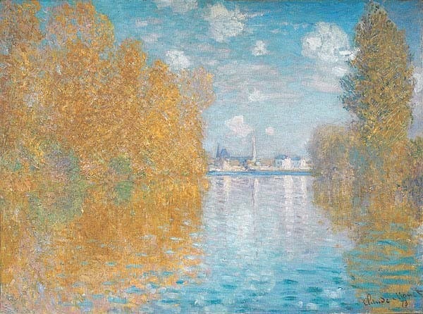
36 Monet, Autumn Effect at Argenteui, 1873, The Courtauld. WC.
Look at Monet’s sky and how it recedes towards a pale magenta at the horizon. Notice how the water mirrors the sky in this same manner.
On the left, see the intense orange of the trees and notice how they are closer to us than the trees on the right. And look how the trees further away from us have a paler magenta mixed in with them.
Another thing is the high contrast of color of the orange reflections of the trees and the blue sky on the water, shooting the water underneath our feet.
I hope that this chapter has shed light on the timeless art of creating spatial depth in two-dimensional works. Using transparency and contrast, artists have been able to bring their visions to life, captivating audiences for centuries.
Practice
As always, it is crucial to reinforce your understanding through practice. We studied how artists create spatial depth by closely matching color values to recede and contrasting them to make them 'pop' forward. For this lesson, I recommend painting little abstract color diagrams based on the five diagrams I included here—the ones with the disks against different colored backgrounds. You can either use five small canvases, 10x8 inches, for each color diagram, or you can draw five separate squares on one larger canvas. The idea is to immerse yourself with five different colored backgrounds and discover how to blend colors to recede and 'pop.' It is a very abstract lesson, but it will be very helpful for your realistic paintings.
[1] In 2019, it was my privilege to teach a workshop in France, organized by the Province Art Experience, with the exceptional guide and host Mathieu Brousses. After the workshop concluded, I had the opportunity to extend my stay for an additional week at an Airbnb located just a 30-second walk away from Van Gogh's renowned Café Terrace at Night in Arles. That week proved to be emotionally charged, filled with profound reflections on living the life of an artist.
Hi Michael - good piece that I enjoyed reading but re van Gogh's 'blue' Irises. You are correct in that the painting was mainly a study in colour but the irises were originally purple. As the red pigment has faded, they have turned blue. In this painting he set out to achieve a powerful contrast placing the purple flowers against a yellow background and in another of the same bouquet he contrasted purple and pink with green. This fading of the red pigment also happened in his painting “The Bedroom” with time turning the purple walls blue and the pink floor brown.
Great artists paint what people feel. Emotions brushed with color on canvas. Thank you Michael, I learned much here about the magic of color!
❤️💚💛💜💙🧡