


Chapter 10, Creating Dynamic Light and Shadow Through Color
From my upcoming new edition of The Art Studio Companion

In this study, we divide and separate the colors of light and shadow of a Rembrandt and a Monet, arguably the two greatest painters of light in the history of art. The idea is to see how shadows have a much more nuanced and limited range, while light has a much larger spectrum of hues and tones. The goal is to show you how to imbue your paintings with great sense of light.
In painting, the range of light vibrations, from white to black, is extremely limited compared to the brightness of sunlight or even artificial light sources. Yet, artists like Rembrandt and Monet managed to convey a powerful sense of real light. How did they accomplish this feat? With this tutorial, we will focus on the differences between their lights and shadows.
In general, I use the term "light" to refer to all those areas that are directly lit by a light source. For example, in this Rembrandt self-portrait, you can see that most of his face, the glow behind him, some of his hair, and the front of his coat are in the light. The "shadows" are all those areas that fall outside of the direct light. To illustrate the divide between light and shadow, I plucked colored square swatches from the shadows and grouped them. Then, I did the same with the light area so that we have a shadow group to contrast with the light group.
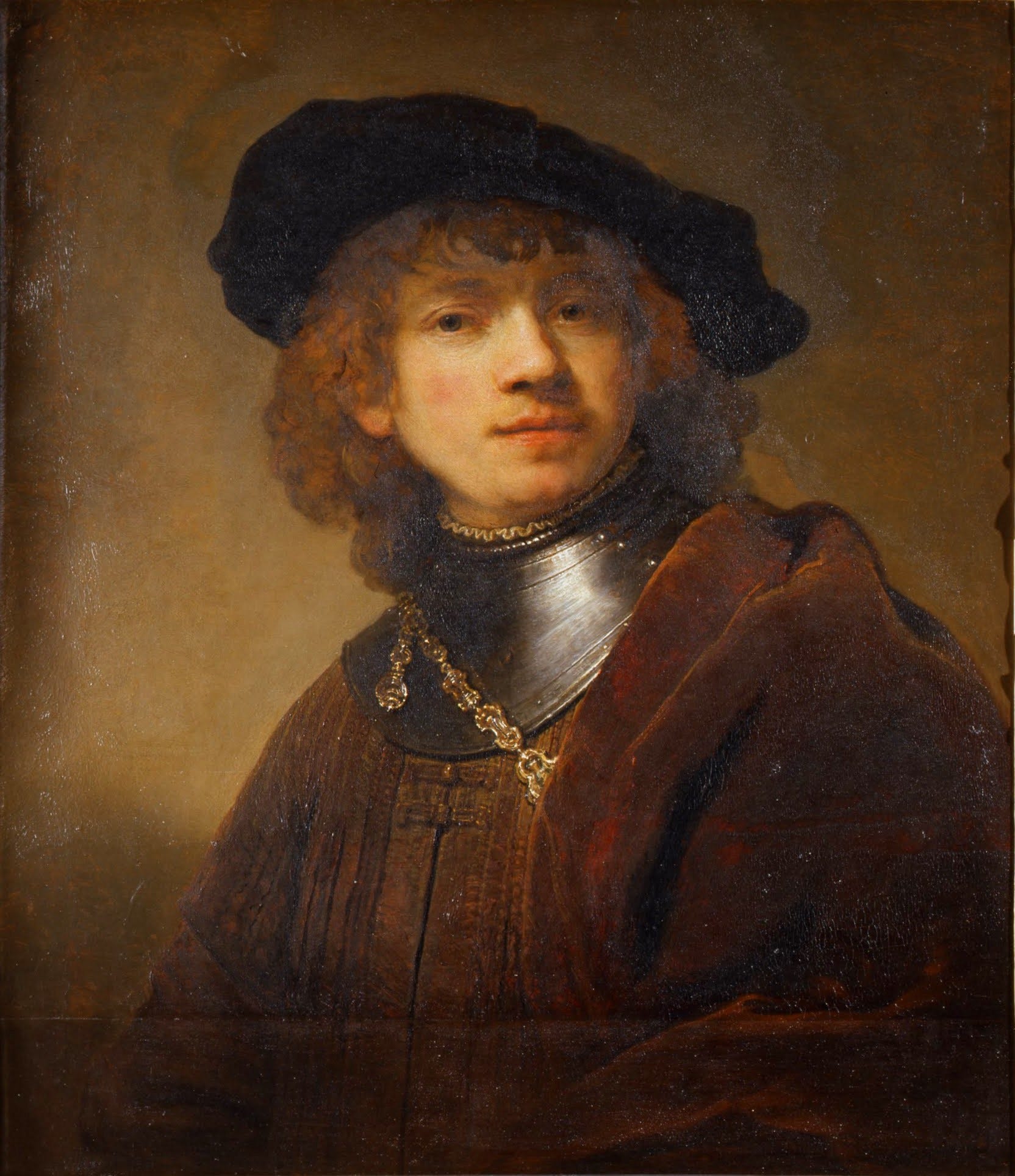
85 Rembrandt, Self-Portrait, 1634. Galleria degli Uffizi. WC.
Using Rembrandt’s self-portrait, on the left are squares taken from the shadows of his face, coat, hair, and the wall. Notice how extremely close in dark tone they are. On the right light side, there is a much larger range of colors and hues.
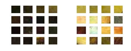
86 Newberry. Demo: color swatches from Rembrandt’s self-portrait, shadow colors on the left, the colors of light on the right.
In the light areas, Rembrandt has golden hues as the base, peppered with a couple of cool colors and dark browns. In the shadow areas, Rembrandt was meticulous in keeping the shadows very close in darkness, with minute differences. His shadows could be described as variations on black, with a couple of very dark gray-browns thrown in—as if they were covered by a dark veil. The key here is the extremely limited range of darks in the shadows versus a large range between light and dark golden tones in the light areas, resulting in the feeling of real light. Our takeaway is that the way to achieve Rembrandt-like light in painting is that shadows should be a tight-knit group of similar tones and hues, and the light areas should have a much larger spectrum of light and darks, with a golden theme.
Monet does a similar thing, but instead of using blacks, he employs a limited color hue in his shadows to create a dramatic feeling of light.
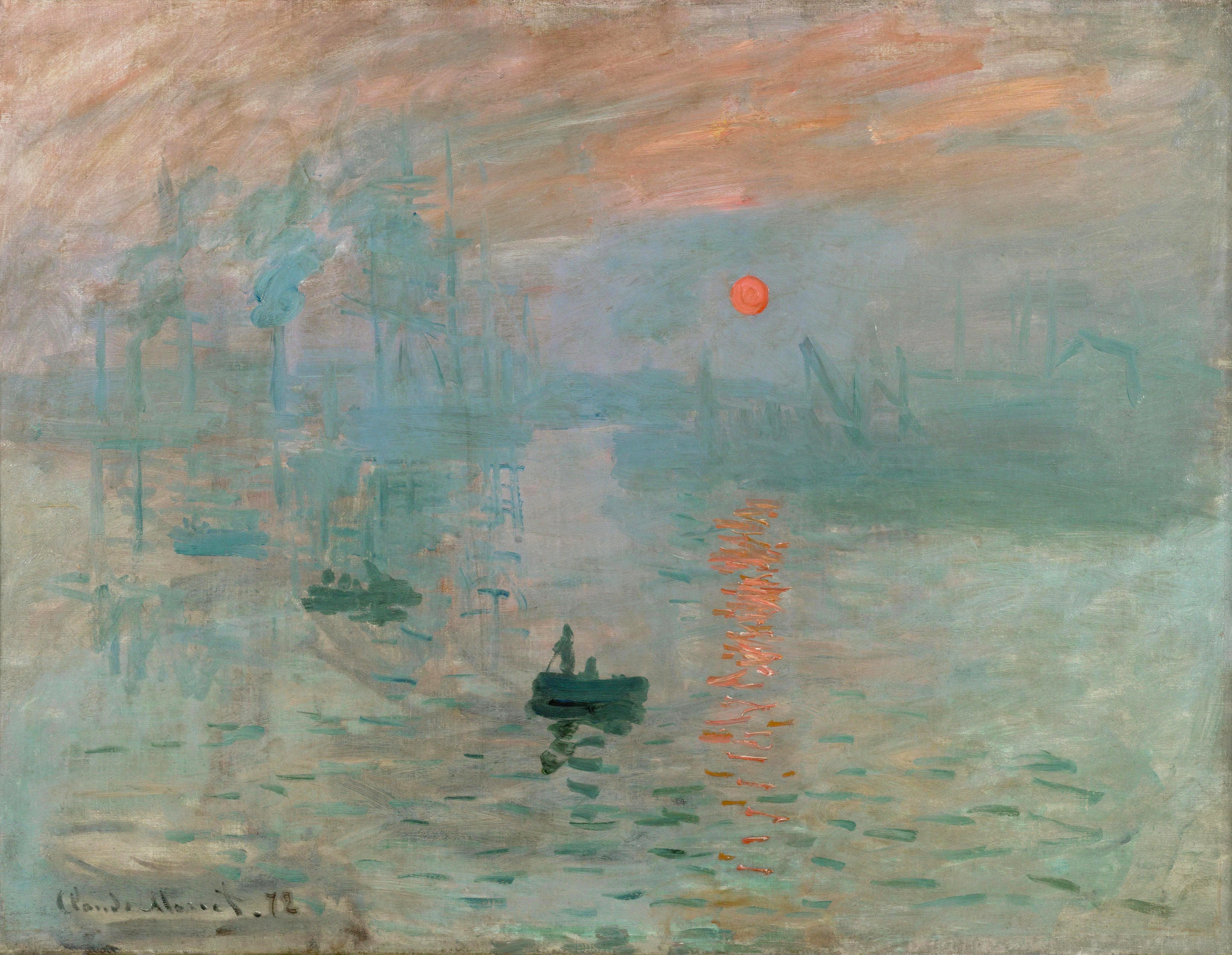
87 Monet, Soleil Levant, 1872. Musée Marmottan Monet. WC.
In this 1872 painting by Monet, Soleil Levant, he is not making dark shadows, yet he is making his shadows similar to each other by linking them with a blue hue. It is as if he placed all the shadows under a blue-green filter. In Monet’s light areas, he has painted cool and intensely warm colors. The orange lights gaining a powerfully feeling light by the complementary contrast with the predominate blue theme. It is very important to note that the tonal range between light and dark is very limited, there are no bright whites to contrast with the darks, as in the Rembrandt, rather Monet creating light by the color contrast of orange and blue. Truly amazing because the scarlet sun is not any lighter than the surrounding sky, but conveys all the brightness of a setting sun.
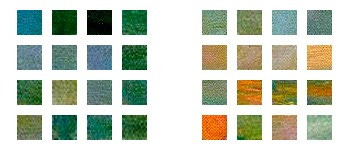
88 Newberry. Color swatches from Monet’s landscape.
Both Rembrandt and Monet create stunning light.[1] Their shadows are highly limited in range, and their highlights feature a few intense warm colors and in general either a large range of tones (Rembrandt) or hues (Monet). By skillfully using color to capture the interplay of light and shadow, they draw us into their worlds of light. Whether you're an experienced artist or just starting out, studying the works of these masters can teach you how to bring light and vibrancy to your own artwork. I hope this exploration of shadow and light has inspired you to experiment with your own color palette and see the world in a fresh and exciting way.
Practice
As always, it is crucial to reinforce your understanding through practice. If you have an unsuccessful painting laying around, dust off the cobwebs and use it to experiment. Isolate all the shadows, looking for those that stand out too much, then repaint them to bring them closer to each other as a group. The idea is that all the shadows should have a similar tone and hue. Once you have homogenized all the shadows, then play with both warm and cool colors in the light areas, being sure to accentuate and saturate a few warm colors for strong accents.
[1] While both Rembrandt and Monet were interested in studying light, they approached it in different settings. Rembrandt focused on the effects of candlelight and natural light through high windows in indoor settings, emphasizing chiaroscuro and creating a spotlight effect. Monet, on the other hand, took his studio outdoors to study the effects of daylight on landscapes with their great depth and atmospheric hues.