


Art Companion: Chapter 31, Optics: The Power of Absence
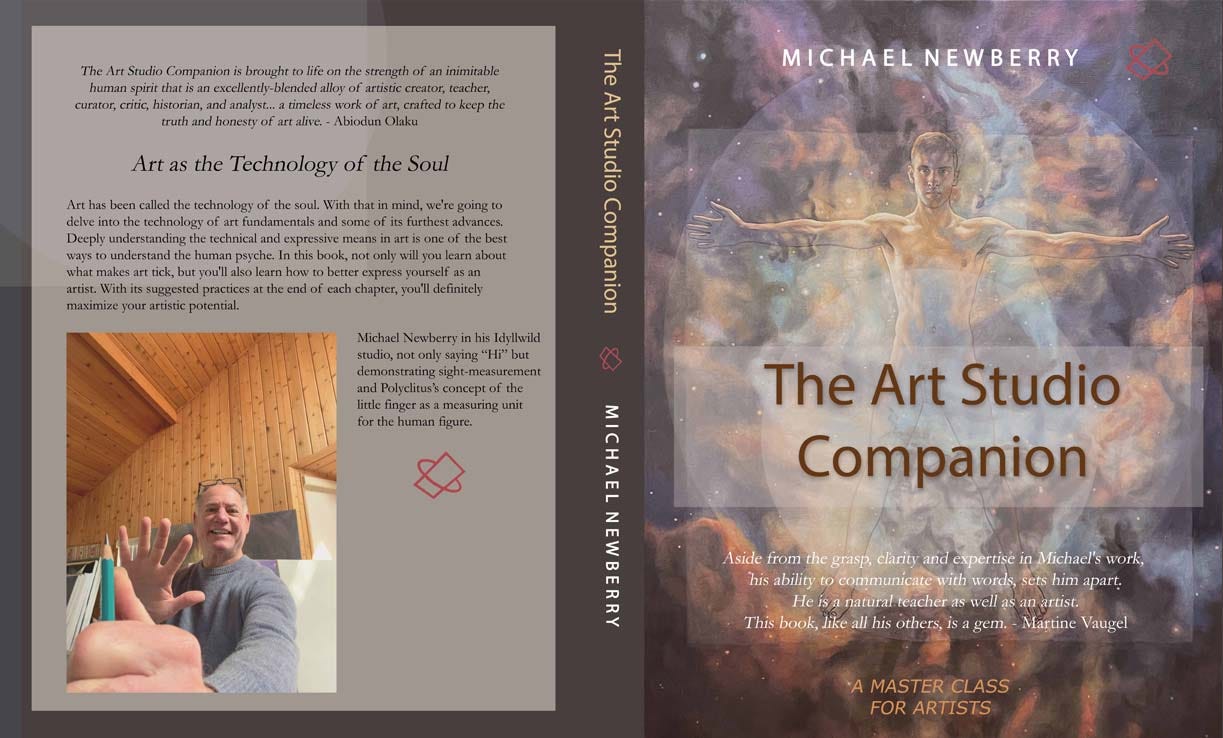
Soon to Be Released. The Art Studio Companion: A Master Class for Artists

Note: I am nearly certain The Art Studio Companion is ready for release. Last night I ordered the fourth print proof and I will check it next week. Meanwhile, here is chapter 31. There are 34 chapters in total. Additionally, it was an honor to have the great sculptor, Martine Vaugel, write this for the cover:
Aside from the grasp, clarity and expertise in Michael's work, his ability to communicate with words sets him apart. He is a natural teacher as well as an artist. This book, like all his others, is a gem.
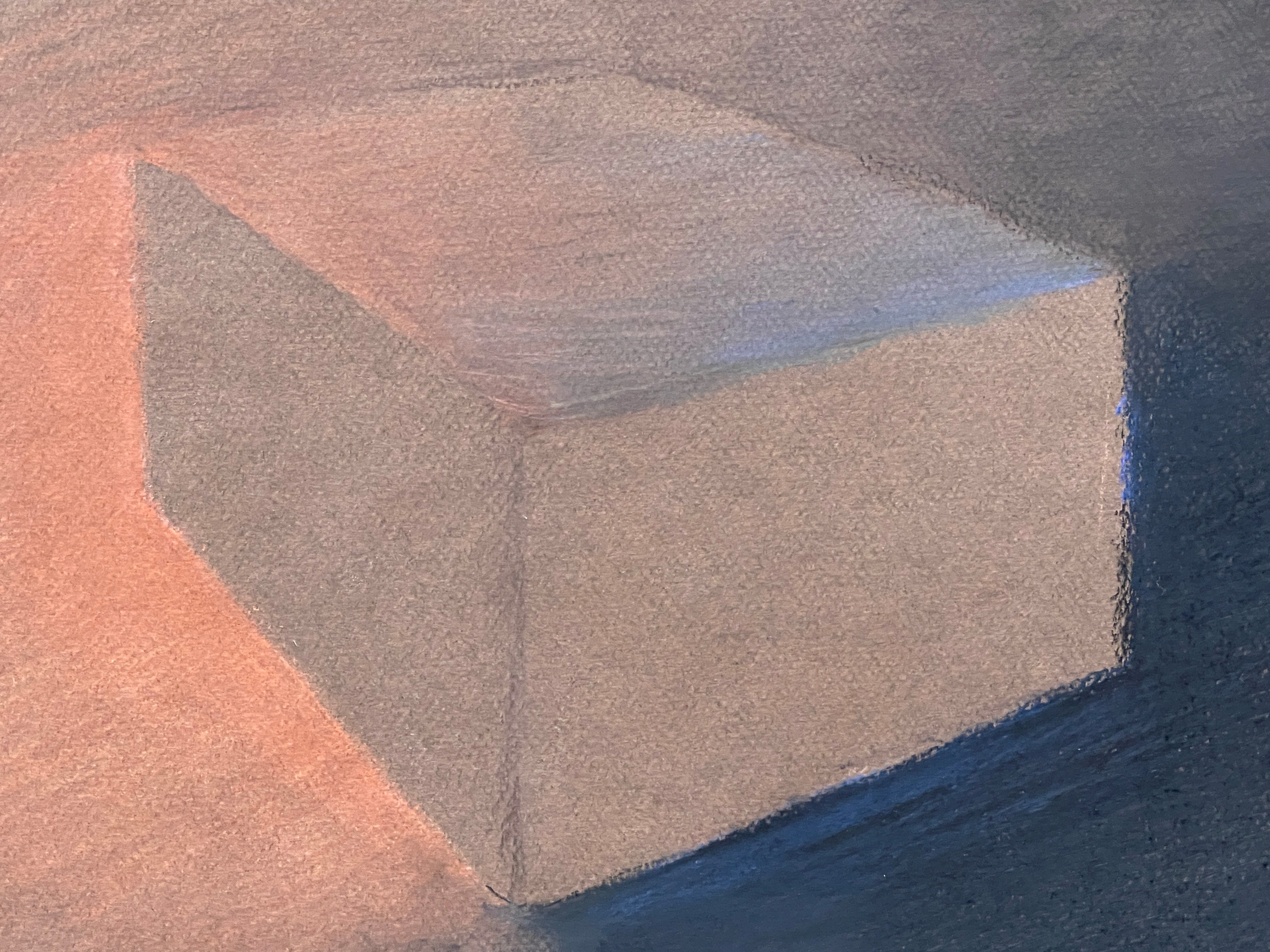
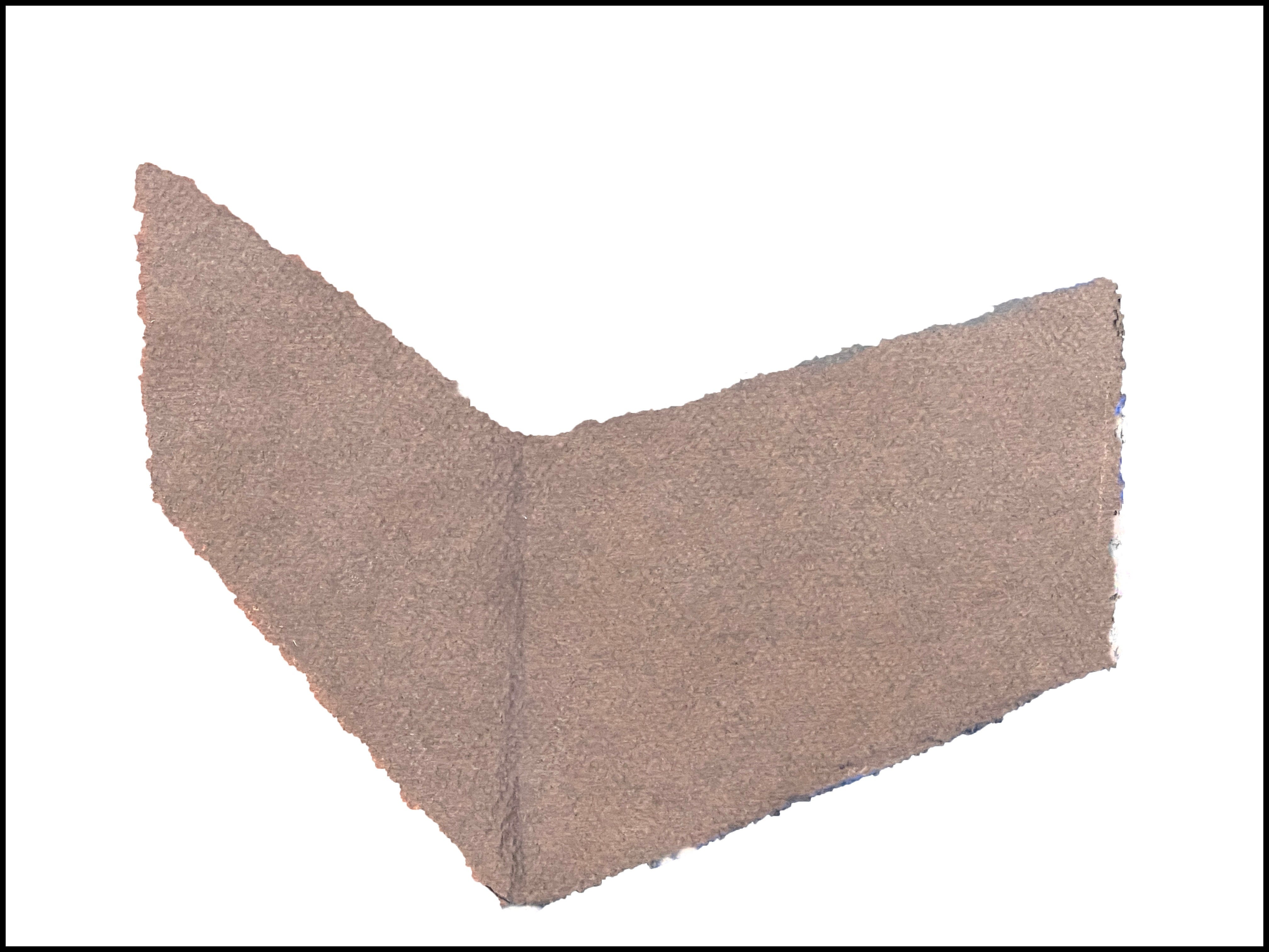
226 Newberry, Box, 2024, pastel. Demo of Chevreul’s tonal paradox.
In this study, we explore the optical illusion by drawing colored light and dark around empty sections of gray paper. This makes it appear as though the untouched parts have light, shadow, and form.
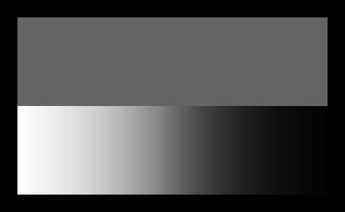
227 Demo of Chevreul’s gray and b/w stripe paradox.
In 1861, Michel Eugene Chevreul published his ground-breaking book, The Laws of Contrast of Color. His illustration depicted a solid gray strip against a gradated white-to-black strip, which I recreated in demo 227. I vividly recall being fascinated by it as a teenager. Like magic, the top gray strip appears to gradate from light to dark gray, despite being a solid tone. It demonstrates the context-aware nature of our visual perception, presenting an intriguing paradox.
In my pastel, Box, I did a variation on Chevreul’s illusion by drawing a box which the two sides are blank gray paper, yet they convey light, shadow, and form.
In image 226, if you look at the shadowed side of the box on the left, it appears slightly cooler and darker gray when compared to the lit side of the box, which appears a little bit warmer and lighter. The paradox is, both these sides are literally the color of the paper and have undergone no change at all.
The shadowed side is surrounded by warm light, and it's the orange that makes the shadow dark and cool. Meanwhile, the midnight blue surrounding the lit side of the box makes it appear lighter and warmer. The box also appears to be three-dimensional, with the sides playing pivotal roles in its form. This demonstrates that you can give light, shadow, and shape to nothing, depending on what surrounds it.
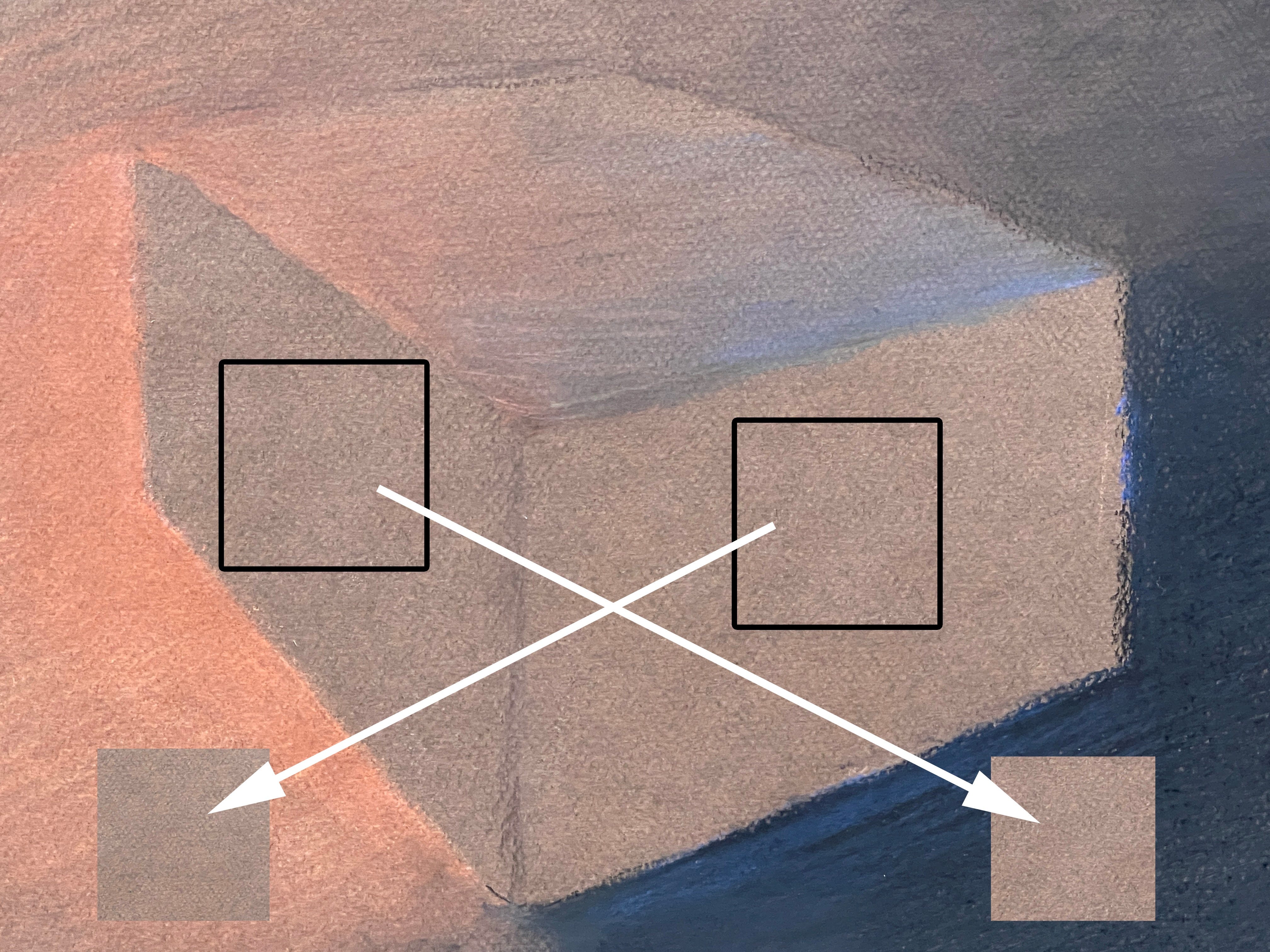
228 Demo showing that the same-colored sides flip from shadow to light and vice versa depending on what colors surround them.
Also in demo 228, I took a swatch from the shadowed side and a swatch from the lit side and pasted them, reversing their backgrounds, consequently changing their appearance. The lit side swatch is pasted over in the orange area, and the shadowed swatch is pasted in the dark area, confirming that both sides of the box are the same color. This also confirms the illusion that the same color can appear either light or dark depending on its surrounding tones.
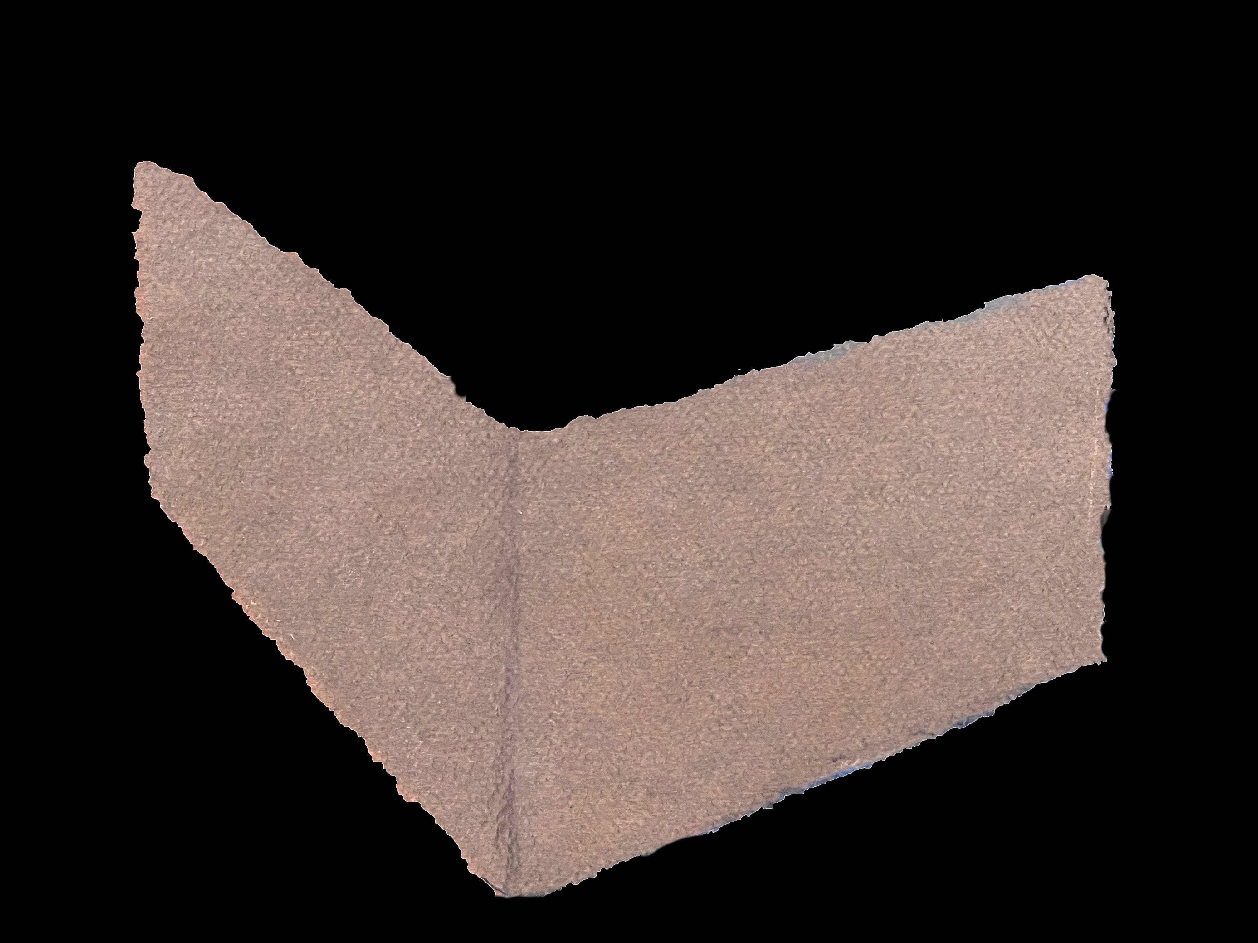
229 Demo showing the two sides framed against black.
230 Demo showing the two sides framed against white.
In demos 229 and 230, I cut out the sides of the box and put them in a black background and a white background respectively, illustrating that both sides are equal tones and, of course, come off light against black or dark against white. It's optically interesting that the corner of the box also looks like it could be inverted and be the inner spine of a book opening. Without the surrounding tones, it's hard to know what its actual shape is.
Chevreul defined two fascinating phenomena: Simultaneous Contrast and Afterimages. Simultaneous Contrast, illustrated earlier in the gray vs b/w stripe, also occurs when the perception of a color is influenced by its neighboring colors. For instance, placing deep blue fabric next to black can impart a warm-dark tint to the black fabric.
Afterimages occur when our eyes adapt to prolonged exposure to a color, like red, causing a ghost-like echo of its complementary color, green, when the red stimulus is removed. If you looked away from the red thing towards a green thing the green afterimage would then double the greenness of the thing. I used that optic in my pastel, Andrew’s Gate, image 231. Which I will discuss shortly.
Both Simultaneous Contrast and Afterimages are optical phenomena that artists can use to intensify the sensation of light and color on a two-dimensional surface. By understanding and manipulating these optical effects on canvas or paper, artists can trick the viewer into experiencing the brilliance of reality.
Van Gogh's art really took off when he began exploring these theories with real-life observations. He wrote, "This reciprocal heightening is what's called the law of simultaneous contrast. ... If the complementary colors are taken at equal value, that is to say, at the same degree of brightness and light, their juxtaposition will raise both the one and the other to an intensity so violent that human eyes will scarcely be able to bear to look at it."[1]

231 Newberry, Andrew’s Gate, 2014, pastel.
In my pastel, image 231, about one-third of the drawing is blank bright green paper, and I used it to play off the light of the rich redwood gate and opaque cement driveway. In the background, you can sense bushy trees, with just a touch of blue sky to indicate their silhouettes. And the cast shadow seems to change, like the Chevreul Illusion, from being darker next to the highlights and lighter against the darker wood shadows. Compare the dark narrow shadow under the gate with the lighter green in the upper left corner, yet they both are the same green.
I drew it on an intensely bright Southern Californian day, and the redwood gate was intense in reds and orange colors. There was almost no way to communicate the intensity of those hot colors. But using the intense green paper (the compliment and opposite of red), I had a chance to set off both the color and the light.
The mental experience is like how Van Gogh describes it, "... an intensity so violent ..." it feels like an explosion of electrons then bouncing off each other inside the confines of the skull. For a enjoyable experiment, try an intensely colored paper and use complementary colors for the light. Wild.
To sum up, from Chevreul's groundbreaking discoveries to Van Gogh's pioneering use of color theory in his art, we have gained a deeper understanding of how our eyes and brains interpret the world around us.
Practice #1
As always, it is crucial to reinforce your understanding through practice. Choose a subject that exhibits intense contrast between light and shadow. Let your dark paper act as the shadow, leaving it pristine, and focus all your attention on drawing the mid-tones and light areas. Surprisingly the untouched paper areas will take on substance.
Practice #2
As always, it is crucial to reinforce your understanding through practice. Try the same exercise as above, but this time, use a very bright-colored paper and carefully use its complements, its opposite colors, for the mid-tones and lights of your drawing. It will be eye-popping challenging, but fun.
[1] Van Gogh. The Letters. To Theo van Gogh. Nuenen, on or about Saturday, 18 April 1885. Page 494. https://vangoghletters.org/vg/letters/let494/letter.html
This book is on my wish list!
Yes, it is an excellent resource, I’m glad you were able to step back and reconsider. I’ll keep an eye out for the relaunch, I think it would be an excellent guide to continuing our homeschool art lessons.